 theFASHIONtamer Where Style Meets Space, Effortlessly
 When it comes to creating a sanctuary for girls, the right color palette can be a powerful tool, transforming a simple bedroom into a vibrant expression of personality and creativity. The hues we choose for our spaces play a crucial role in shaping mood, inspiring creativity, and evoking comfort. In this guide, we will explore the transformative power of color, offering practical tips and thoughtful insights to help you select the perfect palette for your girl’s room. Whether it’s a soft blush pink, a bold turquoise, or a calming lavender, each shade can tell a story, reflect individual tastes, and ultimately create an environment that nurtures growth and self-finding. Join us as we delve into the art of color selection, helping you craft a personalized retreat that resonates with joy and inspiration.
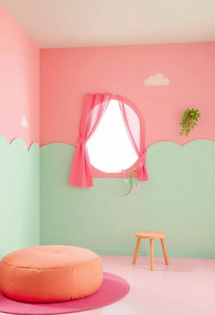
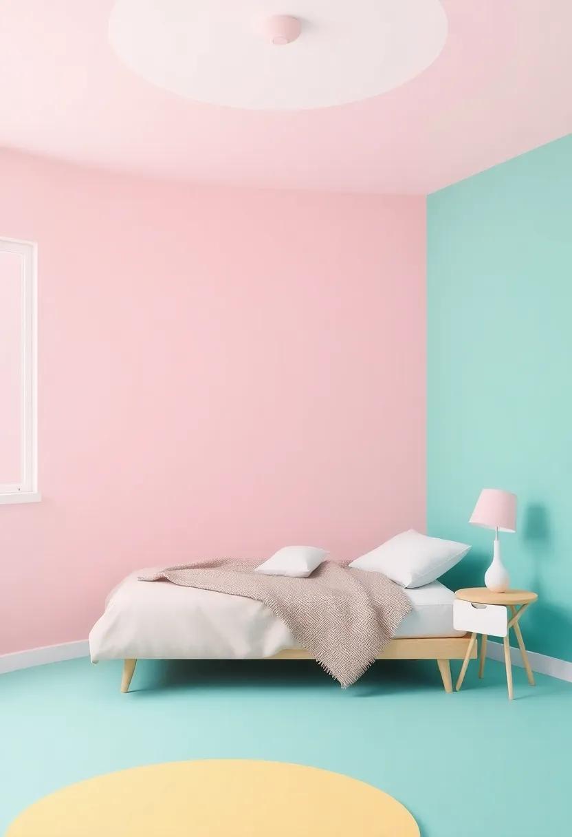
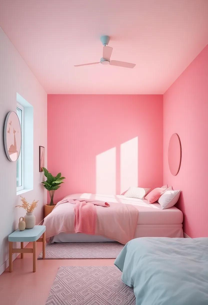
Choosing the Right Color Palette for a Dreamy Girls’ Room Sanctuary
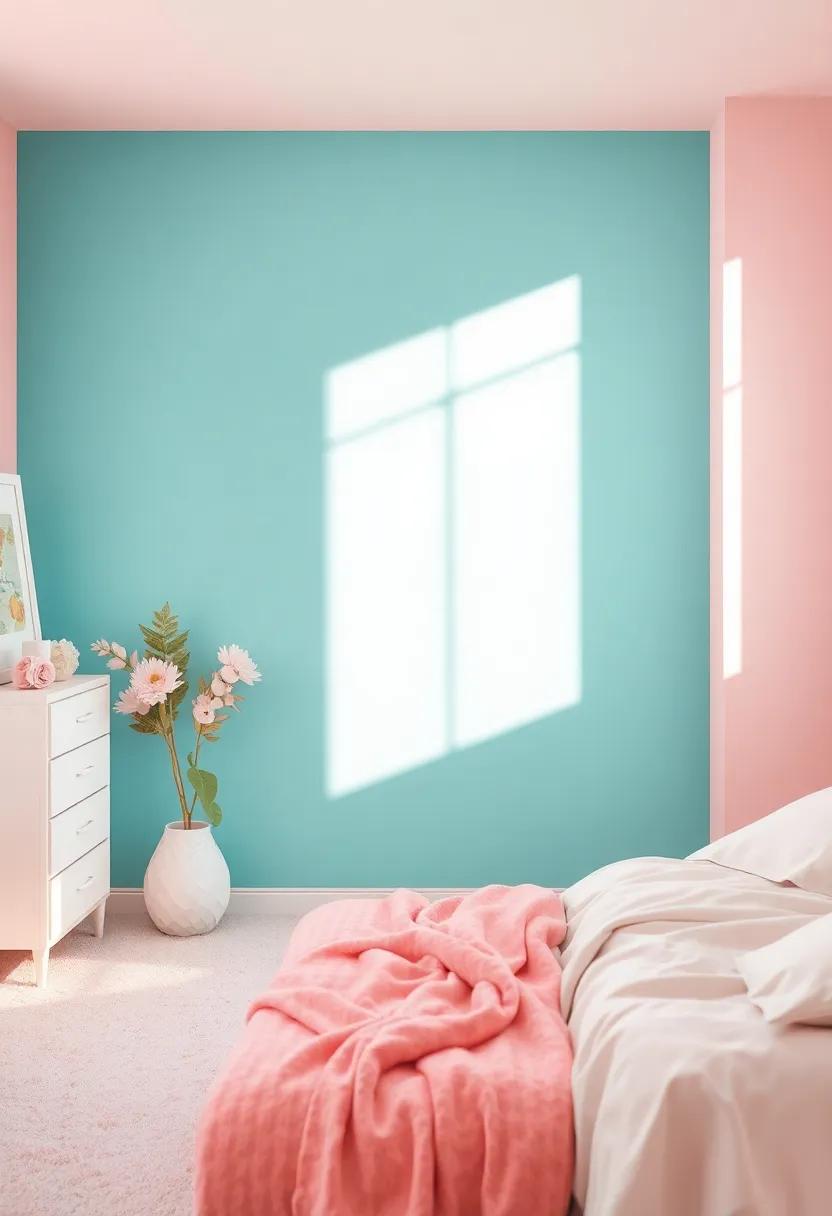
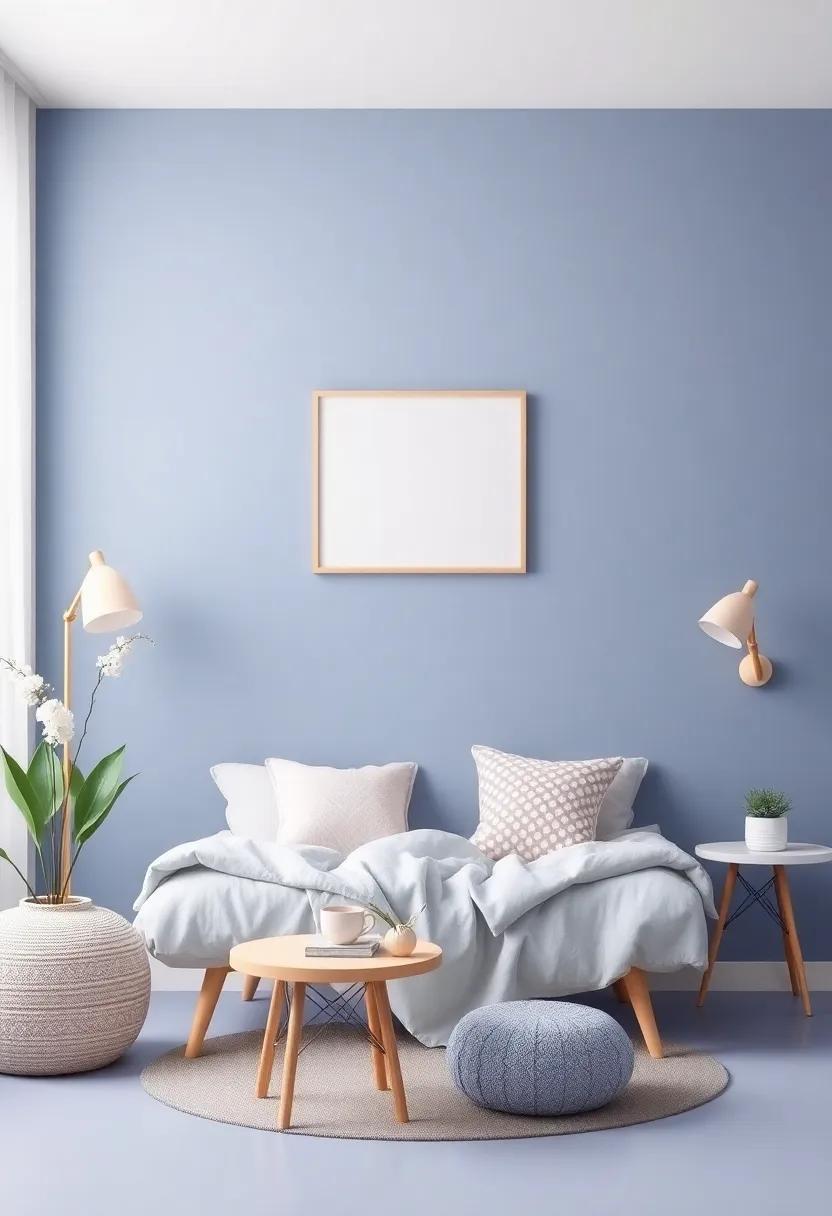
Creating a cozy and imaginative space for a girl frequently enough begins with the right color palette. Think about the mood you want to evoke in her sanctuary. Soft pastels, like blush pink, lavender, and mint green, can emit a sense of calm and serenity. Conversely, vibrant hues like coral, teal, and sunshine yellow can bring energy and a spark of creativity. Consider the following color combinations to inspire her dream room:
- Whimsical Pastels: Blush pink, soft lavender, pale yellow
- Nature-Inspired: Sage green, sky blue, sandy beige
- Bold & Bright: Coral, turquoise, sunny lemon
- Elegant Neutrals: Dusty rose, dove gray, soft white
Additionally, allowing for personal expression is essential when selecting the color scheme. Integrating her favorite colors or patterns can make the room feel uniquely hers. Using the 60-30-10 rule can be a practical approach here: 60% of the room should be the dominant color, 30% a secondary color, and 10% an accent color to tie in the room’s decor. This balance creates harmony and allows her to explore with accent pieces without overwhelming the space. Consider a simple table to visualize this concept:
| Color Type | Recommended Colors |
|---|---|
| Dominant Color | Soft Lavender |
| Secondary Color | Pale Pink |
| Accent Color | Bright gold |
Exploring the Psychology of Color in Girls’ Room Design
When designing a girl’s room, the selection of colors can have a powerful impact on mood and behavior. Warm hues, such as soft pinks and yellows, often evoke feelings of comfort and warmth, making them a popular choice. These colors can create a cheerful and inviting atmosphere, perfect for fostering creativity and imagination. In contrast,cool tones like blues and greens are known for their calming properties,helping to create a serene space that encourages relaxation and restful sleep. Understanding the psychological effects of different color palettes can aid in crafting a personal haven tailored to the unique personality of each young girl.
Incorporating an element of playfulness and fun in color schemes can also enhance a girl’s room. Consider the following options when choosing the right shades:
- Accent colors: Use vibrant pops of color, such as turquoise or coral, to inject energy into the room.
- pastel palettes: Soft colors not only promote a tranquil ambiance but also allow for colorful accessories.
- Patterns and textures: Combining colors through patterns can stimulate creativity while adding visual interest.
| Color | Psychological Effect |
|---|---|
| Pink | Comfort and nurturing |
| Blue | Calmness and tranquility |
| Yellow | Happiness and energy |
| Purple | Creativity and inspiration |
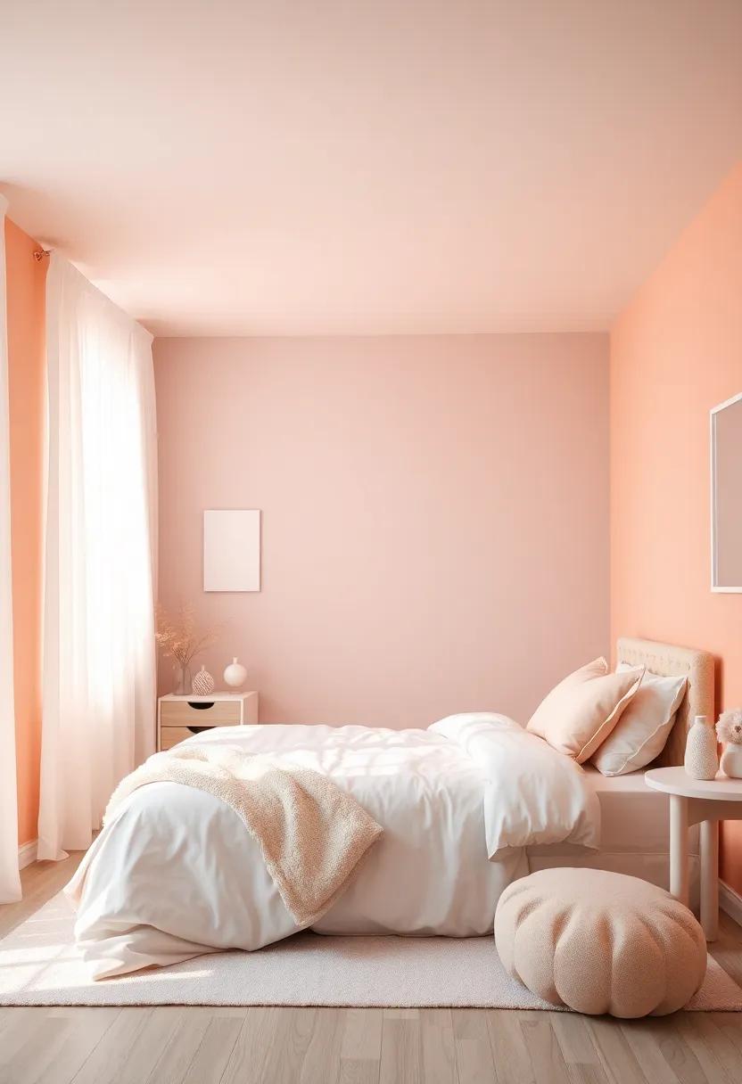
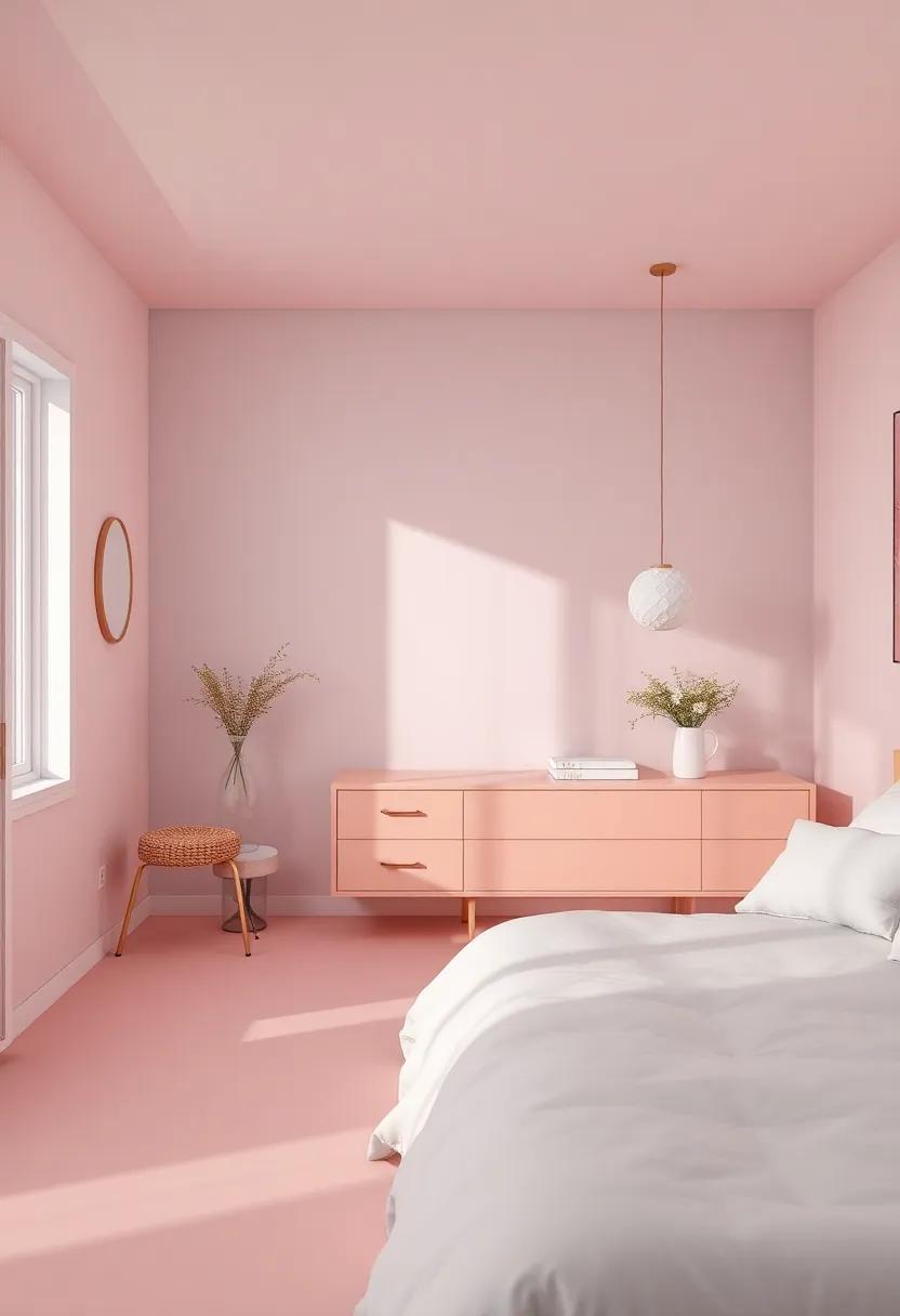
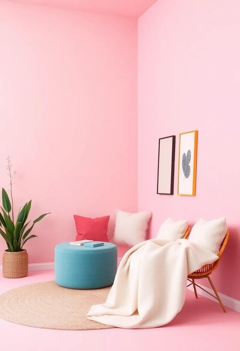
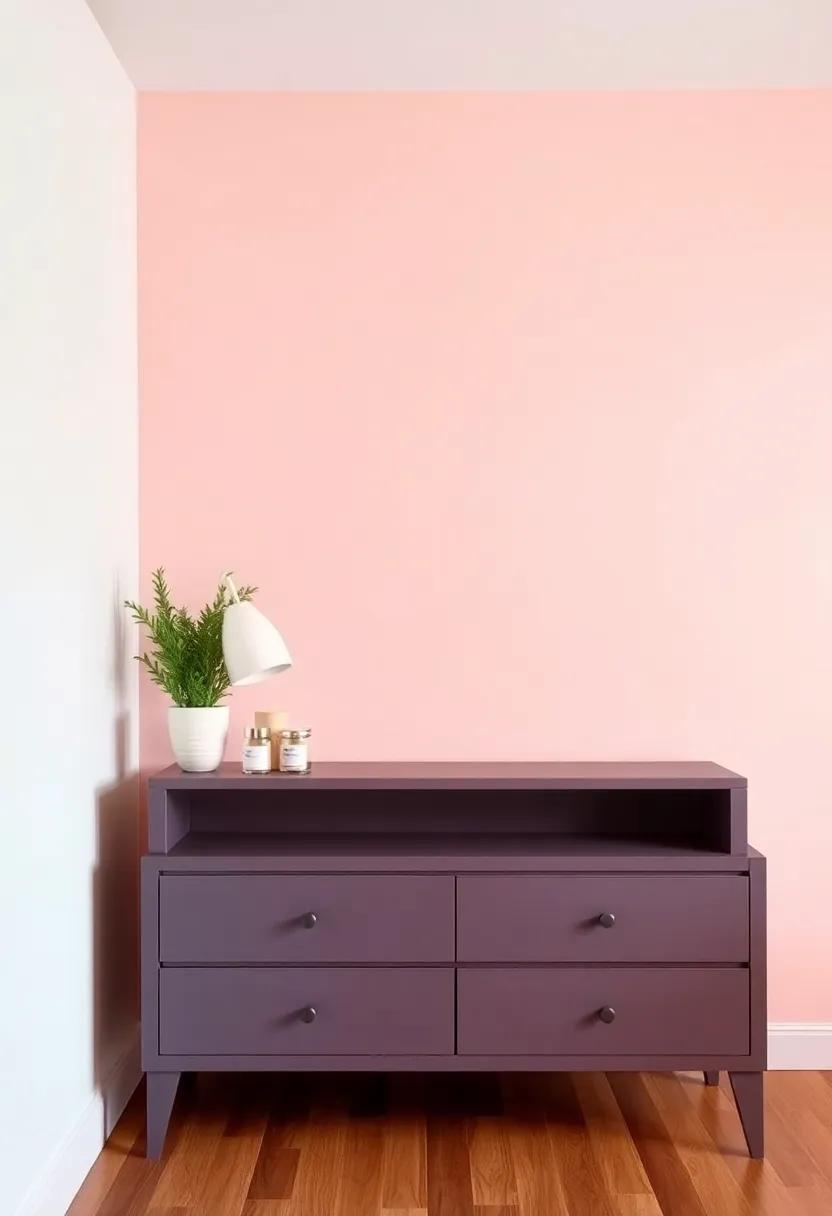
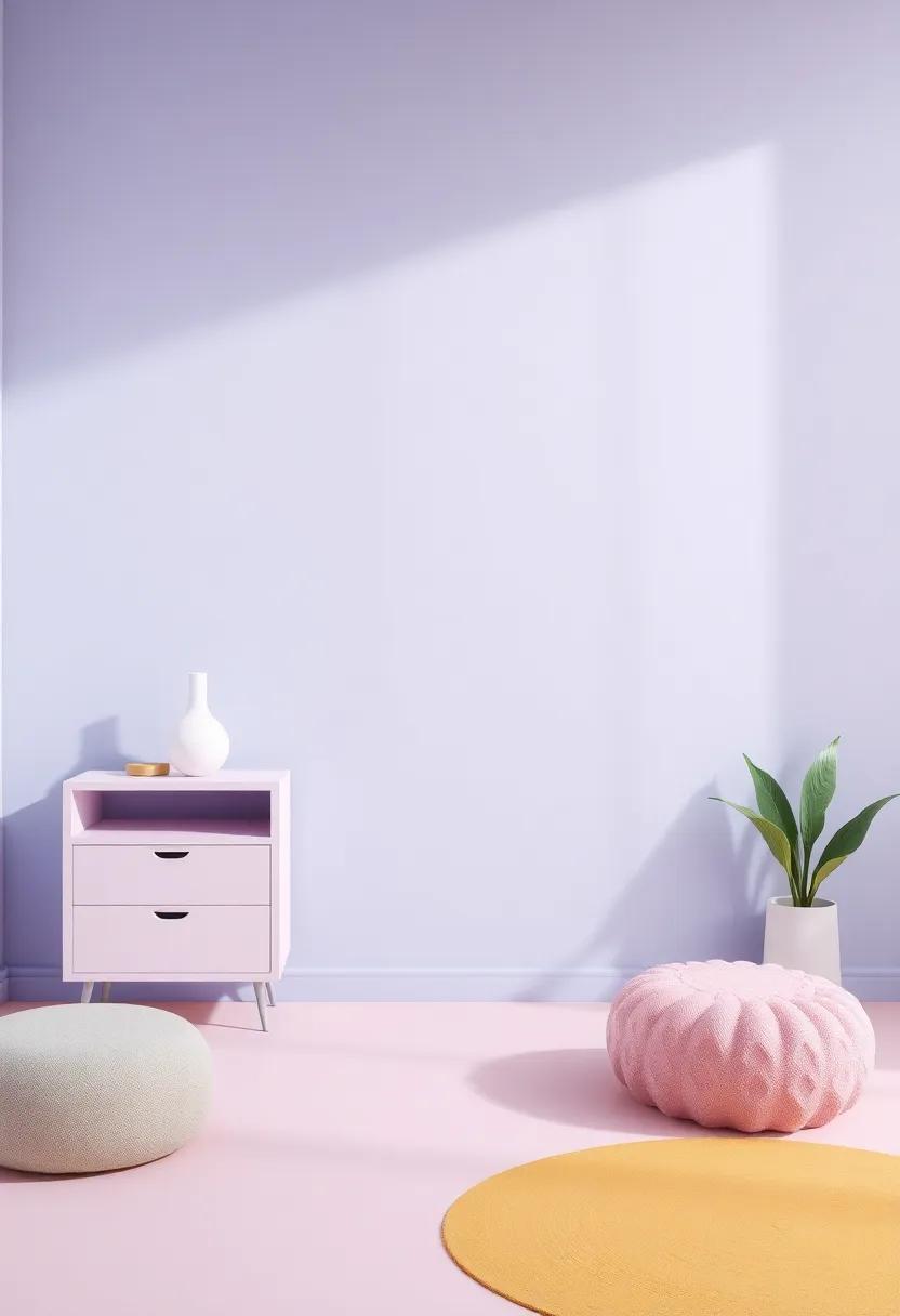
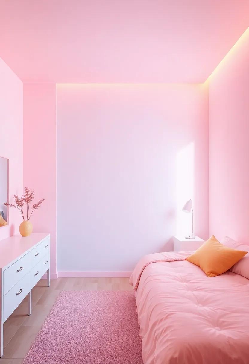
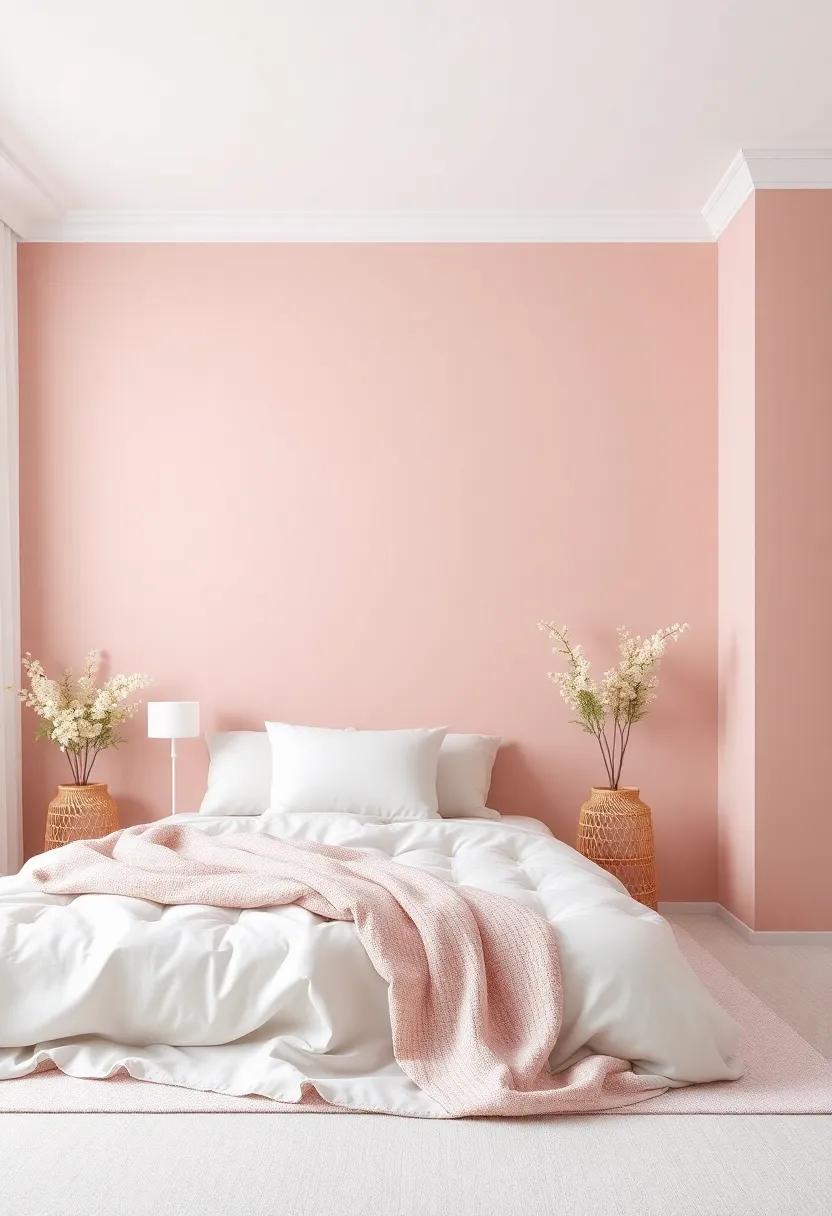
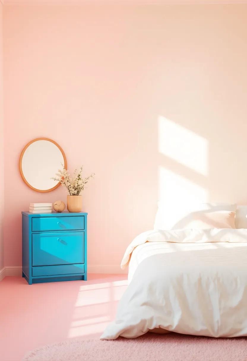
Embracing Pastel Hues: A Soft Approach to Room Transformation
When it comes to creating a serene and inviting atmosphere in a girl’s room, pastel hues offer a gentle palette that promotes calmness and creativity.Soft shades like blush pink, mint green, lavender, and baby blue evoke a sense of tranquility while still making a bold statement. The beauty of these colors lies in their versatility; they can be paired with neutral tones or other pastels to create nuanced and visually appealing combinations. Some delightful pairings to consider include:
- Blush pink and soft gray: A chic, modern palette that exudes sophistication.
- Mint green and creamy white: A fresh, airy feel perfect for maximizing light.
- Lavender and sunshine yellow: A playful contrast that energizes the space.
These soothing colors can be integrated into various design elements, from wall paint to accessories. Consider using pastel shades in textiles like curtains, bed linens, or rugs to add layers of coziness and style. Additionally, furniture painted in these soft tones can also serve as stunning focal points in the room. Below is a simple table detailing potential pastel color inspirations along with their ideal complementary colors:
| Pastel Color | Complementary Shades |
|---|---|
| Blush Pink | Soft Grey, Cream |
| Mint Green | Beige, White |
| Lavender | Soft Yellow, Coral |
| Baby Blue | Peach, Light Brown |
incorporating these pastel hues can significantly enhance a girl’s room, making it a restful retreat while allowing for personal expression. By mixing and matching these colors thoughtfully, you can easily create a harmonious design that reflects her unique personality and style.
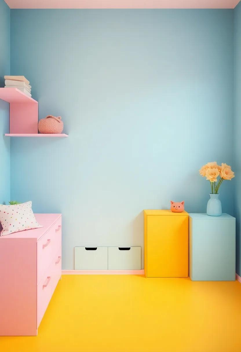
Vibrant Colors That Inspire creativity in Young Girls
Choosing the right color palette can set the stage for boundless imagination and playful creativity. Soft pastels combined with vibrant accents can create an inviting atmosphere that encourages exploration.Popular shades such as light pinks, mint greens, and soft yellows can serve as a marvelous backdrop, allowing for bursts of color through accessories, furniture, and artwork. Incorporating elements like wall decals or colorful rugs can further enhance the space,bringing a sense of warmth and joy while still maintaining a balance that feels restful and inviting.
Additionally, consider the psychological impact of color when designing the room. Bold colors such as fiery reds or deep purples can instill a sense of confidence and passion, making them ideal for accent walls or focal points. Meanwhile, earth tones like terracotta or soft blues can ground the environment, creating a soothing space conducive to reflection and relaxation. Here is a quick reference table for popular colors and their associated meanings:
| Color | Meaning |
|---|---|
| Pink | love & Nurturing |
| Blue | Calm & Trust |
| Yellow | Joy & Optimism |
| Purple | Creativity & Imagination |
| Green | Growth & stability |
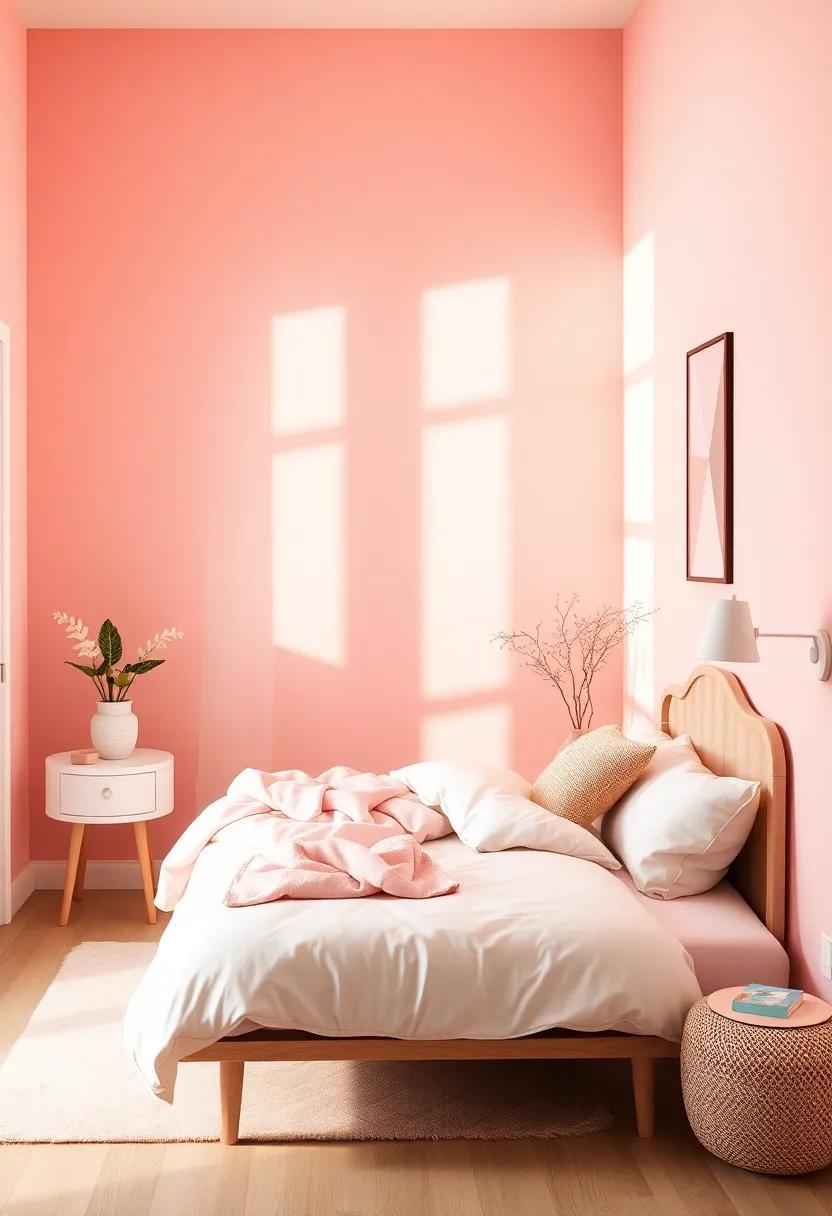
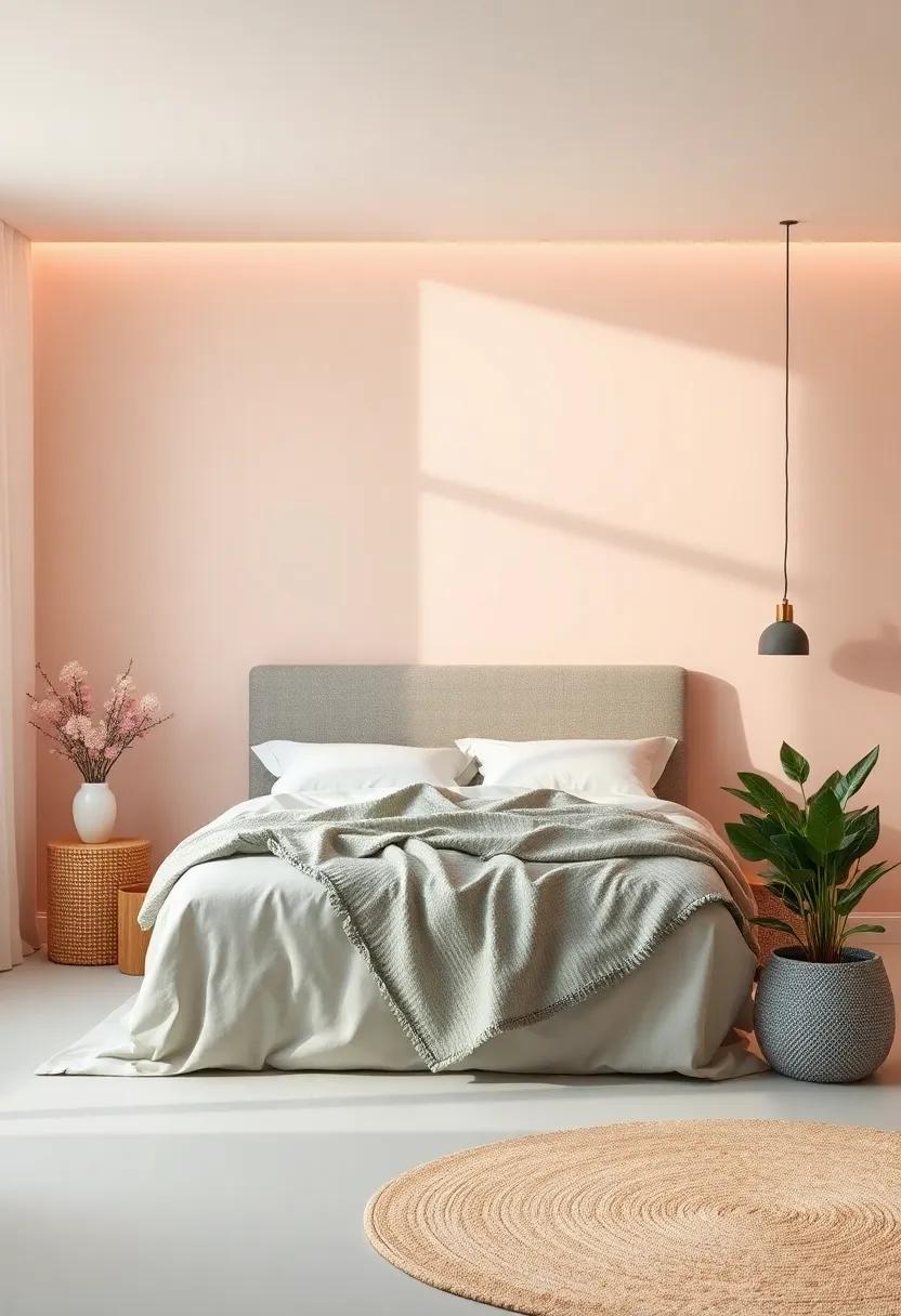
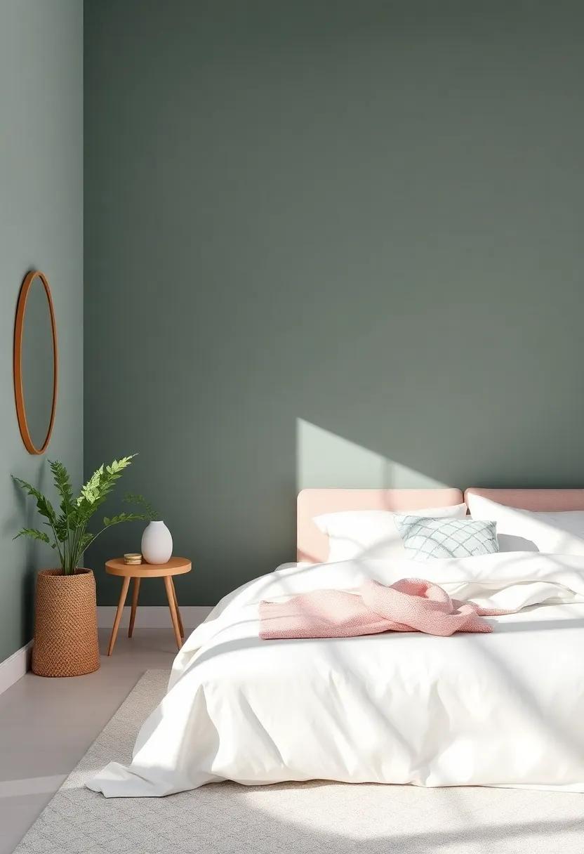
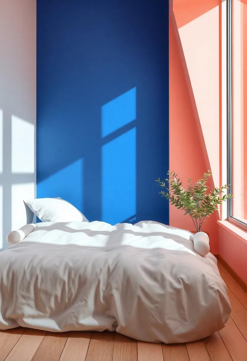
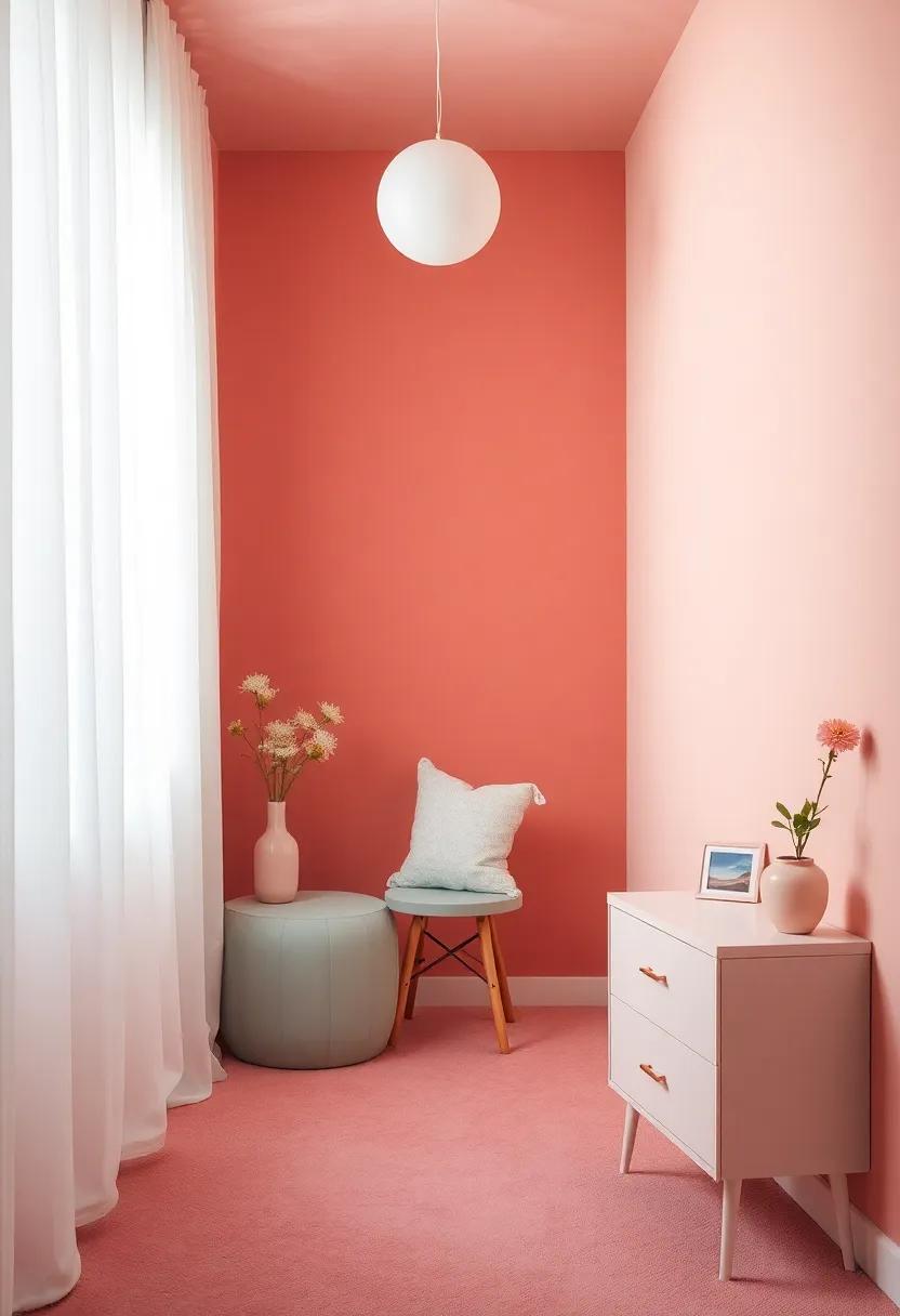
Balancing Bold and Soft Tones: A Harmonious Bedroom Space
Creating a dreamy bedroom requires a balance of various tones, where bold hues can add energy and personality, while soft shades bring serenity and warmth.When choosing a palette, consider incorporating colors such as rich lavender or vibrant coral to serve as anchors in the space. These can be beautifully balanced with gentler tones like creamy pastels or delicate neutrals—think buttery yellows or soft pinks. A well-thought-out combination of these colors can turn a bedroom from merely functional to a harmonious retreat.As an example, you might pair a striking emerald green accent wall with lighter mint decor to create visual interest without overwhelming the senses.
Texture can also play a crucial role in balancing these tones. Consider mixing fabrics and materials that complement both bold and soft colors. Below is a simple guide to different textures that can enhance your color choices:
| Texture Type | Recommended Color Pairings |
|---|---|
| Soft Velvet | Light pink with deep plum |
| Natural Linen | Soft beige with vibrant teal |
| Glossy Acrylic | Bright yellow with cool gray |
| Woven Textiles | Muted mauve with rich navy |
by thoughtfully mixing these elements, you can create a dynamic and inviting bedroom space that reflects a girl’s unique personality. Remember, the key lies in keeping the balance—bold accents should be strategically placed while soft tones provide a calming backdrop that encourages relaxation and creativity.
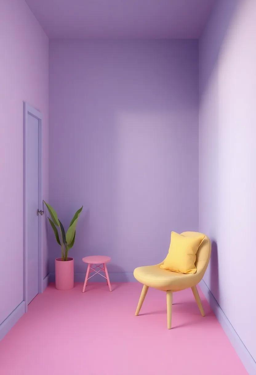
The Magic of Monochromatic Schemes in Girls’ Rooms
Monochromatic color schemes offer a wonderful opportunity to create a serene and cohesive environment in any girl’s room. By selecting varying shades and tints of a single color, you can foster a captivating and harmonious aesthetic that promotes a sense of calm and comfort. Imagine a soft pink room decorated with deeper fuchsia accents and gentle blush textiles, creating a layered effect that feels inviting and elegant. This approach allows for an expansive canvas where textures and patterns can shine without the chaos of competing hues.
To further enhance the magic of monochromatic design, consider incorporating various elements such as paint, furniture, textiles, and accessories that share the same color family.This technique not only brings depth but also a personalized touch to the space. Here are some suggestions to make the most of a monochromatic palette:
- Layering Textures: Use different materials like velvet, cotton, or linen to add dimension.
- Accent Walls: Consider a bold wallpaper or paint treatment on one wall for added flair.
- artwork: Choose wall art that incorporates varying shades of the chosen color.
| Color | Shade | suggested Accents |
|---|---|---|
| Lavender | Deep Purple | White Pillows |
| Mint Green | Seafoam | Gold Accents |
| Soft Blue | Dark Navy | Silver Decor |
Layering Textures and Colors for an inviting Atmosphere
Creating a space that resonates with warmth and welcoming vibes frequently enough hinges on the thoughtful combination of textures and colors. To achieve this, consider integrating a mix of materials that evoke comfort and personality. Soft textiles such as plush throws, velvet cushions, and cozy area rugs can add depth and warmth, while a variety of wall finishes—like matte paints or whimsical wallpaper—can serve as a stunning backdrop. A blend of colors that complement each other will enhance the emotional impact of the room, so mixing shades of pink with soft pastels or pairing vibrant hues with neutral tones works exceptionally well.
When it comes to layering,think about the interplay between different elements in the room.Incorporate accessories that create visual interest, such as decorative pillows in varying textures or wall hangings that bring in a sense of depth. Here’s a quick guide to help you choose the right combinations:
| Color Pairing | Texture Element |
|---|---|
| soft Pink & Cream | Faux Fur Throw |
| Mint Green & Coral | woven Baskets |
| Lavender & Light Grey | Knitted Throws |
| Sky Blue & Warm Yellow | Textured Ribbons |
This thoughtful integration invites a sense of balance and enjoyment, helping to create a sanctuary that reflects the style and personality of its inhabitant. Experimenting with different structures—like varying the height of furniture or mixing patterns—can further enhance the dynamic feel of the room, making it a delightful and engaging space.
Incorporating Nature-inspired Color Palettes in Bedroom Decor
Embracing nature-inspired color palettes can breathe new life into a girl’s bedroom, transforming it into a serene retreat that reflects the beauty of the great outdoors. Shades like soft greens, delicate blushes, and calming blues evoke the essence of nature and create an uplifting atmosphere. Consider incorporating these colors in various elements of the room, such as wall paint, bedding, and decorative accents. A few options to consider include:
- Forest Green – evokes tranquility and can be paired with light wood furniture.
- Ocean Blue – promotes relaxation and enhances a space filled with soft textures.
- Lavender – inspired by wildflower fields, brings whimsy and sophistication.
- Coral Pink – reminiscent of sunsets, adds warmth and cheerfulness.
To create a well-balanced look, it’s effective to mix and match these colors with neutral bases.using a soft white or light grey as a foundation will allow the nature-inspired shades to pop without overwhelming the space. Consider the following combinations:
| Base color | Accent Colors |
|---|---|
| Soft White | Forest Green,Coral Pink |
| Light Grey | Ocean Blue,Lavender |
| Beige | Sage Green,Blush |
By thoughtfully selecting a color scheme inspired by nature,you can foster an environment that is not only visually appealing but also promotes relaxation and creativity,providing a perfect backdrop for any girl’s unique personality to flourish.
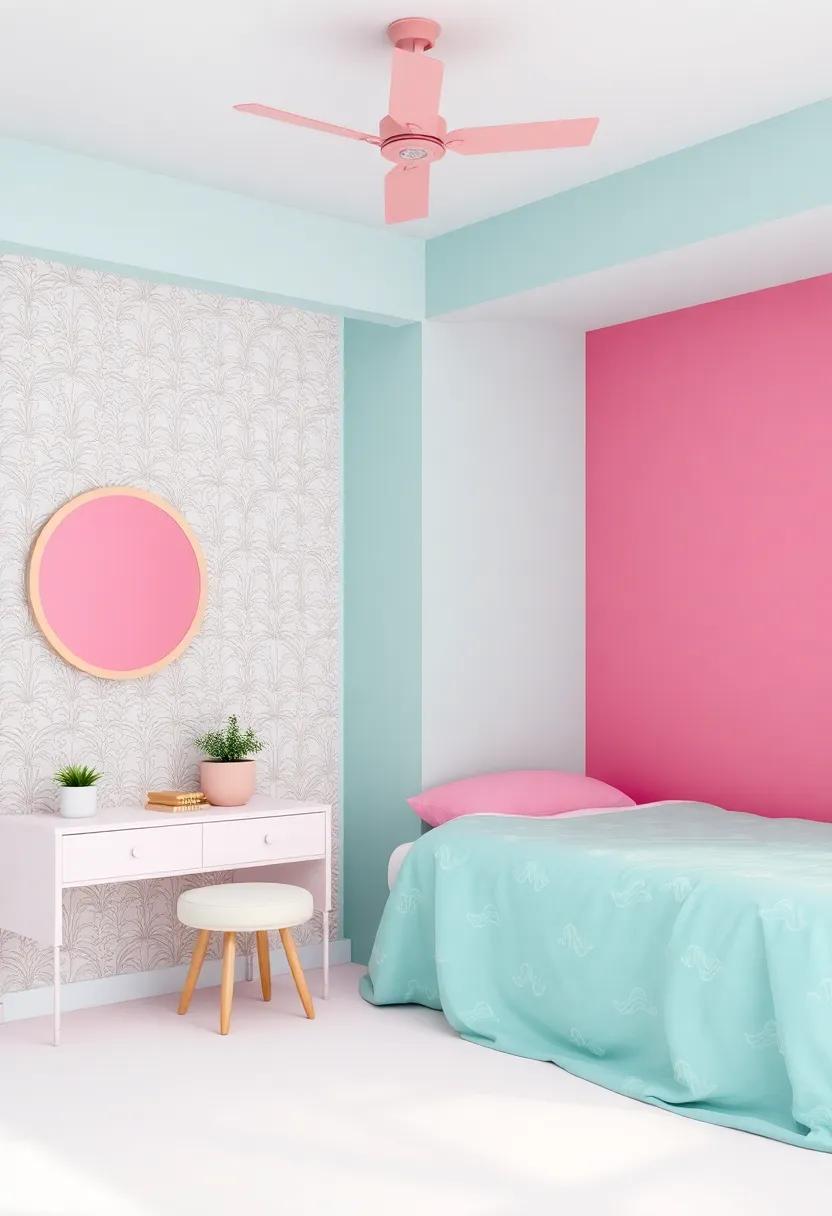
Creating a Whimsical Wonderland with Playful Colors
Infusing a girl’s room with playful colors can transform the space into an enchanting retreat. Start by selecting a base color that evokes joy and comfort while remaining harmonious with the other elements in the room.Shades like soft pastels or vibrant jewel tones can serve as excellent foundations. Experiment with color combinations that bring life to the walls, furniture, and accessories. Consider pairing complementary colors to create a lively contrast or using analogous shades for a more soothing palette. Here are a few playful color pairings to consider:
- Peach and Mint – A delightful mix that radiates warmth and freshness.
- Lavender and Lemon Yellow – A whimsical choice that balances softness with brightness.
- Turquoise and Coral – A vibrant duo that captures a carefree spirit.
To further enhance the whimsical feel, incorporate splashes of accent colors through decor items, textiles, and artwork. These accents add depth and character, allowing for creativity without overwhelming the senses. Use playful patterns, such as polka dots or floral motifs, to bring excitement and movement to the space. Below is a simple table showcasing key elements to consider when designing a whimsical wonderland:
| Element | Color Ideas |
|---|---|
| Walls | Soft Pink, Sky Blue |
| Furniture | Bright Yellow, Aqua |
| Textiles | Floral prints, Geometric Patterns |
| Accents | Vivid Red, Lively Green |
Modern vs. Classic: Finding the Right Color Style for Every Girl
when designing a girl’s room, the choice between modern and classic color styles can significantly influence the atmosphere and overall aesthetic. Modern palettes often embrace bold, vibrant colors combined with clean lines and minimalistic designs. Think cheerful hues like turquoise, coral, and lime green, which bring a sense of energy and optimism to the space. Furthermore, the modern approach frequently incorporates unexpected pairings, allowing for playful accent walls and eclectic decor that reflect contemporary trends.
In contrast, classic styles draw inspiration from timeless color schemes that evoke elegance and charm. Rooms designed in classic palettes typically feature soft tones such as pastel pinks, powder blues, and creamy whites. These colors not only create a soothing ambiance but offer versatility, making them easy to accessorize as a girl evolves in her tastes. Moreover, incorporating wallpaper with vintage patterns or using wooden furniture can enhance the classic theme, providing a cozy yet sophisticated touch.
Color Combinations That Promote Calmness and Focus
creating an atmosphere that fosters tranquility and concentration begins with the careful selection of color palettes. Soft hues such as light blue, pale green, and gentle lavender have been shown to induce a sense of serenity in a room. These colors not only resonate with calming energy but also invite a sense of peace, allowing for relaxation and focus. Consider pairing these soothing shades with neutral accents like beige or soft gray to create balance and warmth, making the space inviting without being overwhelming.
To enhance the calming effects, incorporate natural elements into the design. Here are some combinations to consider:
- Light Blue & White: A fresh, airy vibe.
- Pale Green & Soft Gray: Nature-inspired tranquility.
- Powder Pink & Cream: A gentle touch of warmth.
- Lavender & Light Beige: An elegant, soothing scheme.
When planning the layout, take advantage of textured materials that complement these colors. Such as,plush rugs in neutral tones can ground the space,while lightweight curtains in pastel shades can add depth without compromising brightness. remember to incorporate good lighting, as it will enhance both the mood and functionality of these serene color combinations.
Building a Color Story: How to Connect Different Elements
Creating a cohesive color story for a girl’s room involves finding a harmonious balance between various elements. To begin, consider the main theme of the room—whether it’s whimsical, serene, or bold. use this theme to guide your choice of dominant colors. As an example,if the theme is whimsical,incorporate soft pastels or vibrant hues that evoke playfulness. To unify the space, choose complementary accents that enhance the main colors. These may include bedding, curtains, and wall art that feature similar tones or patterns, reflecting the overarching theme. Here are some coordinating color combinations:
- Pastel Pink with Mint Green
- Lavender with Soft Yellow
- Coral with Cool Aqua
- Sunny Yellow with Crisp White
Next, pay attention to the colors of the furnishings and decor. when selecting furniture, opt for pieces that either match or complement the chosen color palette.A neutral base, like white or grey, can provide a perfect backdrop for bolder colors in the decor. Introduce texture and depth through decorative items—think cushions, rugs, and wall decals. These elements can be in contrasting colors or patterns that reinforce the main colors without overwhelming the space. Below is a simple guide to understanding how the balance of colors can transform the room:
| Main Color | Suggested Accent Color | Decorative Element |
|---|---|---|
| Peach | Teal | Pillows |
| Mint | Coral | Rug |
| Lilac | Gold | Wall Art |
| Light Blue | Yellow | Decorative Throw |
Personalizing Spaces with Custom Color Choices
When it comes to crafting a space that reflects personal style and encourages creativity, selecting the perfect color palette is key. Custom color choices not only set the mood but also create a sense of belonging. Consider the following shades that can transform a bland room into a vibrant sanctuary:
- Pastel Pink: A soothing hue that promotes relaxation and warmth.
- Mint Green: Enhances calmness and evokes freshness, perfect for a lively environment.
- Lavender: Blends elegance with tranquility, inspiring imagination.
- Sunshine Yellow: Brightens up the room, instilling joy and positivity.
To further customize the space, incorporating accent colors can really elevate the room’s vibe. Think about complementary shades that can be introduced through furniture, decor, or even wall art. A clever color scheme might look something like this:
| Primary Color | Accent Color | Accessible Neutrals |
|---|---|---|
| Pale Pink | Coral | Soft Grey |
| Light Aqua | Sunny Yellow | White |
| Peach | Turquoise | Beige |
By thoughtfully coordinating hues and shades, each girl can turn her room into a personalized retreat that resonates with her individuality and style.
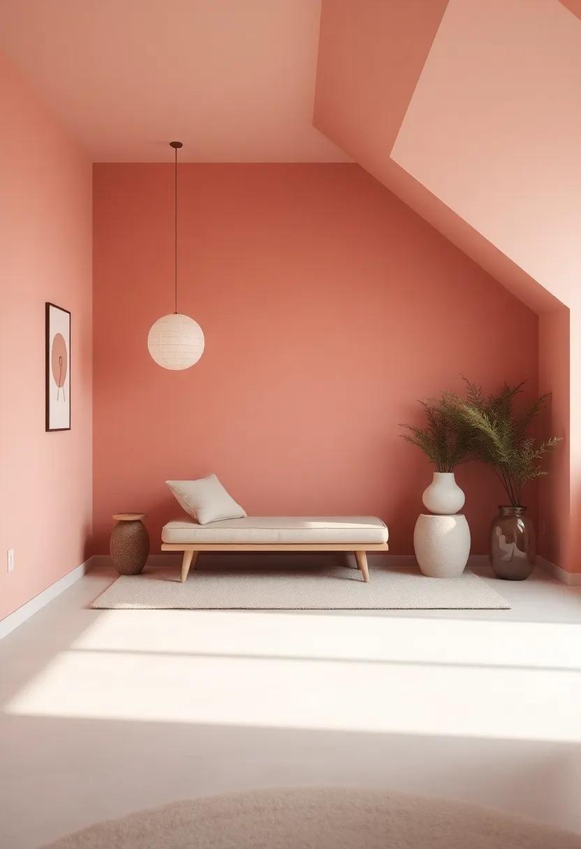
Utilizing Accent Walls to Make a Bold Statement
accent walls are an extraordinary way to infuse personality into a girl’s room, allowing for creativity without overwhelming the space. When selecting a wall to accentuate,consider options like the wall behind the bed,which can become a stunning focal point. Bold colors or intricate patterns can create a striking contrast against more muted tones throughout the room. some popular choices for accent walls include:
- Deep jewel tones like emerald green or sapphire blue
- Soft pastels such as blush pink or mint green
- Graphic wallpaper that adds texture or a whimsical design
- Wood paneling for a cozy, rustic feel
to achieve a cohesive look, ensure the colors of the accent wall harmonize with the overall color scheme. Accent walls provide an opportunity to play with contrasts, such as pairing warm tones with cool shades, or rich colors with lighter pastels. Consider using a subtle DIY technique, like ombre or geometric stencils, to add a unique flair. Here’s a simple guide for choosing the right accent color based on room themes:
| Room Theme | Suggested Accent Color |
|---|---|
| Whimsical Fairy Tale | Lavender |
| Chic Bohemian | Rust Orange |
| Modern Minimalist | Charcoal Gray |
| Ocean-Inspired | Aquamarine |
Incorporating Favorite Hobbies into Color Selections

Integrating a child’s favorite hobbies into their room color scheme not only personalizes the space but also creates an inspiring and motivating environment. Such as,if your daughter loves painting,vibrant shades of turquoise,lavender,and sunny yellow can evoke creativity and energy. alternatively, if she’s a budding musician, rich tones such as deep burgundy or midnight blue can create a calming atmosphere perfect for practice and relaxation. Consider the emotions and feelings these colors evoke, as they will set the tone for her sanctuary.
Here are a few suggestions on how to match colors with different hobbies:
- Reading: Soft pastels or gentle earth tones can create a cozy nook for book lovers, encouraging hours of enjoyable reading.
- Sports: Bright,energetic colors like lime green or electric blue can motivate an active lifestyle and reflect the energy of her favorite activities.
- Dancing: Warm hues like coral or glamorous shades of gold can bring a sense of elegance, embodying the grace and style of dance.
| Hobby | Color Suggestions |
|---|---|
| Painting | Turquoise,Lavender,Sunny Yellow |
| Music | Burgundy,Midnight Blue |
| Sports | Lime Green,Electric Blue |
| Reading | Soft Pastels,Earth Tones |
Seasonal Color Trends for Girls’ Rooms: Fresh Inspirations
When it comes to refreshing a girl’s room, seasonal color trends offer a source of inspiration that can transform the space into a delightful haven.Spring often calls for soft pastels like blush pink,lavender,and mint green,evoking a sense of renewal and freshness. As summer arrives, vibrant colors like coral, turquoise, and sunshine yellow can brighten the atmosphere, making it the perfect backdrop for playful activities and creativity. Moving into autumn, rich hues such as burnt orange, mustard yellow, and deep burgundy create a cozy ambiance for cuddling up with books or crafting. Winter, on the other hand, can be expressed with calming colors like powder blue and soft gray, accompanied by metallics like gold or silver, adding a touch of festive elegance.
To create a cohesive look that reflects these seasonal trends, consider incorporating colors in a variety of elements throughout the room:
- Wall Paint: Choose a fresh base color or an accent wall to set the tone.
- Textiles: Opt for cushions, curtains, and bed linens that highlight your chosen palette.
- Decor Items: Incorporate artwork, wallpapers, or accessories that tie the look together.
- Furniture Accents: Consider painting or reupholstering furniture in trending colors.
| Season | Color Palette | Suggested Accent Colors |
|---|---|---|
| Spring | Pastels (Blush, Lavender, Mint) | White, light Gray |
| Summer | Vibrant (Coral, Turquoise, Yellow) | Bright Green, fuchsia |
| Autumn | Warm Tones (Burnt Orange, burgundy) | Olive Green, Cream |
| Winter | Cool Tones (Powder Blue, Soft Gray) | Metallics (Gold, Silver) |
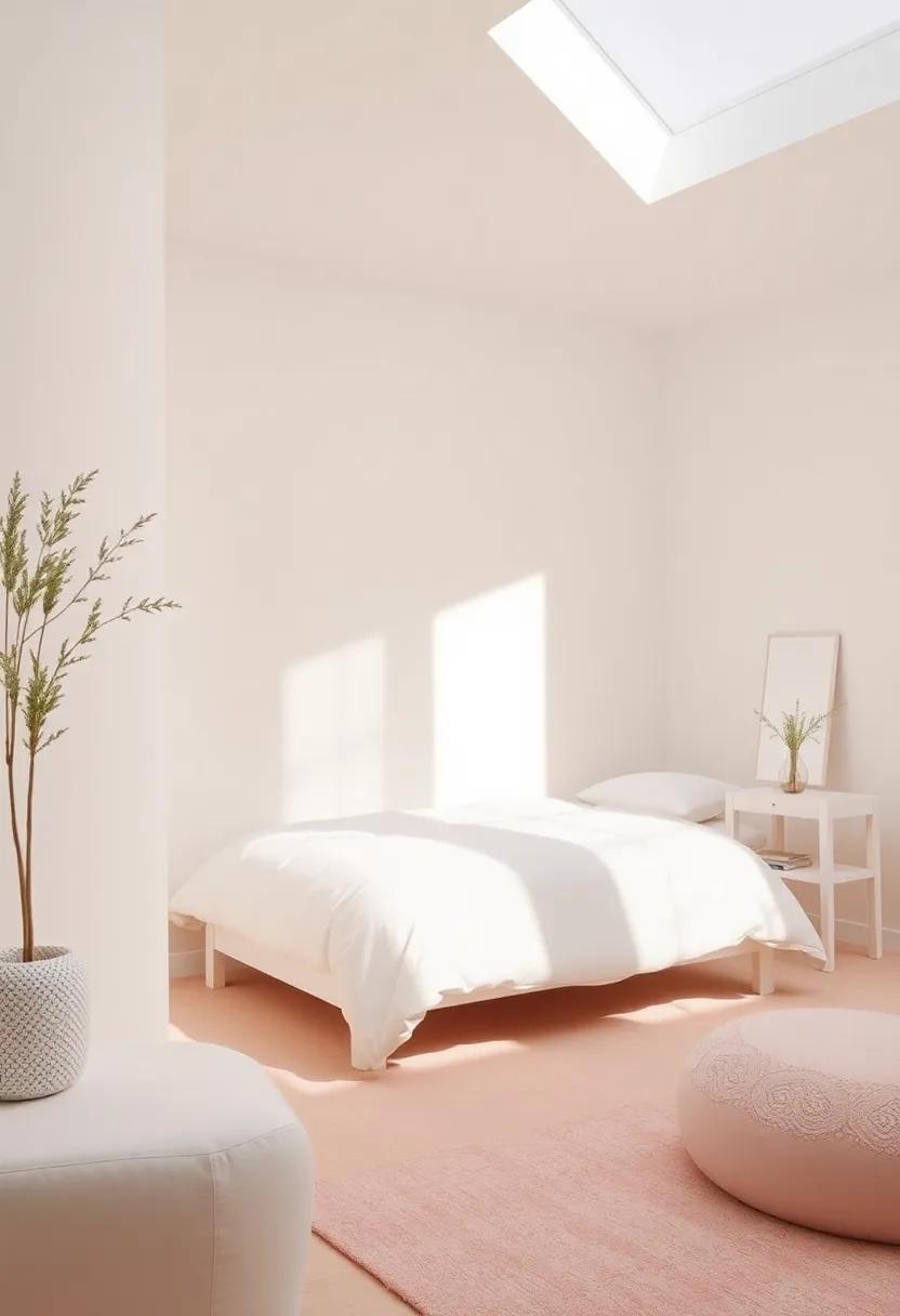
Creating a Timeless Room with a Neutral Color Base
Opting for a neutral color base is a brilliant strategy when designing a timeless room. Neutral shades such as ivory, beige, and soft grey provide a serene backdrop that enables creative versatility. By incorporating these colors, you create a blank canvas where accents can shine. Consider layering textures with materials like linen, cotton, and subtle patterns to add warmth and depth, ensuring the space feels inviting and cozy. This carefully curated combination fosters an atmosphere that grows with your child, adapting to their evolving preferences.
To further enhance a neutral backdrop, think about how you can introduce pops of color through accessories and decorative elements. A few strategic choices may include:
- Throw pillows in vibrant hues
- Wall art that showcases their favorite interests
- Bed linens with playful prints
These elements can be easily swapped or updated as your child’s tastes change,ensuring the room remains fresh and relevant. Additionally, incorporating some living greenery can breathe life into the space, contrast beautifully against neutral tones, and add a touch of nature.
Rethinking Color Schemes with Multi-Functional Spaces
When designing a girl’s room that seamlessly evolves into a multi-functional space, the choice of color becomes paramount. Color schemes can serve as a backdrop for various activities, from studying to relaxing. Soft pastels, such as lavender and mint, can promote a calming atmosphere, while bold hues, like teal or coral, can inspire creativity and energy. Mixing colors can create distinct zones in a room, allowing for versatility without sacrificing style. For example, a feature wall in a vibrant color can energize a study area, while lighter tones can soften the space near the bed, creating a restful retreat.
To effectively integrate a multi-functional approach, consider using color-blocking techniques or accent areas that define each zone. Here are some ideas to explore:
- Accent Walls: Choose a fun wallpaper or a vigorous paint color to signify an activity hub.
- Textiles: Use bedsheets and cushions in harmonious colors to tie the room together without overpowering the space.
- Artwork: Incorporate art pieces that resonate with the room’s theme, infusing character and personal style.
| Color | Effect | Best for |
|---|---|---|
| Lavender | Calming | Relaxation |
| Coral | Energetic | Creativity |
| Teal | Invigorating | Focus |
The Impact of lighting on Color Perception in Bedrooms
Lighting plays a pivotal role in how colors are perceived in any space, especially in bedrooms where a comfortable and inviting atmosphere is essential. With choices ranging from soft pastels to bold shades, the right lighting can enhance or diminish the vibrancy of these hues. Warm white lights can create a cozy ambiance, making colors appear richer and more inviting, while cool white or blue-toned lights may lend a more dramatic, modern touch, emphasizing the true tones of the color palette. It’s essential to consider how the natural light streams into the room throughout the day, as this can also affect color perception, shifting the mood from bright and airy to soft and subdued.
To optimize your chosen color scheme, it’s advisable to experiment with various lamp types and placements.Here are some considerations to keep in mind:
- Layer your lighting: Combine ambient, task, and accent lighting to create depth.
- Color temperature matters: Use bulbs with different color temperatures to see how they interact with your colors.
- Dimmer switches: These allow for flexibility, enabling adjustments to lighting intensity to match the time of day or activity.
Creating a harmonious environment means understanding that every color reflects light differently. Below is a simple table that showcases how specific colors react under varying lighting conditions:
| color | Warm Lighting Effect | Cool Lighting Effect |
|---|---|---|
| Soft pink | Cozy and inviting | Bright and fresh |
| Lavender | Calm and soothing | Cool and crisp |
| Peach | Warm and cheerful | Subdued and muted |
Choosing the Right Finishes and Paint Types for Lasting Beauty
When it comes to enhancing the overall aesthetic of a girls’ room, the choices of finishes and paint types play a pivotal role in achieving a visually appealing and enduring space. Opting for low-VOC (volatile organic compounds) paints not only ensures a healthier environment but also adds a layer of durability. Here are some finishes to consider:
- Matte: Offers a soft, non-reflective finish, perfect for creating a cozy atmosphere.
- Satin: Provides a subtle sheen which is both easy to clean and ideal for high-traffic areas.
- Eggshell: Balances both matte and satin, suitable for a sophisticated look without being overly shiny.
- Gloss: Adds a striking look and is an excellent choice for trim or accents, reflecting light beautifully.
In addition to the finishes, the method of request can significantly impact the room’s final look. Using quality brushes and rollers ensures a smooth and even coat, while considering a spray gun can provide exceptional coverage for larger areas. Here’s a quick comparison of popular paint types:
| Paint Type | Best For | Durability |
|---|---|---|
| latex Paint | Walls and Ceilings | Good |
| Oil-Based Paint | Trim and Furniture | Excellent |
| Chalk Paint | vintage Looks | Moderate |
| Textured Paint | Accent walls | Good |
Celebrating Uniqueness: Custom Colors for the Individual Girl
Every girl deserves a space that reflects her unique personality and style. Custom colors offer an opportunity to express individuality, transforming a simple room into a personalized retreat. When selecting hues, consider her preferences and interests to create a palette that speaks to her.Bold colors like vibrant pinks or electric blues can energize the space, while pastel tones bring a soothing quality.To spark creativity, here are some ideas:
- Incorporate her favorite color as an accent
- Mix and match complementary shades for a playful vibe
- Use unexpected color combinations to inspire creativity
Designing her room is not just about paint but also about textiles, artwork, and decor that echo her style.Creating a cohesive look means considering how these elements interact with the chosen colors. For instance, pairing warm tones with soft neutrals can create a harmonious environment, while combining a spectrum of cool colors can reflect an adventurous spirit. Check out this simple guide for creating balanced color schemes:
| Color Type | Best Pairing |
|---|---|
| Bold Colors | Soft Neutrals |
| Pastel Tones | Bright Accents |
| cool Colors | Warm Textures |
A Guide to Accessorizing with Coordinating Colors in Decor
Accessorizing with coordinating colors is essential in creating a harmonious ambiance in girls’ rooms. Start by selecting a dominant color that resonates with the overall theme you envision. From there, consider a complementary or analogous color scheme to enhance the aesthetic appeal. Key shades can be introduced through decorative pillows, rugs, and wall art.These elements should share a common hue while introducing varying shades to add depth and interest. Here are some critically important tips:
- Choose a Base Color: Pick one that sets the tone of the room.
- Use Neutrals Wisely: Balance vibrant colors with soft, neutral shades.
- Mix Textures: Coordinate colors through different materials, like velvet or cotton.
In addition to the basics, pay attention to the smaller details that can elevate your decor. Picture frames, lampshades, and even books can be selected in shades that complement your primary color. To help visualize your choices,consider a simple color palette table that showcases potential combinations:
| Dominant Color | Complementary Color | Accent Colors |
|---|---|---|
| Soft Pink | Mint Green | White,Gold |
| Lavender | Coral | Silver,Cream |
| Turquoise | Yellow | Brown,Peach |
The Role of Pattern and color Fusion in Room Transformation
In the world of interior design, the interplay of patterns and colors serves as a magical catalyst for creating compelling spaces, especially in girls’ rooms. By thoughtfully layering different patterns, whether through fabrics, wallpapers, or accessories, you can introduce an exciting element of depth. Stripes,florals,and geometric designs can coexist beautifully when combined with a harmonious color palette. Here are a few tips to merge these elements seamlessly:
- Choose a Dominant Color: Select one main color to anchor the room.
- Mix Patterns with Intent: Use a mix of sizes in patterns (large florals with small polka dots) for visual interest.
- Add Texture: Incorporate varied textures to enhance the feeling of coziness and warmth.
Color fusion can further elevate the aesthetics of the room, transforming it into a personalized haven. Soft pastels can set a calming backdrop, while vibrant shades energize the atmosphere. When combined with strategically chosen patterns, they can evoke specific moods or themes, such as whimsy, elegance, or adventure. A practical approach is to create a color scheme table that outlines the desired shades and their corresponding patterns,ensuring a cohesive look:
| Color | Pattern | Use Case |
|---|---|---|
| Soft Pink | Floral | For bedding and curtains |
| Mint Green | Geometric | On rugs or accent walls |
| Sunny Yellow | stripes | As accent pillows or artwork |
Inspiring Ideas for Colorful Storage Solutions that Delight
Embrace the power of a vibrant color palette by incorporating creative storage solutions that not only serve a functional purpose but also add a pop of joy to the room. Consider using multi-colored bins or woven baskets that blend harmoniously with your chosen hues. For example, pastel shades of pink, mint, and lavender can create a serene atmosphere while providing ample storage for toys, books, and clothing. Hang colorful wall-mounted shelves to display favorite items and keep them organized, making it easy for your little one to access their treasures while enhancing the visual appeal of the space.
Don’t overlook the potential of color-coded systems in storage options. Utilizing an assortment of bright-colored boxes, tailored to different categories (like arts and crafts, clothes, or books), can instill a sense of order amidst the joyful chaos of a girl’s room. This method not only teaches your child how to keep things tidy in a fun way, but it also assists parents in maintaining the aesthetic.Here are some examples of ideal storage options:
| Storage Type | Color Ideas | Best For |
|---|---|---|
| Woven Baskets | Coral, Aqua, Sunny Yellow | Toys, Blankets |
| Wall-Mounted Shelves | Pastel Purple, Mint Green | Books, Decorative Items |
| Drawer Organizers | Bright Pink, turquoise | Clothing, Accessories |
Evoking Memories: Color Choices That Reflect Personal Stories
Color is more than just a visual experience; it can unlock cherished moments and stories from our lives. When designing a girl’s room,consider hues that resonate deeply with her personality and experiences. Shades like soft lavender can evoke the tranquility of a day spent in nature, while vibrant coral could remind her of fun family gatherings at the beach. These colors don’t just decorate the walls—they become a canvas for memories. Think about colors that reflect your own childhood or stories that you wish to share, making the space a comforting and personal sanctuary.
To guide your selection, reflect on the feelings different colors can inspire. Here are some suggestions to help you anchor your choices:
- Blue: A calm feeling, akin to a peaceful afternoon by the sea.
- Yellow: The warmth and joy of sunny days spent outdoors.
- pink: A nostalgic touch of innocence and youth.
- Green: Connection to nature and the soothing effect of lush landscapes.
Creating a color palette that not only enhances the aesthetic appeal of the room but also resonates with personal stories can make all the difference. Consider the emotional impact of each color choice and how these shades can inspire a lifetime of memories.
Concluding Remarks
As we bid farewell to the vibrant journey of transforming girls’ rooms through the art of color, we hope this guide has illuminated your path toward creating a personal sanctuary that reflects individuality and dreams. Choosing the perfect color palette is not just about aesthetics; it’s about crafting an environment that resonates with personality and inspires creativity. Whether you opt for soft pastels that whisper serenity or bold hues that spark excitement, remember that each color has the power to evoke emotions and set the tone for cherished moments. Embrace this opportunity to explore, experiment, and express—after all, the room is more than just a space; it’s a canvas of memories waiting to be painted. Happy decorating!