 theFASHIONtamer Where Style Meets Space, Effortlessly
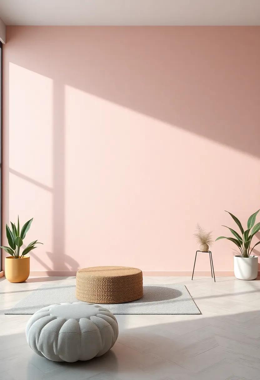
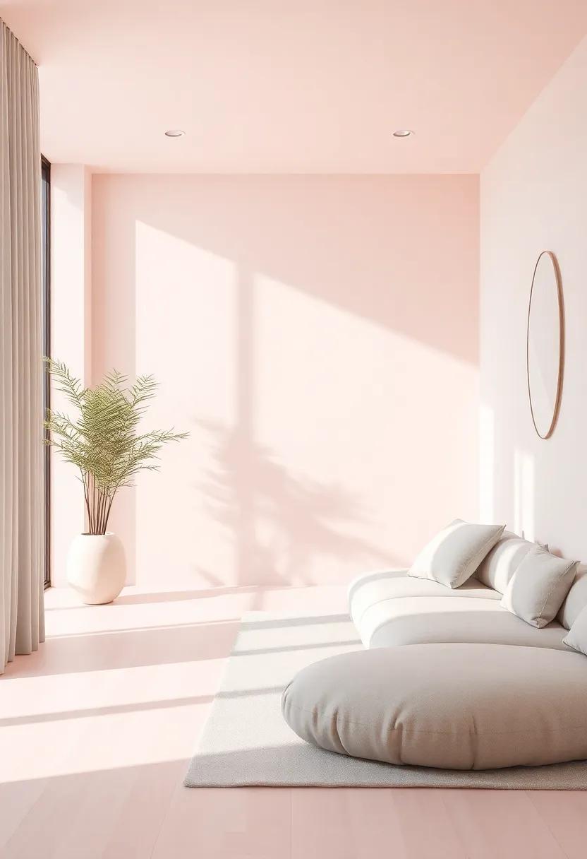
In a world often overwhelmed by the vibrancy of contemporary aesthetics, there exists a growing desire for tranquility adn calm within our living spaces. Enter the soothing embrace of pastel pink and muted gray—two shades that, when harmoniously combined, create an oasis of serenity conducive to relaxation and mindfulness. This article delves into the transformative power of these gentle hues,exploring how they can redefine interiors,evoke a sense of peace,and foster a retreat from the chaos of everyday life.From cozy bedrooms to chic living areas, discover how the delicate balance between softness and sophistication can transport any space into a realm of understated elegance, where every corner invites a moment of respite.Join us on this journey of design exploration, and learn how to infuse your surroundings with the gentle touch of pastel pink and muted gray, allowing serenity to flourish in your home.
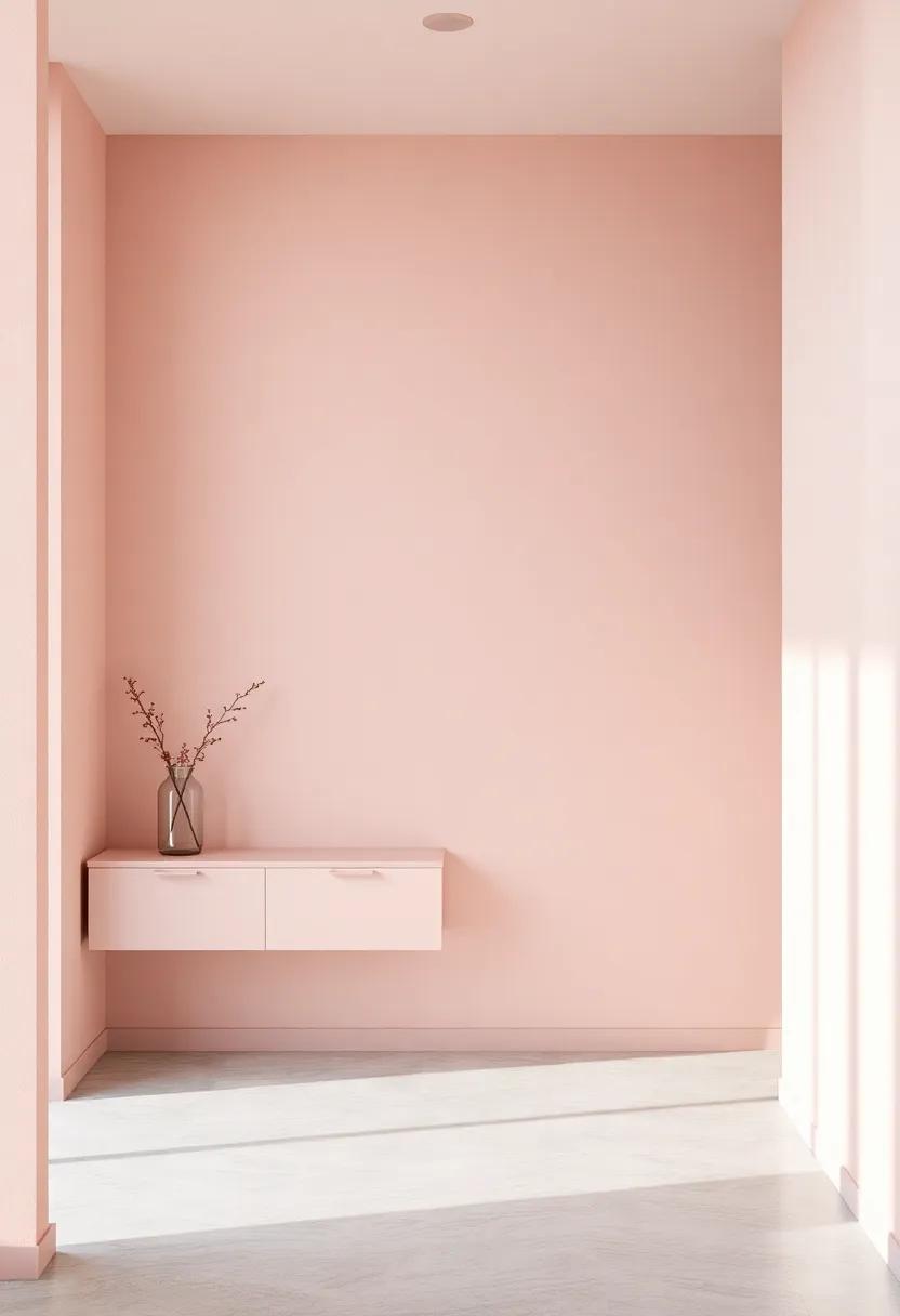
Embracing Pastel Pink: The Calming Effect of a Soft color Palette
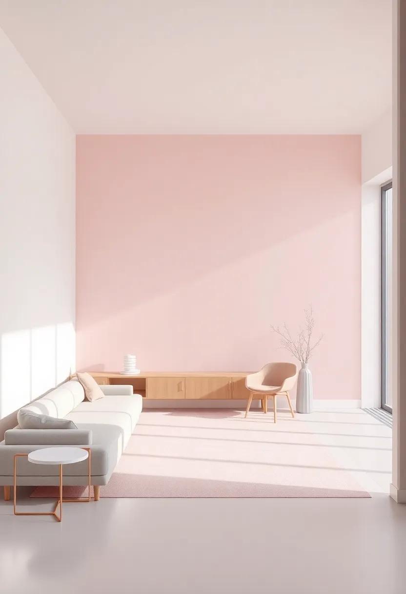
Pastel pink is more than just a pretty shade; it’s a hue that evokes tranquility and a sense of calm. This gentle color has a remarkable ability to soften the atmosphere of a room, creating a serene environment that promotes relaxation and well-being. When integrated into a design scheme, pastel pink can act as a backdrop for various styles, from modern minimalism to cozy bohemian. Consider layering it with complementary elements to enhance the subdued elegance of the space. Some of the key advantages of using pastel pink in interior design include:
- Versatility: It pairs well with an array of colors, notably muted grays, whites, and earthy tones.
- Warmth: The soft hue adds warmth to spaces without overwhelming the senses.
- Timelessness: Pastel shades are timeless and can effortlessly adapt to changing design trends.
Incorporating pastel pink into your décor can be achieved through various methods, whether it’s through wall paint, furniture choices, or accent pieces such as cushions and artwork. A well-balanced color scheme that mixes pastel pink with muted gray can create a harmonious look that feels fresh yet grounded. For exmaple, consider the following simple combinations:
| Element | Color Combination |
|---|---|
| Accent Wall | Pastel Pink + Soft Gray |
| Furniture | Muted gray Sofa + Pastel Pink Pillows |
| Accessories | pastel Pink Rugs + Gray Curtains |
muted Gray Elegance: Balancing Light and Shadow in Interior Design
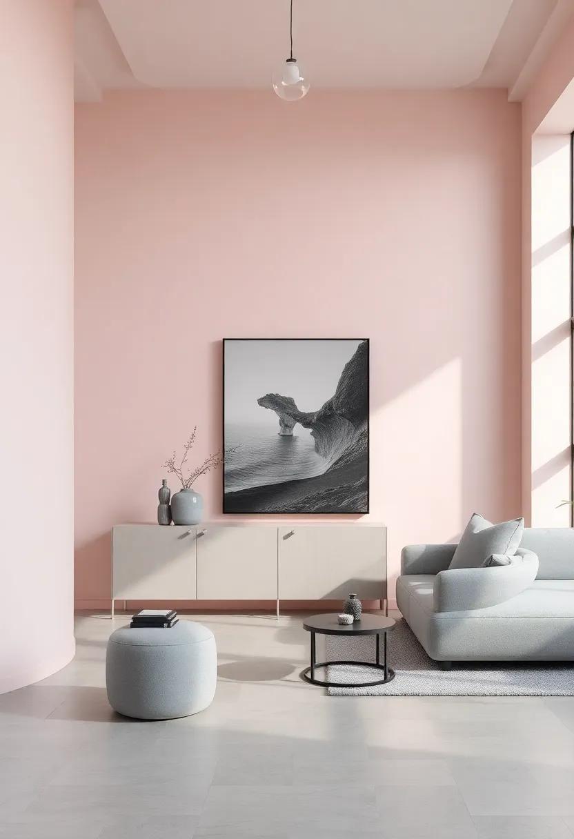
Muted gray acts as a tranquil backdrop, effortlessly weaving together elements of modern elegance and subtle sophistication. This versatile shade enhances the serene ambiance of any space, acting as a canvas that allows other colors to shine, especially when paired with soft pastel pinks. Consider incorporating varying shades of gray to create depth and texture, allowing light to dance across surfaces. Layering materials, such as cozy linens, plush rugs, and sleek metals, can establish harmony and contrast, showcasing an organic interplay between light and shadow.
In your design journey, thoughtfully selected décor elements can streamline this aesthetic. Consider the following approaches to achieve harmonious interiors:
- Choose soft furniture with muted upholstery that invites relaxation.
- Incorporate pastel pink accents—through cushions, artwork, or decorative pieces—to introduce warmth without overwhelming the senses.
- Utilize reflective surfaces like mirrors or metallic finishes to amplify natural light, enhancing the space’s overall luminosity.
- Bring nature indoors with delicate greenery to breathe life into the muted elegance, complementing both gray and pink.
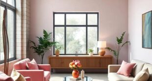
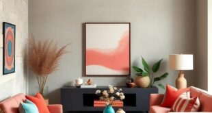
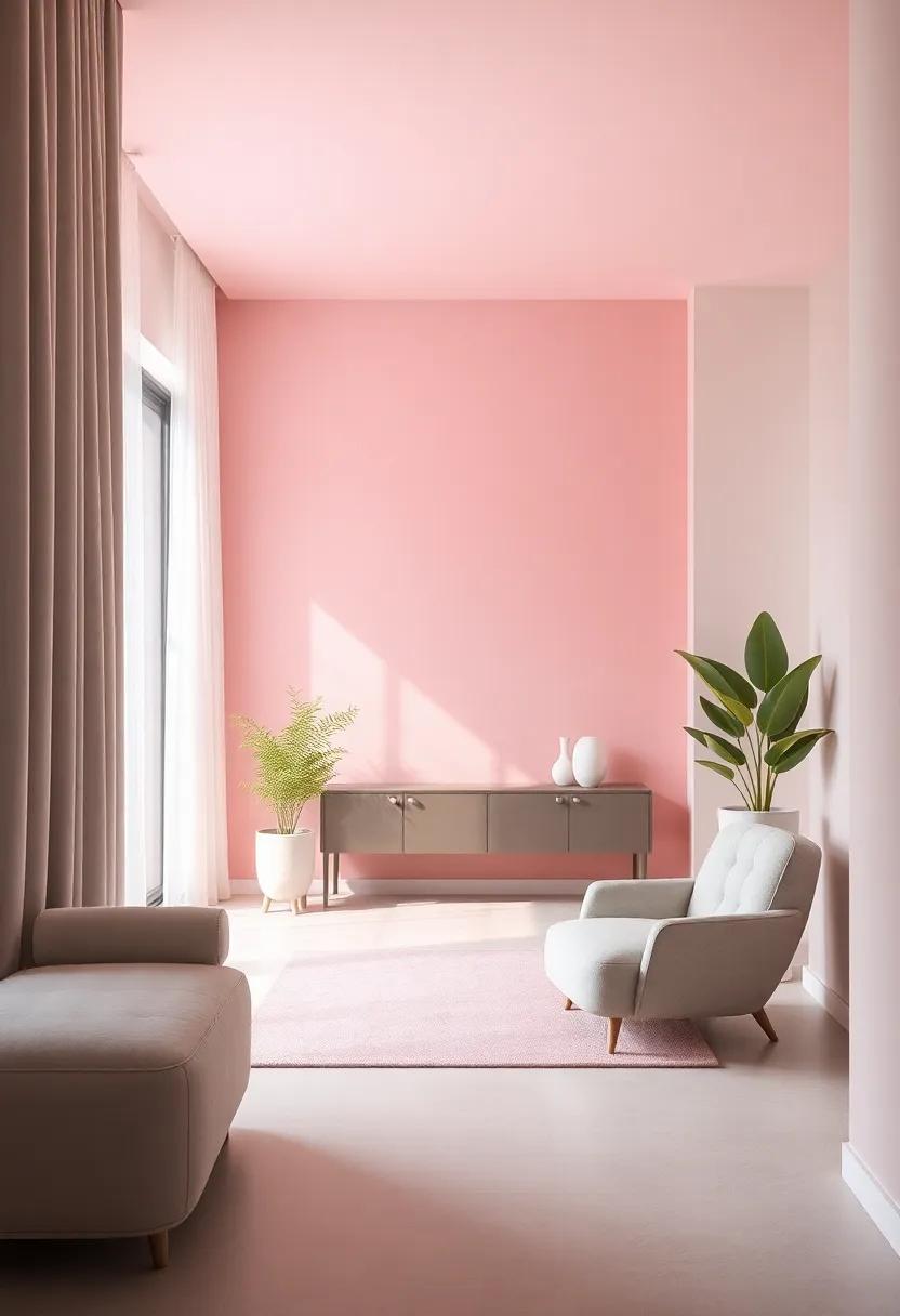
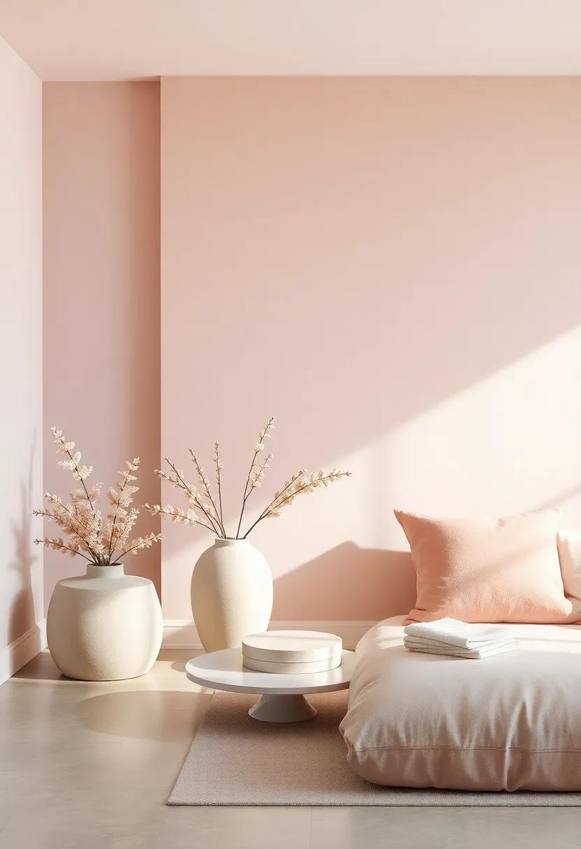
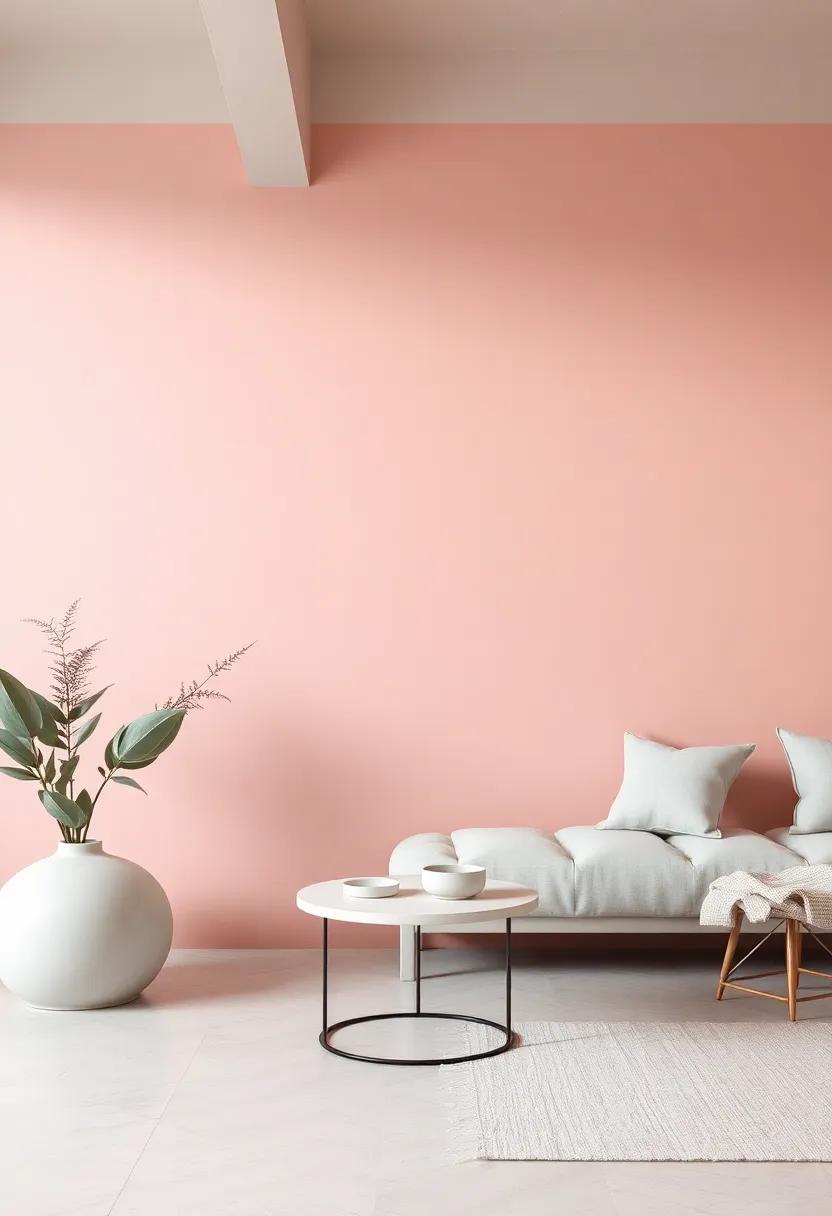
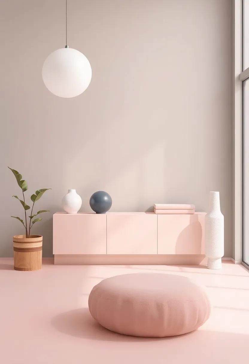
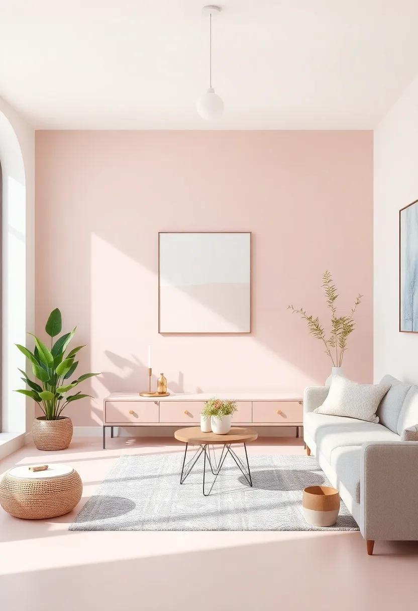
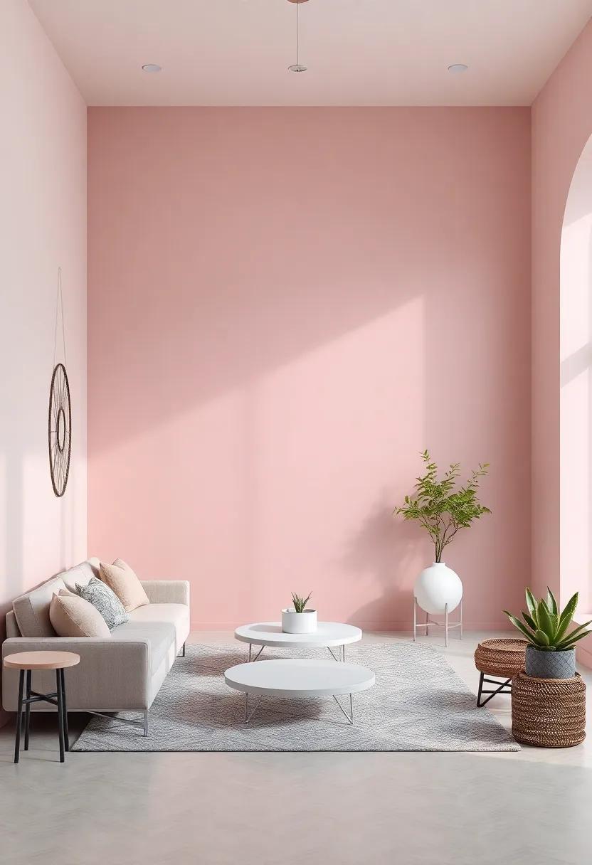
Creating Harmony: The Art of Blending Pastel Pink and muted Gray
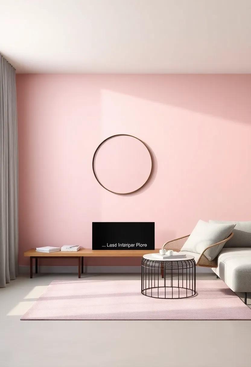
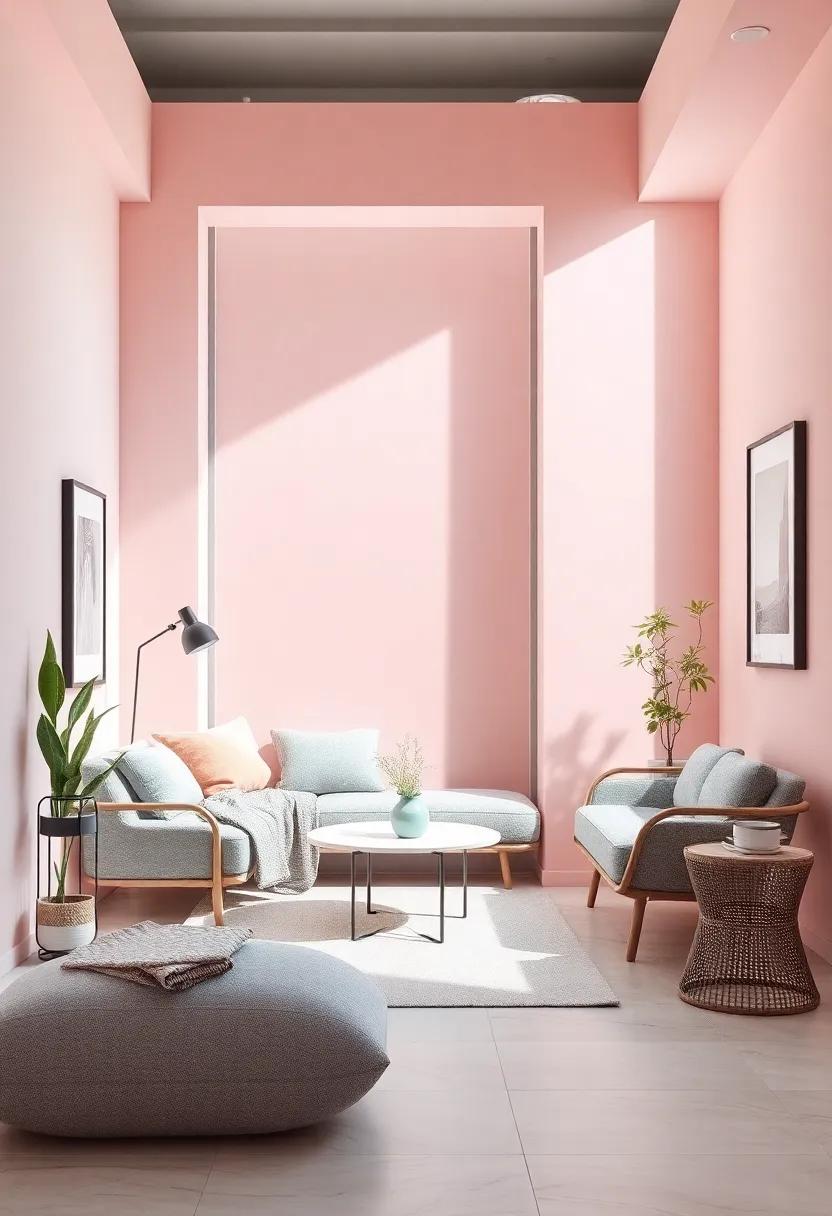
Achieving the perfect balance between pastel pink and muted gray creates a serene atmosphere that invites tranquility into any space. The gentle warmth of pastel pink, reminiscent of dawn’s first light, pairs beautifully with the cool, elegant undertones of muted gray. This combination can evoke feelings of comfort and relaxation, making it an ideal choice for bedrooms, living rooms, or creative workspaces. Consider integrating these hues through:
- Textiles: Soft bedding, plush throws, and decorative pillows.
- Wall Treatments: Pastel pink accent walls paired with muted gray trims or vice versa.
- Furniture: A pastel pink sofa accentuated with gray cushions or a chic gray armchair complemented by pastel pink accessories.
To further enrich the ambiance, incorporating natural elements can elevate the aesthetic. Think of plants with lush green leaves,which harmonize effortlessly with both colors. Accessories like artwork or vases can introduce additional layers of texture and interest. Here’s a simple table to outline effective combinations for different elements within your space:
| Element | Pastel Pink Option | Muted Gray Option |
|---|---|---|
| Sofa | Blush Velvet | Slate Fabric |
| Wall Color | Peach Blush | Stone Gray |
| Accent Pillows | Pastel Floral | Solid Charcoal |
Transformative Textures: Utilizing Fabrics to Enhance Serenity
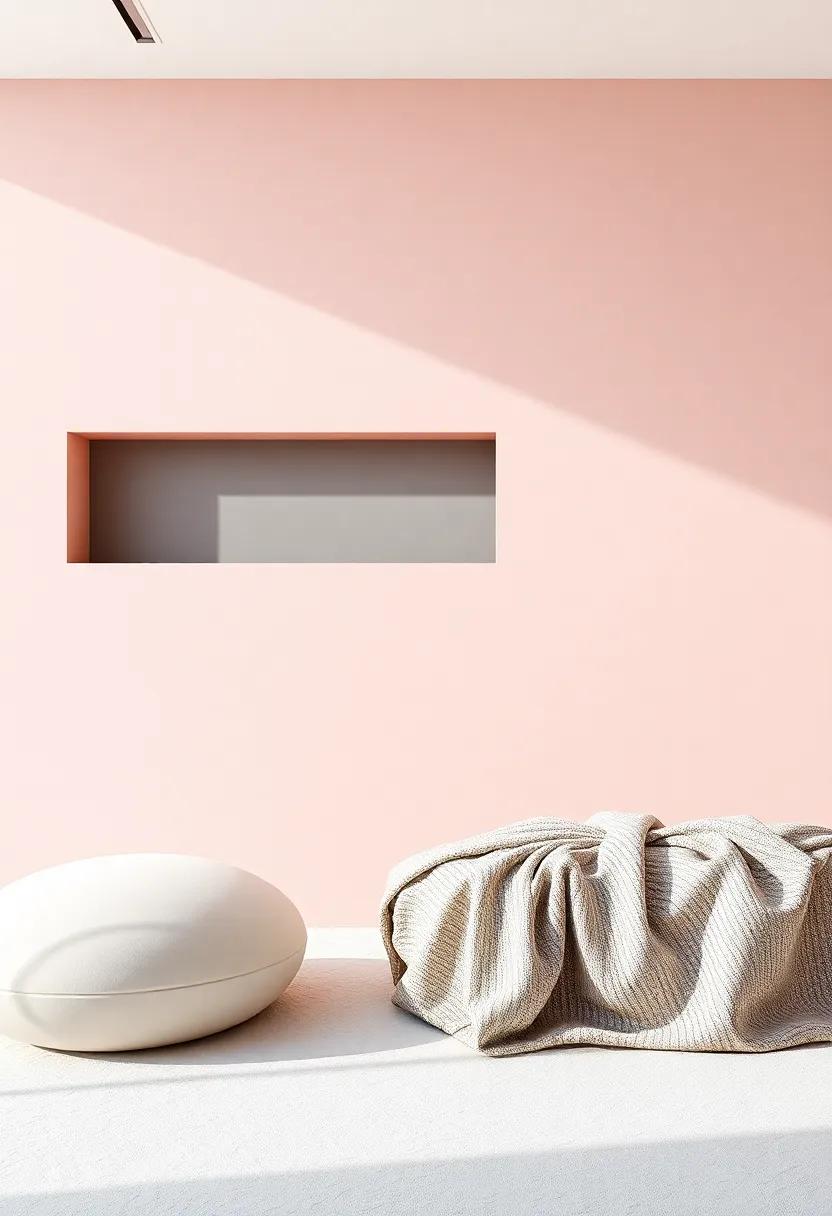
In the quest for serenity,the thoughtful integration of fabrics can play a pivotal role in shaping a tranquil atmosphere. Fabrics are not just functional; they offer a canvas for expressing emotion through texture and color. To achieve a calming effect, consider the following fabrics and their contributions to your space:
- Linen: Soft and breathable, linen drapes beautifully, allowing light to filter softly through, creating an airy, peaceful environment.
- Velvet: Its plush, luxurious feel not only adds warmth but brings depth, enriching the soothing palette of pastel pinks and muted grays.
- Muslin: Lightweight and gentle, muslin can be layered to provide a touch of coziness without overwhelming the senses.
Additionally, the strategic use of upholstered furniture and textiles can further enhance tranquility. When choosing textures, aim for a harmonious blend that invites comfort and serenity:
| Fabric Type | Serenity Aspect |
|---|---|
| Textured Cotton | Breathable and calming, perfect for casual spaces. |
| Wool Blends | Adds warmth while maintaining a serene aesthetic. |
| Sheer Fabrics | Creates a light, ethereal ambience that softens edges. |
By incorporating these elements, individuals can create spaces that not only look inviting but also foster a sense of inner peace and relaxation. Let your design journey reflect the balance between tactility and tranquility, ensuring that every fabric choice contributes to an overarching narrative of serenity.
The Power of Accessories: Enhancing Spaces with Delicate Accents

In the realm of interior design, the right accessories can wield an amazing influence, turning a simple space into a serene sanctuary. Pastel pink and muted gray create a soothing backdrop that invites the addition of thoughtful accents to elevate the overall aesthetic. Consider incorporating elements such as:
- Cushions in soft fabrics
- Artwork featuring gentle curves and calming palettes
- Vases filled with pale florals
- Throws that layer texture without overwhelming
These delicate touches harmonize beautifully, crafting a cohesive look that embodies tranquility. A carefully curated selection can transform spaces, inviting both comfort and style. Pay attention to the scale and placement of your accessories. As an example, arrange a trio of vases on a muted gray console table, allowing the pastel pink interiors to shine through. The table’s elegance is further enhanced by these thoughtful additions, creating a distinctive visual appeal. A quick reference chart for choosing the right accessories could include:
| Accessory Type | Color Palette | Purpose |
|---|---|---|
| Cushions | Pastel Pink | Comfort and Color |
| Artwork | Muted Gray | Visual Interest |
| Vases | Soft Pastels | Natural Elements |
| Throws | Neutral Shades | Layering Texture |
Lighting Magic: How soft Illumination Complements Calm Colors
In the realm of interior design, the interplay between light and color can create an atmosphere that breathes tranquility and elegance. Soft illumination, such as warm white or gentle yellow hues, acts as a soothing backdrop that beautifully complements the soft tones of pastel pink and muted gray. This harmonious lighting accentuates the delicate shades, enhancing their soothing effect and inviting a sense of calm. When strategically placed, lighting fixtures can transform a space, making it not just visually appealing but also an oasis of serenity.
To maximize the calming influence of soft lighting and color combinations, consider the following elements in your design:
- Layered Lighting: Mix ambient, task, and accent lighting for depth and warmth.
- Dimmable Fixtures: Adjust brightness to suit different moods throughout the day.
- Natural Light: Utilize windows and reflective surfaces to enhance daylight flow.
Incorporating these lighting techniques can create truly enchanting spaces. To visualize this synergy, refer to the table below that outlines some ideal combinations of lighting and color harmony:
| Color | Light Type | Effect |
|---|---|---|
| Pastel Pink | Soft LED Lamps | Invites warmth and comfort |
| Muted Gray | Recessed Lighting | Enhances depth and sophistication |
| Pastel Pink & Muted gray | Table Lamps with Soft Shades | Creates a cozy, intimate atmosphere |
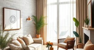
nature’s Touch: Incorporating Plants into Serene Spaces
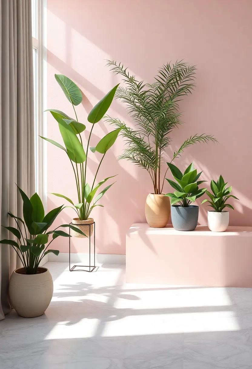
Integrating greenery into your design is a powerful way to cultivate a tranquil atmosphere,especially when paired with the gentle tones of pastel pink and muted gray. Consider including a variety of plants to enhance both aesthetics and ambiance. Succulents and ferns thrive in nearly any light condition while requiring minimal maintenance, making them ideal companions for a serene space. You might also explore larger statement plants like Fiddle Leaf Figs or Rubber Plants, which can add a bold yet soothing contrast against the softness of your chosen color palette.
To create a harmonious balance, think about using decorative pots that complement your design scheme. Opt for simple, elegant ceramic pots in soft pastel hues or matte gray finishes. These can effortlessly elevate the overall vibe of your room while allowing the natural beauty of the plants to shine through. A well-placed grouping of plants can draw the eye and promote a sense of peace, transforming corners or empty spaces into a mini oasis. Here’s a quick guide to plant choices that work beautifully with your serene aesthetic:
| Plant Type | Light Requirements | Maintenance Level |
|---|---|---|
| Succulents | Radiant, indirect light | Low |
| Ferns | Low to medium light | Moderate |
| Fiddle Leaf Fig | Bright, indirect light | Moderate |
| Rubber Plant | Indirect light | Low to moderate |
Mood Boards: Visualizing Serenity with pastel pink and Gray
Creating a sanctuary of calmness and serenity can be achieved through the harmonious combination of pastel pink and muted gray. Pastel pink, with its delicate and soft nature, evokes a sense of warmth and comfort. Meanwhile,muted gray serves as the perfect counterbalance,offering a sophisticated neutrality that allows the pink to shine without overwhelming the senses. Together, they create a tranquil palette that is ideal for various spaces such as bedrooms, living areas, or home offices, promoting relaxation and a peaceful mind.
In crafting your visual mood board, consider integrating elements such as:
- Textiles: incorporate soft cushions and blankets in pastel pinks.
- Furniture: Choose sleek furniture in muted gray to anchor your design.
- Art: Select artwork with soft colors and gentle shapes to enhance the serene atmosphere.
- Accent Decor: Add subtle gold or silver accents for a touch of elegance.
To visualize how these colors interact, here’s a simple portrayal:
| Element | Color |
|---|---|
| wall Color | Soft Pastel Pink |
| Furniture | Muted Gray |
| Accent Pieces | Rose Gold or Silver |
| Flooring | Light Gray or Natural Wood |
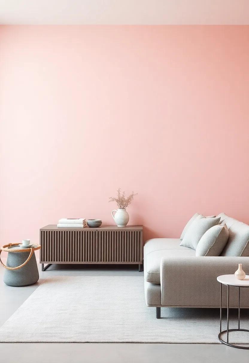
Furniture Selection: Choosing Pieces that Reflect Tranquility
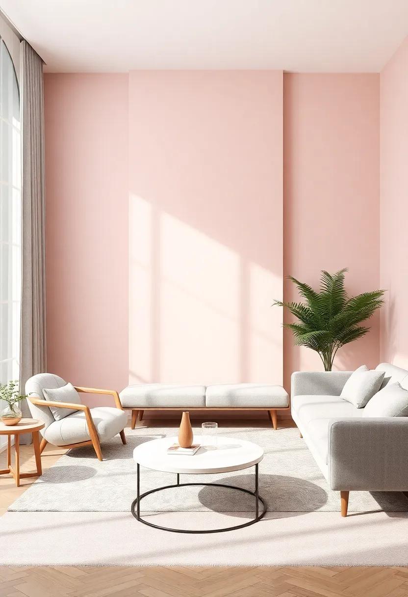
When selecting furniture pieces that embody a sense of tranquility,prioritize soft lines and soothing colors that harmonize with the pastel pink and muted gray palette. Consider lounge chairs with rounded edges and plush upholstery, as they invite relaxation. A low-profile coffee table in a light, natural wood finish can enhance the calm atmosphere while providing functionality. Incorporate elements such as open shelves or light, airy bookcases to display curated decor items that echo your serene theme. Your choices should aim to create a cohesive look, combining comfort and aesthetic appeal.
Another essential aspect of creating a tranquil environment is the balance between form and function. Select furniture that not only serves its purpose but also contributes to the overall ambiance. Look for pieces like soft ottomans, which can double as seating or a footrest, and can easily be moved around. Incorporate soft textiles, such as cushions and throws in complementary shades, to add layers of comfort. Here’s a quick visual guide to furniture pieces that promote serenity:
| Furniture Type | Key features |
|---|---|
| Cozy Sofa | Soft fabric, gentle curves |
| Accent Chair | Plush seating, pastel hue |
| Coffee Table | Light wood, minimalist design |
| Bookshelf | Open design, airy feel |
Flooring Options: Creating a Grounded Essence with Subtle Hues
When choosing flooring, selecting materials that reflect the serenity associated with pastel pink and muted gray is essential for creating a cohesive and calming atmosphere. Consider soft-textured carpets that echo the gentle tones of your design. Options such as:
- Pale Gray Carpet Tiles: Easy to install and versatile.
- Pastel Pink area Rugs: Perfect for adding warmth and comfort.
- Engineered Wood in Soft Tones: Offers a touch of elegance while grounding the space.
For those leaning towards a more polished aesthetic, vinyl planks or laminate flooring can effectively mimic the appearance of hardwood while maintaining the soft color palette. Integrating a table into your design choices can provide clarity on your flooring options:
| Flooring Type | Color Options | Benefits |
|---|---|---|
| Carpet | Soft Gray,Blush Pink | Comfort,Sound Absorption |
| Vinyl Planks | Muted Gray,Light Blush | Water-Resistant,Durable |
| Engineered Wood | Pale gray Wash,soft Pink Stain | Classic Look,Easy Maintenance |
Wall Treatments: Painting Techniques to Elevate Serenity
when it comes to transforming a space into a serene sanctuary, one of the most impactful methods is through color and texture. Pastel pink and muted gray offer a gentle palette that instills calmness and warmth. Experimenting with various painting techniques can further enhance these hues and create a visually stimulating yet peaceful atmosphere. Consider incorporating the following methods to elevate your walls:
- Ombre Effect: This technique allows colors to blend seamlessly from light to dark, creating a soft gradation that can make a room feel larger and more ethereal.
- Textured Finishes: Use techniques such as sponging or rag rolling to introduce subtle texture that catches the light, providing depth to your pastel walls.
- Accent Stripes: Introduce personality and dynamism through delicate stripes or shapes in muted gray, which can serve as a focal point without overwhelming the senses.
To effectively coordinate your wall treatments with furnishings, it is indeed essential to consider how these colors interact with various materials and light sources. A simple color scheme can work wonders when paired with quality textiles and well-placed accessories. The following table illustrates how different elements can complement your pastel and muted gray palette:
| Element | Color connection |
| Textiles | Soft whites and creams enhance warmth |
| Accessories | Brass or gold accents add a touch of elegance |
| Furniture | Light wood or transparent materials provide balance |
Artful Arrangements: Curating Decor that Radiates Peace
Creating a serene environment can be a transformative journey that harmonizes your space with the soothing qualities of color.Pastel pink and muted gray work hand-in-hand to foster a calm atmosphere, ideal for any room in your home.When designing your decor, consider incorporating elements such as:
- Textiles: Soft linens and cozy throws in pastel pink bring warmth, while muted gray cushions provide a neutral balance.
- Artwork: Choose soft-toned art pieces that inspire tranquility, perhaps abstract works that blend both colors seamlessly.
- Furniture: Select minimalist gray furniture to allow the pastel accents to shine without overwhelming the senses.
In addition to color and textures, the arrangement of decor plays a crucial role in creating a peaceful ambience. Balance is key, so consider using structured layouts, where items are deliberately placed to guide the eye and mind. A thoughtful arrangement can include:
| Item | Placement |
| Pastel Pink Vase | Centre of a neutral coffee table |
| Muted Gray Shelving | Against a light-colored wall |
| Pastel Art Piece | Above a gray sofa |
Spatial Layout: Designing Flow for a Tranquil Environment
In any tranquil environment,the flow and spatial design hold the key to emotional balance and comfort.By embracing pastel pink and muted gray, you can create a harmonious space that invites peace and relaxation. To achieve this, consider the following design elements:
- Open Spaces: Emphasize clear pathways and uncluttered areas that encourage movement.
- Natural Light: Use large windows to flood rooms with sunlight, enhancing the gentle hues.
- Conversational Areas: Arrange seating to promote openness, allowing for flow and connection among occupants.
- zones of Calm: Create dedicated areas for relaxation, such as reading nooks with soft, inviting fabrics.
Additionally, the placement of furniture and decor should invite a sense of tranquility. Avoid rigid layouts that stifle air and light flow; instead, favor organic arrangements that foster balance. Consider incorporating a color palette table to visualize the interplay of your chosen hues:
| color | Emotion | Usage Tips |
|---|---|---|
| Pastel Pink | Warmth, Calm | Use as an accent in textiles or wall colors to evoke a soothing atmosphere. |
| Muted Gray | Stability, Peace | Opt for gray tones in larger furniture pieces for a grounding effect. |
Color Psychology: The Emotional Impact of Soft Hues in Design
Soft hues like pastel pink and muted gray carry an inherent ability to evoke emotional responses that can profoundly influence our perception of a space. these gentle colors serve as a balm for the senses,subtly instilling feelings of calm and tranquility. When integrated into design,they create a harmonious ambiance,making environments more inviting and soothing. This emotional impact is particularly beneficial in areas intended for relaxation, such as bedrooms and lounges, where the desire is to foster a sense of peace and comfort.
Utilizing these shades in decor can be achieved through various elements, such as:
- Wall Paint: A soft pastel pink can transform a room, making it feel airy and spacious.
- Furnishings: Muted gray sofas or chairs offer a neutral balance, allowing for flexibility in accessory choices.
- Textiles: Incorporating throw pillows and blankets in soft shades adds warmth without overwhelming the senses.
- Artwork: Choose pieces that feature pastel accents to tie the aesthetic together cohesively.
To highlight the versatility of these colors,here’s a simple comparison of how pastel pink and muted gray can impact the psychological atmosphere of different spaces:
| Color | Psychological Effect | Ideal Use |
|---|---|---|
| Pastel Pink | Warmth and Comfort | Bedrooms,nurseries |
| Muted Gray | Calmness and stability | Living rooms,offices |
Cohesion in Detail: Focusing on Finishes for a Seamless Look
To achieve a cohesive and polished aesthetic, attention must be paid to the finishing touches that tie a room together. In a serene space dominated by pastel pink and muted gray hues, options like matte finishes, soft textures, and subtle patterns play key roles. Incorporating elements such as:
- Textured fabrics: Velvet cushions and linen curtains complement the soothing colors, adding depth.
- Muted metal accents: Soft gold or brushed nickel hardware can provide an understated elegance without overwhelming the palette.
- Artistic wall treatments: Consider a decorative plaster finish or gentle wallpaper patterns to introduce an element of sophistication.
Flooring options should also align with the intended cozy vibe. Hardwood floors stained in a light gray or beige can create a harmonious base for pastel pink rugs, inviting warmth. Moreover, details like window casings and trim in a delicate white finish can enhance the seamless appearance of the overall scheme.A well-thought-out choice of accessories can further bridge the colors,such as:
| Accessory | Description |
|---|---|
| Wall Art: | Abstract pieces highlighting both pink and gray tones. |
| Lighting Fixtures: | Soft pendant lights in pastel shades to illuminate the space effectively. |
| Drapery: | Lightweight, sheer curtains that filter natural light beautifully. |
Soundscapes: Incorporating Auditory Elements for Enhanced Calm
In the pursuit of tranquility, the auditory elements we introduce into our environments play a pivotal role. Consider incorporating sounds that evoke a sense of calm and well-being, such as:
- Soft instrumental music: Gentle melodies can create a soothing backdrop that enhances relaxation.
- Nature sounds: The delicate rustling of leaves, soft ocean waves, or birdsong can transport your mind to serene landscapes.
- Ambient white noise: A gentle hum can mask distracting sounds and provide a sense of security.
To effectively intertwine these auditory elements into your pastel pink and muted gray spaces, consider strategically placing sound devices in various areas. A curated playlist can be played softly from a hidden speaker, while a small fountain can add the gentle sound of flowing water. Below is a simple guide to creating an auditory sanctuary:
| Sound Element | Placement | Purpose |
|---|---|---|
| Soft Instrumental Music | Living area or bedroom | Enhance relaxation and set a calming atmosphere |
| Nature Sounds | Near windows or outdoor spaces | Bring the serenity of the outdoors inside |
| Ambient White Noise | Workspaces or study areas | Improve focus and block distractions |
Personal Touch: Infusing Comfort through Personalized Elements
Creating an inviting atmosphere in your space often begins with the incorporation of personalized elements that resonate with your style and preferences.Think about the unique touches that can tell your story, such as:
- Family Photos: Framing cherished moments in soft pastel pink and muted gray hues can seamlessly blend with your overall color scheme while adding a heartfelt touch.
- Handcrafted Decor: Incorporating items like hand-painted ceramics or woven textiles can add layers of texture and warmth,making the environment feel lived-in and special.
- Potted Plants: Choose greenery that complements the color palette, providing a refreshing contrast and promoting tranquility.
Additionally, incorporating personalized artwork can serve as both a focal point and a conversation starter. A gallery wall featuring your favorite art pieces or meaningful quotes can infuse personality into the decor, allowing the room to reflect your individuality. Consider using a color-coordinated table to display these elements cohesively:
| element | Color Scheme | Personal Touch |
| Photos | Pastel Pink Frames | Family Memories |
| Decor | Muted Gray Accents | Handcrafted Items |
| Artwork | Complementary Colors | Personal Expression |
Seasonal Adjustments: Refreshing Serenity with Seasonal Decor
As the seasons shift, so does the chance to refresh our living spaces with tranquil touches that resonate with the natural world. Introducing pastel pinks and muted grays into your seasonal decor can create an atmosphere of calm and warmth. Consider incorporating elements such as delicate floral arrangements or soft textiles that harmonize with the colors of the season. This gentle palette not only promotes relaxation but also serves as a versatile backdrop that allows for endless creative expression.
To bring this vision to life,create a seasonal decor checklist to guide your conversion. focus on integrating the following elements for an elegant yet soothing effect:
- textiles: Soft throw pillows and plush blankets in pastel hues.
- Floral Arrangements: Fresh or faux flowers that highlight the serenity of spring.
- Wall Art: Prints that feature gentle colors and serene landscapes.
- Candles: Opt for unscented candles in varying heights to add warmth.
- Lighting: Incorporate soft lighting with decorative lamps or string lights.
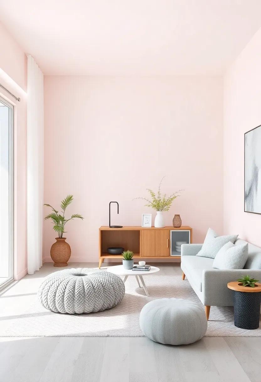
Inviting Comfort: Designing Cozy Nooks within Pastel Landscapes
Transforming spaces into serene retreats brings a sense of tranquility to our everyday lives. By incorporating soft pastels, particularly muted pinks and grays, we can create inviting corners that beckon relaxation. Imagine a cozy nook adorned with plush cushions in varying shades of blush and delicate throws draping over a subtle gray chaise lounge. Consider these elements to craft the perfect calming atmosphere:
- Layered Textures: Combine different fabrics such as velvets and linens to enhance comfort.
- Soft Lighting: Utilize warm, dimmable lights or fairy lights to create an inviting glow.
- Natural elements: Incorporate soft greenery or floral arrangements to bring in a touch of nature.
In this pastel paradise, every detail counts. When designing these cozy nooks, think about the placement of furniture to ensure a harmonious flow. Here’s a simple layout idea:
| Furniture Item | Color | Placement |
|---|---|---|
| Chaise Lounge | Muted Gray | Corner position for optimal coziness |
| cushions | Pastel Pink | Scattered across the lounge |
| Side Table | Soft White | Next to the lounge for easy access |
Reflective Surfaces: Utilizing Mirrors for light and Serenity
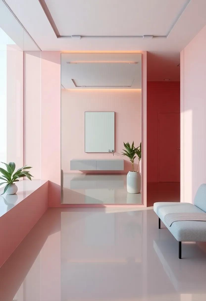
Utilizing reflective surfaces, especially mirrors, can profoundly influence the ambiance of a space, enhancing both light and tranquility. When integrated into a design palette featuring pastel pink and muted gray, mirrors become not just functional objects but also captivating artistic elements. Their ability to bounce light around the room amplifies the inherent softness of these colors, creating a harmonious environment that feels open and inviting. Consider placing mirrors opposite windows or light sources to maximize their reflective qualities,transforming everyday light into a luminous experience.
Moreover, the strategic placement of mirrors can introduce depth and dimension to your interiors. By positioning them in key areas, such as above furniture or as part of a gallery wall, you can create focal points that draw the eye and evoke a sense of serenity. Whether you opt for intricately framed pieces or sleek, minimalistic designs, the mirrors can enhance the overall aesthetic, reflecting both the soft pastels and the calming hues of gray. To illustrate the versatility of mirrors in design,here’s a simple breakdown of ideas:
| Mirror Types | Suggested Use |
|---|---|
| Round Mirrors | Ideal for softening angular spaces; can enhance the pastel pink theme. |
| Full-length mirrors | Perfect for creating the illusion of spaciousness; complements muted gray tones. |
| Mirrored Furniture | Brings elegance and lightness to the overall design; adds a touch of glamour. |
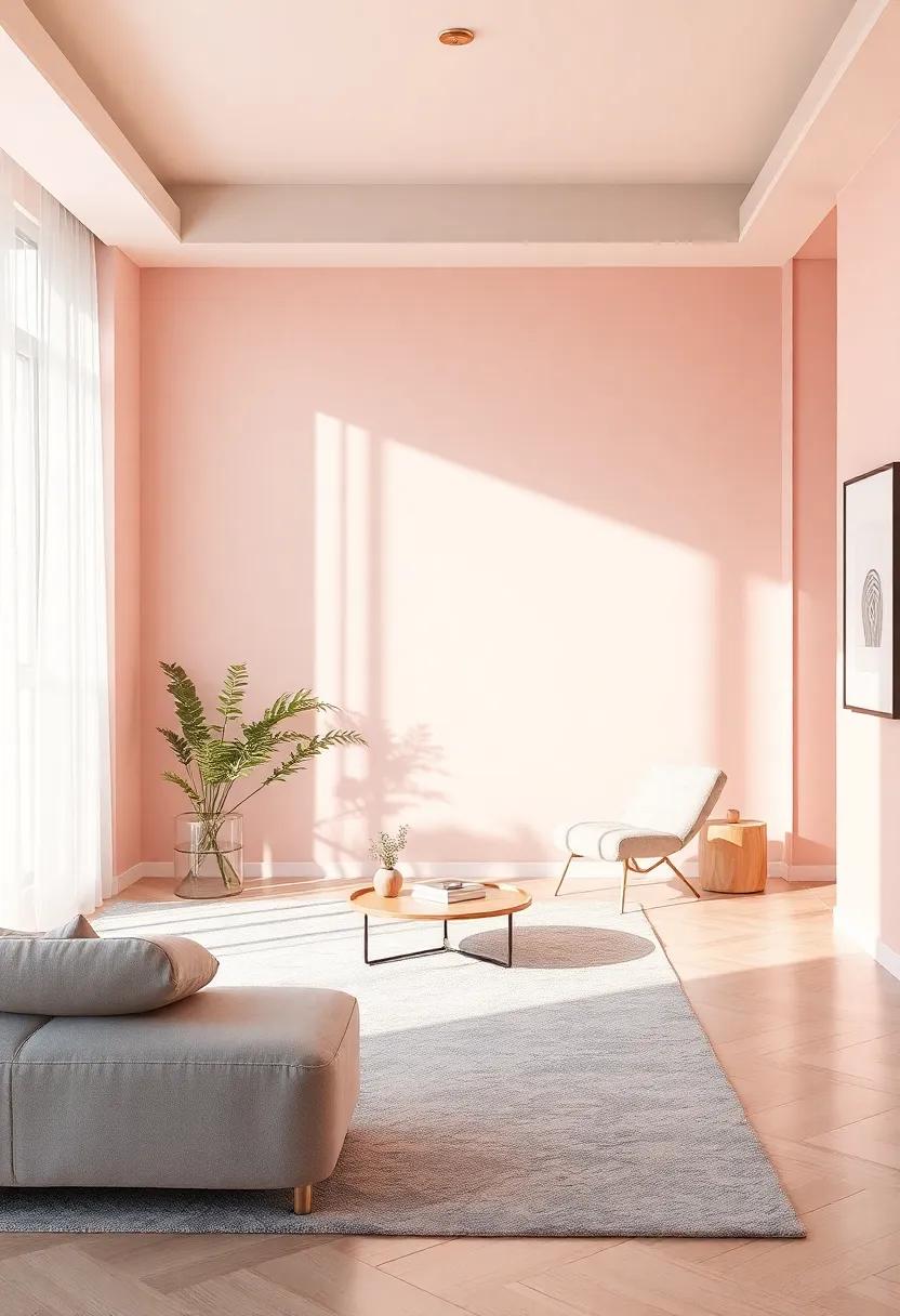
Inspirational Spaces: Drawing Influence from Nature’s Pastel Palette
Nature has an incredible ability to inspire our design choices, particularly through its gentle pastel hues. When imitating nature’s palette, soft pinks and muted grays establish a serene atmosphere, reminiscent of sunrises and twilight skies. By blending these shades, spaces transform into peaceful retreats, where one can escape the chaos of daily life. The subtle elegance of the color scheme can evoke a sense of calm, while simultaneously adding depth and character. incorporating elements such as:
- Textured fabrics – Think plush throws and delicate drapery.
- Natural wood furnishings – Create warmth and balance.
- Artistic accents – Add personality through subtle decor pieces.
To enhance this tranquil setting, consider integrating various natural elements that complement the pastel tones. decorative pieces inspired by nature not only elevate the aesthetic but also reinforce a connection to the great outdoors. Think about incorporating:
| Element | Purpose |
|---|---|
| Plants and Florals | Add life and a pop of color that harmonizes with pastels. |
| Natural Stone Accents | Introduce organic textures for visual interest. |
| Pastel Artwork | Infuse creativity that ties the color scheme together. |
Timeless Trends: The enduring Appeal of Pastel Colors in Design
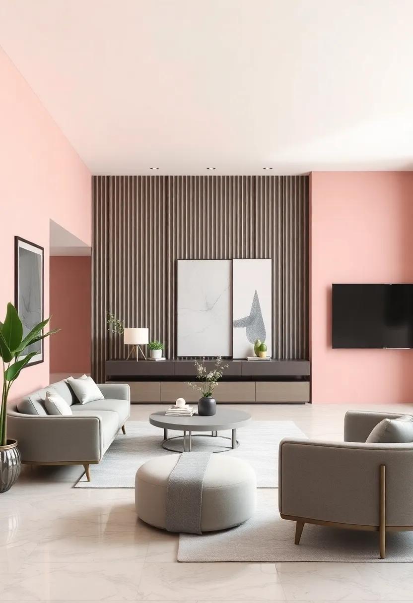
In the world of design, the quiet elegance of pastel hues has an undeniable allure. Particularly, pastel pink and muted gray create a harmonious blend that evokes a sense of calm and sophistication. These colors can seamlessly complement a range of aesthetics, from minimalist to eclectic. Incorporating pastel pink in fabrics and decor, alongside muted gray in structural elements like walls and furniture, brings a unique balance that invites serenity into any space. Whether you choose a soft, blush pink throw pillow or a sleek, gray upholstered chair, the interaction between these shades fosters a tranquil environment.
To enhance the ambience further, consider these essential design elements when working with pastel colors:
- Textures: layering different textures, such as soft wool throws or sleek metallic accents, can add depth to the pastel palette.
- Lighting: Natural light enhances pastel tones, so strategically position mirrors to reflect sunlight.
- Artwork: Choose artwork that incorporates both pastel pink and gray to tie the room together.
A well-planned layout that favors open spaces encourages the calming effect of these colors. Below is a simple comparison table outlining the best furniture choices for pastel pink and muted gray:
| furniture Type | Pastel Pink options | Muted Gray Options |
|---|---|---|
| Sofa | Convertible pink linen sofa | Gray sectional with plush cushions |
| Coffee Table | Round pink marble table | Industrial gray metal table |
| Accent Chair | Retro pink velvet chair | Modern gray barrel chair |
Cross-Cultural Aesthetics: Blending Global Influences into Serenity
In an increasingly interconnected world, the fusion of varied cultural aesthetics presents an exciting opportunity to redefine our living environments. By incorporating pastel pink and muted gray tones into design, we not only create a serene atmosphere but also merge different cultural influences that evoke tranquility. These colors can be seen as universal, transcending borders and traditions, allowing individuals to experience comfort through various visual expressions. The warmth of pastel pink,frequently enough associated with kindness and nurturing,complements the calming effect of muted gray,which symbolizes stability and neutrality. Together, these hues encourage a harmonious balance that speaks to the collective pursuit of peace and serenity.
To truly appreciate the impact of cross-cultural aesthetics, consider the elements that can enhance the ambiance in spaces infused with these colors.From curated decor items to thoughtfully chosen patterns, every detail can contribute to a more serene environment. Here are some design elements that beautifully embody this blend:
- Textiles: Incorporate soft fabrics like cotton or linen in blush tones.
- Artwork: Select pieces that feature minimalist designs or abstract forms that invite reflection.
- Furniture: Opt for sleek lines and understated designs in gray wood or upholstered pieces.
- Plants: Use green foliage to introduce life and vibrancy, contrasting beautifully with pastels.
| Element | Cross-Cultural Influence |
|---|---|
| Pastel Pink Walls | Derived from eastern cultural inspirations of serenity and warmth. |
| Muted Gray Furniture | Reflects Nordic minimalism, emphasizing simplicity and functionality. |
| Japanese zen Inspirations | Blends elements of nature with calming designs, encouraging mindfulness. |
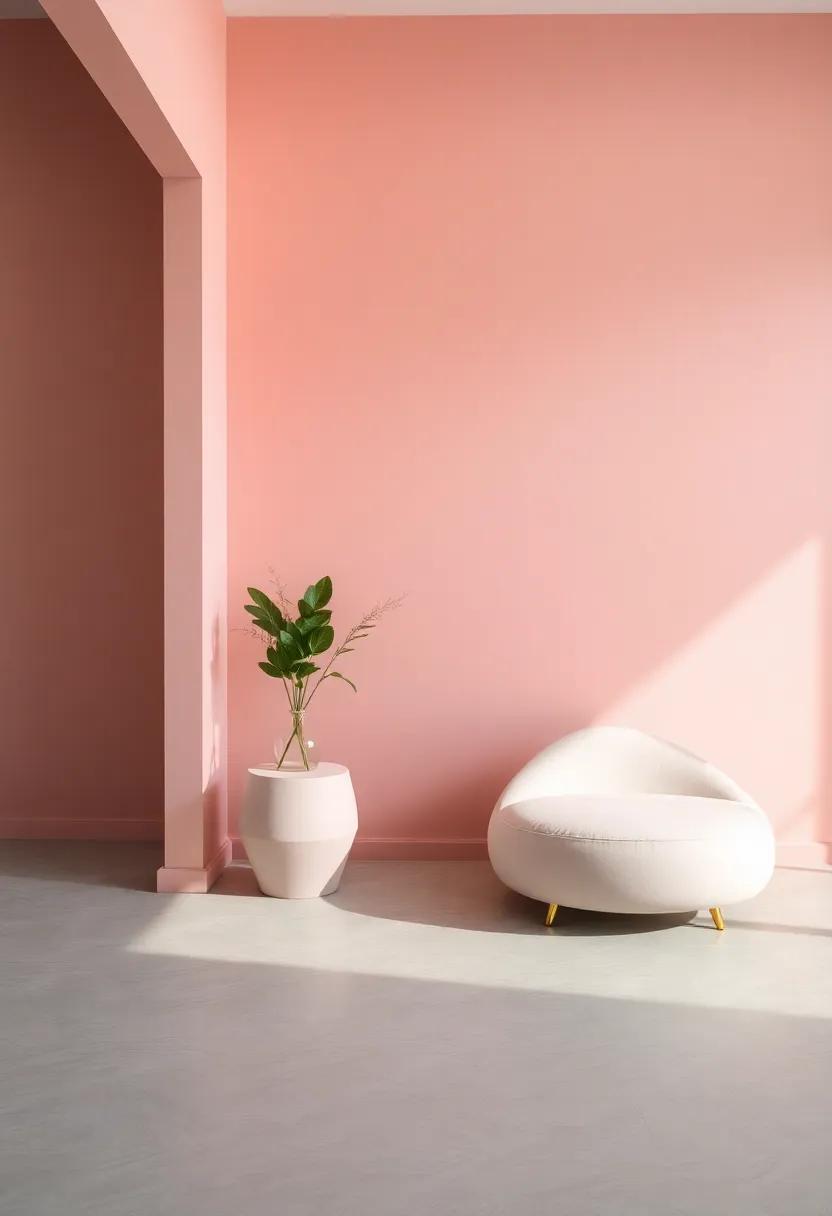
Soft Lines and Curves: The Role of Shape in Creating Calm Spaces
In the quest for tranquility, the shapes within our living spaces can wield immense power over our emotions. Soft lines and gentle curves create a sense of flow that speaks to the subconscious, inviting relaxation and harmony. For instance, when furniture pieces feature rounded edges instead of sharp angles, they tend to foster an atmosphere of comfort and ease. This is particularly potent when combined with shades of pastel pink and muted gray,which together serve to temper vibrant energy,replacing it with soothing undertones. Emphasizing organic shapes through decor can enhance this effect, promoting an environment where stress dissipates and calm prevails.
To effectively incorporate these design elements, consider the following strategies:
- Curved furniture: Opt for sofas and chairs that embrace rounded silhouettes.
- Decorative accessories: Incorporate objects with soft shapes, such as round vases or pillows with gentle contours.
- Gentle lighting: Utilize fixtures that offer diffused illumination, casting a warm glow over the space.
By thoughtfully integrating these principles into your design, you can cultivate a sanctuary where the mind can unwind, encapsulating the essence of serene living. Below is a simple guide to help visualize your space transformation:
| Element | Effect |
|---|---|
| Curved sofa | promotes relaxation |
| Pastel accent wall | Enhances calmness |
| round coffee table | Encourages social engagement |
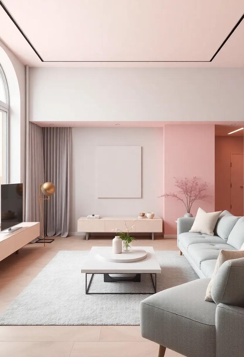
Creating Multi-Functional Spaces: Blending Elegance with Unity
In the pursuit of creating an inviting atmosphere, the combination of pastel pink and muted gray serves as a stunning backdrop for multi-functional spaces. The delicate softness of pastel pink adds warmth and comfort, making a room feel more intimate and welcoming. When paired with subdued gray tones, the overall design achieves a perfect balance of sophistication and tranquility, allowing different areas of the space to flow seamlessly into one another. This harmonious palette supports various functionalities, such as:
- Relaxation Zones: areas designed for unwinding and recharging.
- Workspaces: Dedicated spots that inspire productivity without harsh distractions.
- Social Spaces: Open layouts that encourage connection and engagement.
strategically incorporating furnishings and décor that resonate with these colors can considerably enhance the sense of unity in a space.For instance, opting for furniture with elegant lines in gray can complement soft, pastel-colored cushions or throws, creating visual interest and comfort. To illustrate this, the table below offers a brief look at how different elements can interact within such a design:
| Element | Ideal Color | Functionality |
|---|---|---|
| Sofa | Muted Gray | Comfort & Seating |
| Cushions | pastel Pink | Accent & Softness |
| Rug | Light Gray | Grounding & Cohesion |
| Artwork | Varied Pastels | Visual Appeal |
Sustainable Serenity: Eco-Friendly Choices for a Peaceful Home
The journey to a harmonious home starts with the colors that envelop our spaces. Pastel pink and muted gray are not just aesthetically pleasing; they embody a sense of tranquility that promotes relaxation. When selecting sustainable materials for your design, consider eco-friendly options that resonate with your peaceful palette. Look for furnishings made from reclaimed wood, organic textiles, and low-VOC paints that minimize environmental impact while maintaining a serene vibe. These choices not only enhance the beauty of your home but also contribute to a healthier planet.
Incorporating elements of nature into your interior can significantly deepen the sense of serenity. Opt for indoor plants that thrive in low light and enhance air quality, such as:
- Snake plants: Hard to kill and stylish, they purify the air.
- Pothos: trailing vines that add a soft touch to your decor.
- Peace lilies: Stunning blooms that thrive in indirect sunlight.
Along with greenery, integrate soft textures through sustainable materials like organic cotton throws or linen curtains that softly diffuse light and bring warmth to the muted grays and pastel tones. By thoughtfully choosing color schemes and materials that encourage both peace and sustainability, your home can become not just a refuge, but a beautifully curated sanctuary.
Insights and Conclusions
In a world that often feels loud and chaotic, embracing serenity through design can be a transformative journey. The delicate balance of pastel pink and muted gray invites a sense of calm while allowing individual expression to flourish. This combination isn’t just a trend; it’s an invitation to create spaces that resonate with tranquility and warmth.
As you contemplate incorporating these soothing hues into your environment,remember that design is a personal expression.Each brushstroke, textile choice, and decor element tells a story—your story. So go ahead, let the gentle palette of pastel pink and muted gray inspire you to craft your haven, a retreat from the everyday hustle and bustle.
ultimately, the spaces we inhabit have the power to shape our emotions and experiences. By embracing serenity through mindful design, we not only enhance our surroundings but also nurture our well-being. So take a deep breath, and step into a world where beauty and peace harmoniously coexist. Your serene sanctuary is just a design choice away.