 theFASHIONtamer Where Style Meets Space, Effortlessly
 In a world bustling with bold hues and striking contrasts,there lies a comforting palette that whispers tranquility and warmth—pastel colors. These delicate shades, reminiscent of sunrises and soft embraces, have the power to transform any living space into a serene retreat. Whether you’re seeking to create a cozy nook for relaxation,a calming atmosphere for family gatherings,or a brightened sanctuary for personal reflection,the right pastel tones can breathe new life into your home. In this article, we invite you to discover the enchanting world of pastel colors and explore how they can elevate your living spaces into inviting havens of comfort and style. Join us on this journey to reimagine your home with the subtle elegance of pastels, and unlock the cozy ambiance you’ve always envisioned.
Embracing Serenity: The Allure of Soft Blue for Relaxing Atmospheres
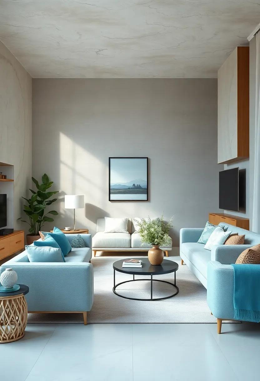
Soft blue is more then just a color; it’s a soothing embrace that conjures imagery of summer skies and tranquil waters. This enchanting hue has an innate ability to transform any living space into a sanctuary, inviting endless relaxation and comfort. By incorporating soft blue into your home, you can achieve a serene atmosphere that calms the mind and nurtures the spirit.It works harmoniously with various design elements, making it an ideal choice for those seeking a peaceful retreat.
To fully embrace the tranquil power of this shade, consider these options for incorporating soft blue throughout your home:
- accent Walls: A soft blue accent wall can instantly elevate a room, adding depth without overwhelming the senses.
- Textiles: From cozy throw pillows to luxurious drapes, soft blue textiles can enhance any space while providing comfort.
- Furniture: Opt for pieces like armchairs or ottomans in soft blue to create inviting, relaxing spots.
- Artwork: Choose calming artwork that features shades of blue to enhance the overall aesthetic.
| Element | Soft Blue Benefits |
|---|---|
| walls | Creates a calming focal point. |
| Textiles | Enhances comfort and warmth. |
| Furniture | Offers stylish versatility. |
| Decor | Promotes tranquility and peace. |
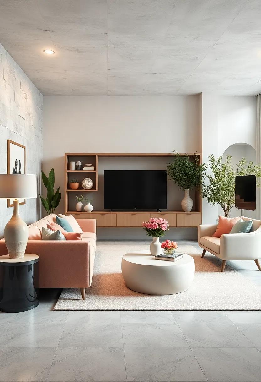
Whimsical Charm: Infusing Peach Tones into Your Living Space
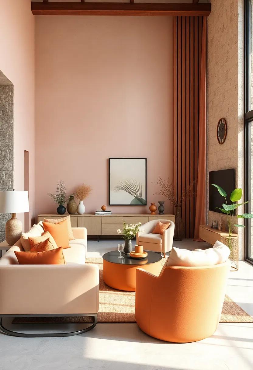
Peach tones possess an undeniable ability to create an enchanting atmosphere within your living space. Whether it’s a soft pastel peach or a deeper, muted variation, these colors bring warmth and a sense of comfort. Incorporating peach hues can effortlessly add a fresh twist to your decor. Consider highlighting accent walls in peach, or using peach-toned textiles such as cushions and throws. Here are some ways to infuse peach shades seamlessly into your home:
- Wall Art: Choose artwork that blends peach with other pastel colors for a cohesive look.
- furniture: Look for vintage pieces painted in charming peach shades or upholstered in peachy fabrics.
- Plants: Combine peach tones with botanical greens to cultivate a lively, inviting surroundings.
To enhance the whimsical charm, consider introducing contrasting colors and textures that complement peach tones. For instance, pairing peach with cool blues or soft grays can create an irresistible balance. accessorizing with natural materials, such as wooden furniture or woven baskets, can also enhance the airy feel associated with pastel peach. Below is a simple visual depiction of complementary colors to help inspire your choices:
| Peach Tone | Complementary Color | Recommended Usage |
|---|---|---|
| pastel Peach | Slate Blue | Accent Pillows or Rugs |
| Muted Peach | Soft Gray | Wall Paint |
| Deep Peach | Mint Green | Artwork and Accessories |
gentle Green: Creating an Inviting Oasis with Sage Hues
Transform your space into a sanctuary with the calming allure of sage hues. This gentle green shade evokes a sense of tranquility, making it an ideal choice for cozy living areas. To create an inviting oasis, consider incorporating sage into various elements such as your walls, furnishings, and décor. The soft undertones pair beautifully with a variety of complementary pastel colors, inviting warmth and serenity into even the busiest of homes.Use the following tips to maximize the impact of sage in your living space:
- accent Walls: Paint one wall in sage while keeping others in a neutral shade to create focal points.
- Textiles: Incorporate sage in curtains,cushions,or throws for a pop of color without overwhelming the space.
- Plants: Pair sage with lush greenery to enhance the natural, calming vibe.
To ensure a cohesive design, consider a thoughtful color palette where sage acts as the central anchor. Combine it with subtle pastels like soft pinks or muted yellows for a refreshing look. This can be effectively demonstrated through the following color combinations:
| Pastel Color | Complementary Effect |
|---|---|
| Soft Pink | Brings warmth and romance to the space. |
| Muted Yellow | Adds a sunny, cheerful vibe without being too bright. |
| Lavender | Creates a serene and balanced atmosphere. |
Incorporating sage in your home decor not only promotes relaxation but also creates a visually pleasing environment. The softness of this hue, when balanced with other pastels, will evoke feelings of comfort and rejuvenation, making every gathering and family moment cherished.
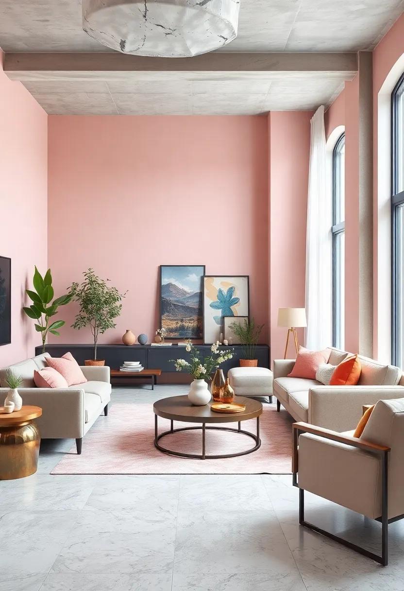
Blushing Beauty: The Role of Blush Pink in Softening Room Edges
The gentle hue of blush pink effortlessly transforms any room, infusing spaces with warmth and subtle elegance. Its innate ability to soften hard edges creates an inviting atmosphere, making it an ideal choice for cozy living areas. When applied to walls or accent furnishings, blush pink accentuates light and promotes relaxation, effectively harmonizing with both modern and traditional decor. this color pairs beautifully with neutrals and earthy tones, making it a versatile selection that transcends seasonal trends.
Incorporating this shade can also evoke a sense of tranquility, especially when combined with natural materials. Consider the following elements to enhance your blush pink palette:
- Soft Fabrics: Cushions and throws in complementary textiles add texture.
- Accents: Use metals or wood finishes that balance the softness of pink.
- Artwork: Choose pieces that feature blush tones to anchor the color scheme.
A curated selection of accent pieces can further enrich the ambiance,elevating your space into a serene retreat.
Sunny delight: The Uplifting energy of Soft Yellow in Interiors
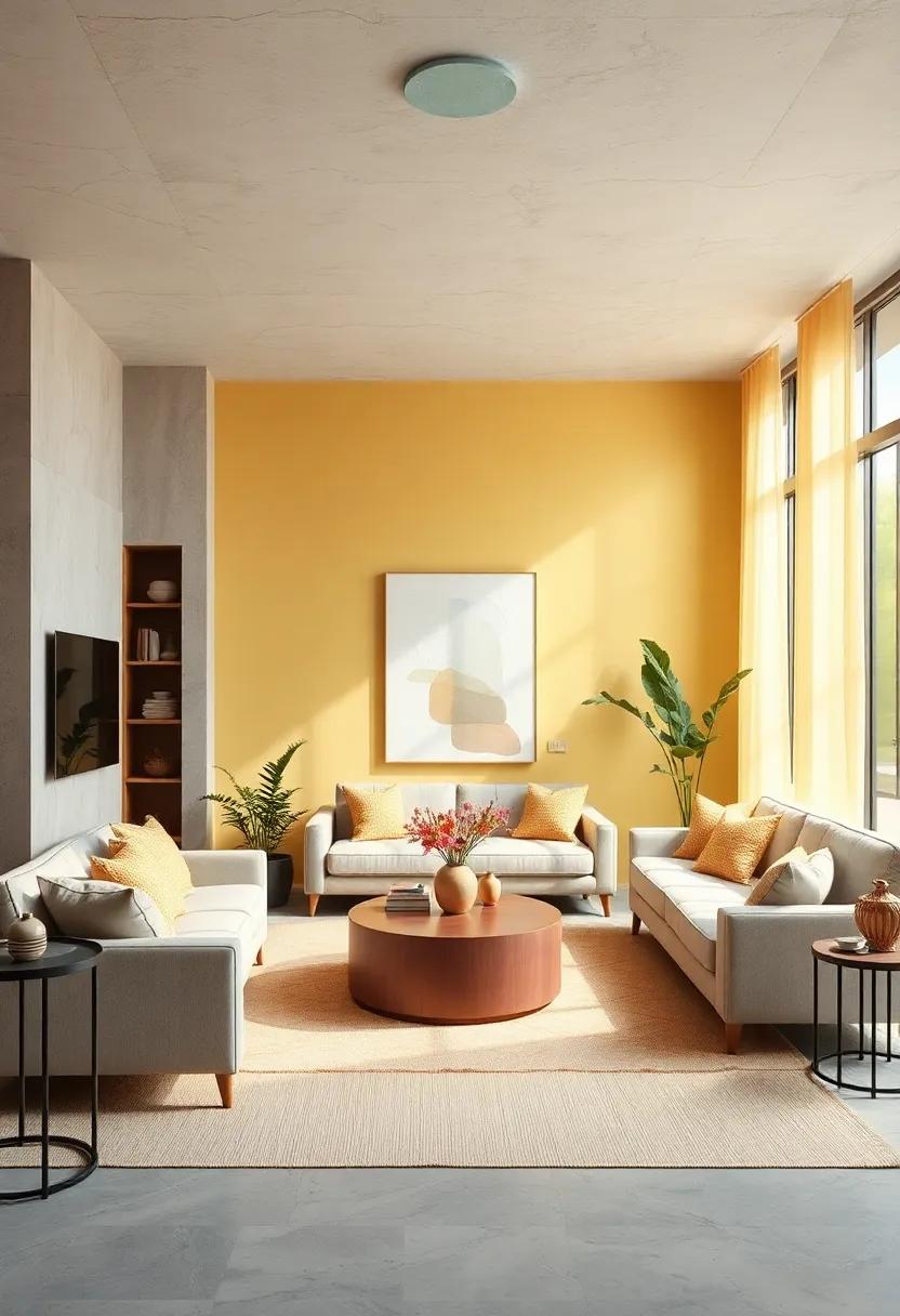
Soft yellow can transform any living space into a sunlit haven,evoking feelings of warmth and cheer. This delightful hue is ideal for infusing a sense of freshness and optimism into your home. Use it in various forms, such as:
- Paint: A gentle coat on walls can create an inviting atmosphere.
- Textiles: Incorporating yellow through cushions and throws adds a playful touch.
- Accessories: Decorative items like lamps or vases can serve as bright accents, enhancing the overall palette.
The beauty of soft yellow lies in its versatility. It pairs wonderfully with other pastel shades, fostering a serene space that feels both relaxing and energizing. Complement your yellow accents with tones like mint green, blush pink, or sky blue to establish a harmonious balance. Consider the following color combinations for maximum effect:
| Color Pairing | Effect |
|---|---|
| Soft Yellow & Mint Green | Refreshingly vibrant |
| Soft Yellow & Blush Pink | Charming and romantic |
| Soft Yellow & Sky Blue | Calming, soothing aura |
Lavender Dreams: How to Use Purple Pastels for Dreamy Vibes
Embracing the soft, soothing hues of lavender can transform any space into a sanctuary of calm and comfort. To effectively incorporate this ethereal color into your home, consider using purple pastels as accents against neutral backdrops. As a notable example, you might choose pastel purple cushions or a throw blanket to enhance a grey or beige sofa. By adding elements like lavender-scented candles or wall art featuring dreamy lilac tones, you can create a cohesive look that radiates tranquility.
When styling your living areas, think about layering shades of lavender with complementary colors to create depth and interest. Some effective combinations include:
- Lavender and Soft Mint: A refreshing blend that adds a touch of nature.
- Lavender and Warm Peach: Balances coolness with warmth for a welcoming feel.
- Lavender and Crisp White: A classic pairing that enhances brightness.
To further explore how to curate the perfect dreamy vibe, consider incorporating a palette like the one below, showcasing various shades of purple pastels and their ideal pairings:
| Shade | Complementary Color | Effect |
|---|---|---|
| lavender | Soft Green | Calm & Refreshing |
| Periwinkle | light Yellow | Cheerful & Bright |
| mauve | Dusty rose | Romantic & Cozy |
Coastal Calm: Incorporating Seafoam Green for a beachy Feel
Imagine stepping into a room that evokes the tranquility of the ocean with its soothing seafoam green tones. This soft, pastel hue can transform your living space into a coastal retreat, reminiscent of serene beaches and gentle waves. To incorporate this calming color effectively, consider pairing it with natural textures, like bamboo or driftwood accents, to create an organic feel. Adding light, airy fabrics can elevate the ambiance, perfect for drapes, cushions, or throws that infuse cozy warmth into the space.
Enhance the seaside vibe by complementing the seafoam green with a palette inspired by the beach. Think of neutral sandy shades, crisp whites, and the occasional pop of coral or deep ocean blue. Here’s a simple color pairing guide to help you visualize the possibilities:
| Color | Complementary Pairing |
|---|---|
| Seafoam Green | Cream & Driftwood |
| pale Sand | Dusty Coral |
| Soft White | Ocean Blue |
When accessorizing, consider incorporating marine-inspired decor, such as seashells, coastal artwork, or woven baskets that echo the textures found along the shore. By thoughtfully integrating seafoam green and its companions,you can create a serene and inviting environment that captures the essence of a beach getaway right in your home.
Warm Embrace: The Comfort of Light Beige for Cozy Corners
Light beige serves as an idyllic backdrop for any cozy corner in your home, effortlessly creating an inviting atmosphere that nurtures relaxation. Its warm undertones seamlessly blend with various color palettes, allowing for the incorporation of diverse textures and accessories. Whether it’s paired with soft pastels or deeper,richer tones,light beige fosters a sense of harmony and serenity. This versatile hue can be accentuated with natural wood finishes, plush cushions, and soft throws, collectively enhancing the snugness of your living space.
Consider introducing light beige elements in the form of:
- Wall paint: Provides an airy, expansive feel.
- Accent Furniture: A light beige armchair becomes a timeless focal point.
- Soft Furnishings: Beige curtains or rugs create a layered, textured look.
Incorporating this soft shade into your cozy corners not only highlights your existing decor but also invites a comforting warmth, making every nook a cherished retreat. The gentle embrace of light beige is perfect for infusing your home with a tranquil yet stylish essence, ideal for moments of relaxation or gathering with loved ones.
pale periwinkle: elevating Spaces with Unique Blue-purple Shades
Pale Periwinkle introduces a whimsical yet sophisticated touch to any living space.Its gentle blue-purple hues evoke a sense of calm and serenity, making it an ideal choice for bedrooms and cozy nooks. This enchanting color complements a variety of decor styles, from modern minimalist to vintage chic. Incorporating pale periwinkle into your home can transform bland walls into a soothing retreat that invites relaxation.
To enhance the charm of pale periwinkle, consider pairing it with these accent colors:
- Soft Greys: For a modern touch that enhances depth
- Warm Taupes: To add a cozy warmth to the cool undertones
- Bright White: For a crisp and fresh contrast
- Peach or Coral: to bring in playful and inviting energy
As you envision spaces adorned with this pastel hue, think about using various textures to amplify its serene vibe. Fabrics like soft linens, plush throws, and rustic wood accents can work harmoniously to create a layered, inviting atmosphere. Below is a simple color palette comparison that showcases how pale periwinkle stands out alongside its complementary shades:
| Color | Hex Code | Best Paired With |
|---|---|---|
| Pale Periwinkle | #A8C8E3 | soft greys, Warm Taupes |
| Soft Grey | #C4C4C4 | Pale Periwinkle, Bright white |
| Warm Taupe | #D1BEB0 | Pale Periwinkle, Peach |
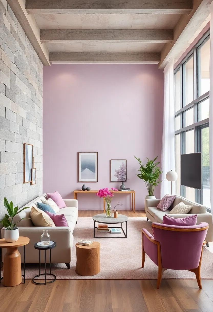
Chic and Modern: The Impact of Dusty Rose in Contemporary Design
The soft allure of dusty rose captivates the eye and the heart, offering a perfect blend of warmth and sophistication. This elegant hue has risen to prominence in contemporary design, infusing living spaces with a sense of calm while maintaining a distinctly modern edge. Its subtle undertones range from warm beige to a delicate lavender, making it an incredibly versatile choice that can be paired seamlessly with other pastels or bolder colors. Designers are embracing dusty rose for a variety of applications, including accent walls, upholstery, and decorative accessories, creating a cozy atmosphere that invites relaxation.
Integrating dusty rose into your home can be effortlessly achieved with the following elements: furniture pieces like plush sofas or chic armchairs, textiles such as throw pillows and blankets, and wall art that showcases this stunning shade. Consider adding accents in complementary colors to enhance its charm while maintaining a harmonious balance. for a unique touch, incorporate different textures through materials like velvet, linen, and ceramic to elevate the visual experience. Below is a quick reference table highlighting some delightful pairings with dusty rose:
| Color Pairing | Effect |
|---|---|
| Mint Green | Fresh and Invigorating |
| Mustard Yellow | Vibrant and Playful |
| Charcoal Gray | Sophisticated Contrast |
| Soft Cream | Warm and Inviting |
Minty Freshness: Revitalizing Rooms with Refreshing Pastel Greens
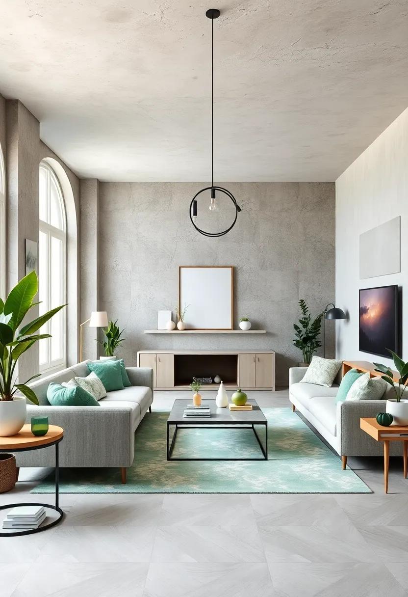
Imagine stepping into a room bathed in soothing green hues, reminiscent of summer days spent in the lush outdoors. Pastel greens have the unique ability to invigorate a space, transforming it into a serene oasis. By incorporating these gentle shades, you can create an atmosphere that encourages relaxation and rejuvenation. Consider using the following elements to enhance the minty freshness in your rooms:
- Accent Walls: Paint one wall in a light pastel green to create a focal point.
- Textiles: Use cushions, throws, and curtains in varying shades of green to tie the room together.
- Plants: Integrate greenery with houseplants that complement the pastel tones, amplifying the freshness.
To balance these leafy shades, it’s essential to choose complementary colors that will enhance the warm and inviting feel of your space. Here’s a simple guide to pairing pastel greens with other hues:
| Pastel Green | Complementary Colors |
|---|---|
| Mint Green | Pale Peach, Soft White |
| Sage Green | Dusty Rose, Charcoal Gray |
| Seafoam Green | Coral, Light Beige |
These combinations not only create visual harmony but also evoke a sense of tranquility, making it easier to unwind after a long day. By carefully selecting your furnishings and decor to reflect this minty theme, you can breathe new life into your home, making it a delightful retreat that invites you to linger just a little longer.
Melon Melodies: Brightening Spaces with Light coral Accents
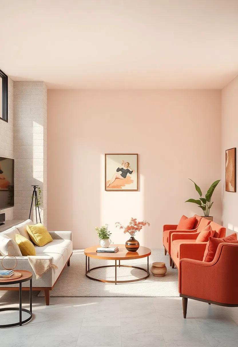
Infusing your home with light coral accents can create a delightful atmosphere that energizes and warms your living space. This vibrant yet soft shade combines the warmth of peach with the refreshing feel of pink, making it ideal for cozy areas in your home. Consider incorporating light coral through various elements, such as:
- Accent Pillows: Add a pop of color to your sofa or bed.
- Curtains: Allow light to filter through while maintaining a cheerful vibe.
- artwork: Brighten walls with pieces featuring coral tones.
- Rugs: Ground your room with a subtle coral pattern.
To complement the soft appeal of light coral, it’s crucial to pair it thoughtfully with other pastel shades. Colors like mint green, soft lavender, or pale yellow enhance the coral’s vibrancy and bring harmony into your home. A well-curated color palette will not only uplift your spirits but also foster a sense of tranquility. Here’s a simple palette guide:
| Pastel Color | Complementary Effect |
|---|---|
| Mint Green | Balances warmth with refreshing coolness. |
| Soft Lavender | Adds a touch of calm and sophistication. |
| Pale Yellow | Injects a sunny, cheerful quality to the space. |
Neutral Canvas: Blending Soft Gray for Versatile Decor
Soft gray serves as a splendid base for creating an airy and tranquil atmosphere in your living spaces. Its versatility allows for seamless integration with both warm and cool color palettes, making it an ideal backdrop for a variety of design styles. When paired with pastel accents, soft gray enhances the serene feel of your home while adding depth and character. Whether you’re accessorizing with blush pinks, mint greens, or lavender tones, this neutral hue effortlessly elevates the overall aesthetic, enveloping rooms in a gentle embrace that invites relaxation.
This calming shade can be applied in numerous ways, from wall paint to furniture selections. Consider the following combinations to maximize its potential:
- accent Walls: Create a dynamic focal point by painting one wall in soft gray while keeping others in pastel hues.
- Textiles: Incorporate soft gray in cushions, throws, and rugs to harmonize with pastel decor.
- Artwork: Choose prints or paintings featuring soft gray tones to tie together the color scheme.
To visualize how this blending can manifest, here’s a simple color coordination table:
| Pastel Color | Complementary Shade | Suggested Use |
|---|---|---|
| Blush Pink | Soft Gray | Cushions and throws |
| Light Lavender | Soft Gray | Wall art |
| Pale Mint | Soft Gray | Accent furniture |
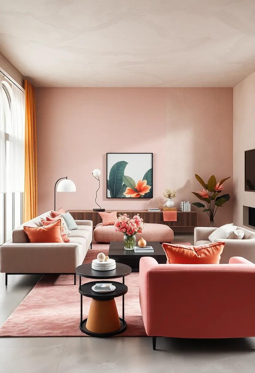
Sunset Tints: Capturing warmth with Soft Orange in Your Home
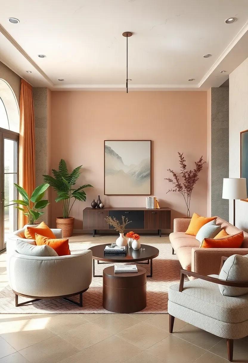
Soft orange hues can infuse a room with warmth and vibrancy, reminiscent of a blissful sunset. This inviting tone works beautifully in various spaces, from a cozy living room to a tranquil bedroom. Consider incorporating it through accent walls,decorative pillows,or art pieces that reflect the sun’s gentle glow. The use of soft orange alongside neutral shades creates a harmonious environment, making your living space both lively and comforting.
To fully capitalize on the warmth of soft orange, pair it with complementary pastel colors. Light mint greens, pale blues, or soft yellows can revive the energy and enhance the overall aesthetic.Experiment with different textures to add depth, such as velvety cushions or woven throw blankets. Here are some charming ideas for integrating this radiant hue into your home:
- Wall Paint: Choose a pale orange shade for a serene backdrop.
- Furniture Accents: Add soft orange storage solutions or side tables.
- Textiles: Incorporate orange in curtains or area rugs to create a cozy atmosphere.
Charming Contrast: Pairing Pastel Shades for Harmonious Spaces
The magic of pastel shades lies in their ability to create a serene and inviting atmosphere, making them the perfect choice for any cozy living space.By combining different pastel tones, you can achieve a delightful contrast that evokes warmth and tranquility. Consider pairing soft mint green with a gentle peach for a fresh yet grounded feel. Add splashes of lavender in decorative pillows or floral arrangements, and let the pale blue accents breathe life into your space. This harmonious mix not only enhances the overall aesthetic but also promotes a sense of calm and balance.
To further enrich your decor, think about incorporating various textures that complement your chosen pastels. A knitted throw in blush pink placed over a light gray couch can create a cozy focal point, while a soft area rug in a subtle butter yellow ties the room together.Use metallic accents, such as a shiny silver vase, to add a touch of sophistication. Here’s a quick reference table to help you visualize some delightful pastel pairings:
| Pastel Color | Best Partner | Texture Suggestions |
|---|---|---|
| Mint Green | peach | Silk curtains, linen throw |
| Soft Lavender | Pale Blue | Cotton pillows, wool rug |
| Blush Pink | Light Gray | Knitted blankets, velvet cushions |
| Butter Yellow | Soft White | Canvas wall art, bamboo accents |
Rustic Retreat: Using Pastel Accents in Country-Themed Interiors
Embracing a country-themed interior involves a delicate balance between warmth and charm.Introducing pastel accents can breathe fresh air into traditional rural aesthetics. Consider shades like soft mint, lavender, and peach for textiles such as curtains and cushions. These gentle hues create an inviting atmosphere while maintaining a cozy feel. Essentials such as shabby chic furniture or handcrafted decor can be enhanced with these understated colors, reflecting a serene and welcoming environment.
To effectively utilize pastel tones in your country retreat, incorporate them into your color palette through a careful selection of paint and decor. Adding a pastel pink vintage rocking chair in your living space or a sky blue accent wall can provide a modern twist on rustic charm. Consider these complementary elements:
- Pastel Throw Pillows: Layer them on neutral sofas for a pop of color.
- Artwork: Opt for local landscape paintings featuring softer shades.
- Rugs: Choose woven designs in pastel hues for added texture.
| Pastel Color | Ideal Use | Suggested Complement |
|---|---|---|
| Soft Mint | Walls | Natural Wood Accents |
| Lavender | Curtains | White Lace Trim |
| Peach | Table Linens | Vintage Dinnerware |
Luminous Light: Harnessing the Glow of pastel Lighting in Design
pastel lighting can truly transform a room, illuminating spaces with a subtle glow that enhances the soft hues of your decor.By incorporating pastel shades into your home’s lighting design, you can create an inviting atmosphere that encourages relaxation and warmth.Consider using mint green and soft lavender in lampshades or light fixtures; these colors not only complement each other beautifully but also diffuse light in a way that is easy on the eyes. To further enhance the ambiance, use rose gold or light wood accents that reflect the pastel tones, adding a touch of elegance to every corner.
Using light pastel colors can substantially change the perception of space in your home. Here are a few color combinations that work exceptionally well when layered with pastel lighting:
- Sky Blue + White: Creates a serene and airy feel.
- Blush Pink + Cream: Adds softness and warmth.
- Pale Yellow + Grey: Invokes a cheerful yet modern vibe.
To give you a better idea of how to pair these colors with lighting, here’s a simple table to guide your choices:
| Pastel Color | ideal Lighting Type | Suggested Room |
|---|---|---|
| Mint Green | LED Fairy Lights | Living Room |
| Soft lavender | Wall Sconces | Bedroom |
| Pale Peach | Table Lamps | Dining Room |
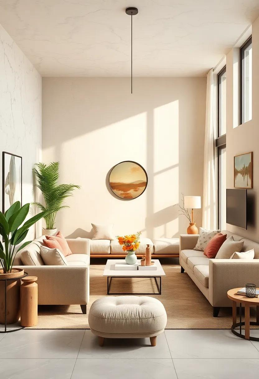
Timeless Touch: The Classic Appeal of Ivory in Living Areas
The subtle elegance of ivory can effortlessly enhance the aesthetic of any living space. This classic hue serves as a versatile backdrop, allowing for a multitude of decor styles to flourish. By integrating ivory into your color palette, you not only embrace timeless beauty but also create an inviting atmosphere.Pairing ivory with pastel shades can further elevate your space, harmonizing soft tones that inspire warmth and tranquility. Consider the following combinations:
- Ivory and Blush Pink: Adds a romantic touch.
- Ivory and Soft Mint: Evokes a fresh,spring-like feel.
- Ivory and Lavender: Infuses a calming vibe.
When incorporating ivory elements, whether through furniture, textiles, or wall colors, aim for balance. choosing the right textures—from plush fabrics to smooth finishes—can create depth and interest in your living area. A simple table like the one below can help clarify the impact of texture when combined with ivory:
| Texture Type | Effect with Ivory |
|---|---|
| Velvet | Adds luxury and warmth |
| Linen | Creates a breathable, relaxed look |
| Wood | Enhances a natural, earthy feel |
Gentle Transitions: Seamlessly Flowing from Room to Room with Pastels
Utilizing pastel colors not only adds a touch of softness but also creates a sense of continuity as you move from one room to another. These delicate hues invite tranquility and can set the perfect mood throughout your living spaces. Consider choosing a palette that allows for gentle flow, such as a combination of soft lavender, mint green, and peach. By integrating these colors into various elements, including furnishings, wall art, and textiles, you can achieve a cohesive aesthetic that gracefully unites your home.
To emphasize the seamless transitions, it’s beneficial to adopt a strategy of repeating specific pastel tones in different rooms. As an example, imagine a soft blue accent wall in the living room that is echoed in the decorative cushions of the adjoining dining area. This technique will not only enhance the fluidity of the space but also create visual harmony. Use the following ideas to ensure a smooth transition:
- Consistent Accent Pieces: choose vases, throw pillows, or artwork in coordinating pastels.
- Flowing Textiles: Opt for curtains or rugs in similar shades to tie rooms together.
- Complementary Furniture: Select pieces that share pastel tones to unify the theme.
Cohesive Collection: Curating Pastel Decor for a Unified Aesthetic
Creating a unified aesthetic with pastel decor is all about selecting pieces that harmoniously blend together to evoke a sense of warmth and tranquility. Start by choosing a color palette that ranges across soft hues like mint green, blush pink, and dusty lavender. Each of these colors can be featured as accents or foundational tones in your space. When picking decor items, consider how they interact with one another in terms of texture and form. Soft fabrics,decorative cushions,and light wood accents can all enhance the cohesive feel and create a serene atmosphere.
To further tie your design together, incorporate cohesive elements across different areas of your home. Consider the following components:
- Wall Art: Choose pieces that incorporate your selected pastel shades, whether through abstract prints or floral motifs.
- Furniture: Opt for light-toned or pastel-painted furniture that complements your overall theme.
- Accessories: Incorporate vases, candle holders, and other decor items that reflect your palette.
A great way to visualize this is by creating a mood board or an inspiration table. Below is a simple guide for reference:
| Pastel Color | Ideal decor Elements | suggested Combinations |
|---|---|---|
| Mint Green | Throw pillows, rugs | Mint + Blush |
| Blush Pink | Candles, wall art | Blush + Lavender |
| Dusty Lavender | Bed linens, curtains | Lavender + Mint |
Closing Remarks
As we wrap up our colorful journey through the world of pastel hues, we hope you feel inspired to embrace the soft, soothing tones that can transform your living spaces into cozy retreats. Whether you opt for the gentle blush of a pale pink, the calming serenity of a light blue, or the invigorating freshness of mint green, these shades have the power to create an inviting atmosphere that fosters comfort and tranquility.
Remember, the beauty of pastel colors lies in their versatility; they can be mixed and matched with various textures and accents to reflect your personal style. so, gather your paint swatches, explore delightful furnishings, and embark on a change that turns your home into a sanctuary of warmth and charm.
Here’s to creating a cozy haven filled with joy, relaxation, and, of course, beautiful pastels. Happy decorating!