 theFASHIONtamer Where Style Meets Space, Effortlessly
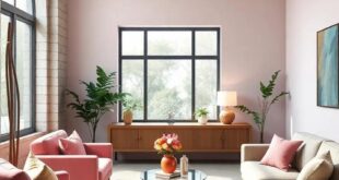
 As we approach the midpoint of the decade, the heart of our homes—the kitchen—stands ready for a vibrant evolution. The year 2025 promises to usher in a palette of transformative colors that will redefine this vital space, blending aesthetics wiht functionality in ways that resonate with our modern lifestyles. Gone are the days of predictable whites and grays; the new wave of kitchen design invites bold hues, soothing earth tones, and inspiring contrasts that reflect our individuality and embrace sustainability. In this article, we will delve into the color trends poised to take center stage, exploring how these shades not only enhance visual appeal but also foster a sense of warmth, creativity, and connection within our homes. Join us as we envision a kitchen reimagined and discover the colors that will breathe new life into your culinary sanctuary.
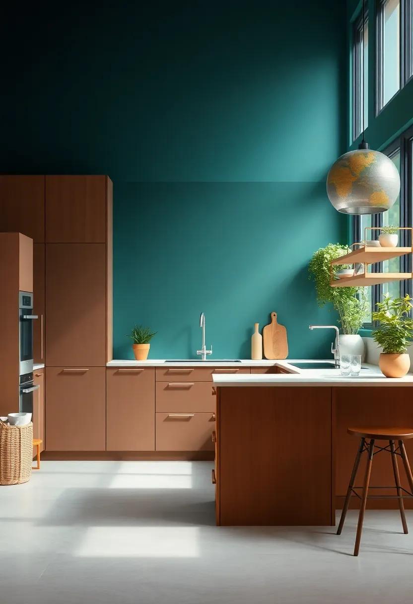
Energizing Blues: Infusing Serenity and Depth into Your Kitchen Design
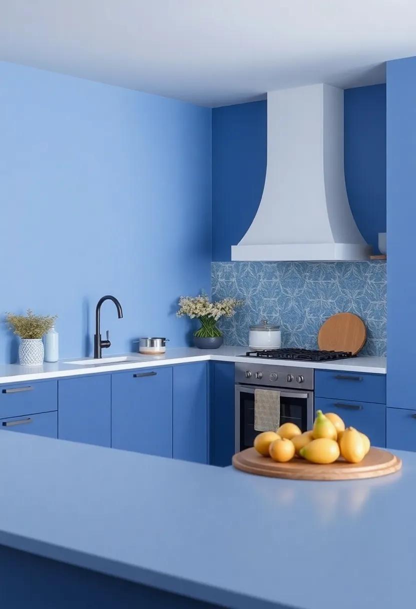
As we venture into a new era of kitchen design, the calming essence of energized blues emerges as a leading choice, transforming spaces into serene havens. This color trend draws inspiration from the tranquil hues of nature, effectively marrying sophistication with comfort. Imagine preparing meals surrounded by shades that evoke the gentle lapping of waves or the stillness of a clear evening sky. Incorporating blues can instill a sense of peace, fostering not just creativity in the kitchen but a soothing backdrop for family gatherings.
To fully embrace this trend, consider blending various shades to create a harmonious design. The following elements can elevate your kitchen’s aesthetic:
- Cabinetry: Opt for deep navy or muted teal to make a bold statement.
- Backsplashes: Use light cerulean tiles to add a refreshing contrast.
- Accents: Incorporate accessories like dishware or textiles in cool indigo shades.
- Lighting: Enhance the ambiance with soft, warm lights that complement the blues.
By carefully curating these elements, your kitchen can embody both tranquility and elegance, weaving a narrative of depth and serenity that resonates with modern living.
| Shade | Effect |
|---|---|
| Sky Blue | Promotes calmness and opens the space. |
| Teal | Adds depth and sophistication. |
| Powder Blue | Radiates warmth and friendliness. |
Warm Neutrals: Embracing Earthy Tones for a Cozy Culinary Retreat
As we approach 2025,the allure of warm neutrals beckons,inviting us into spaces that evoke comfort and serenity. These earthy tones, ranging from soft taupes to gentle beiges, create an inviting atmosphere in the kitchen, transforming it into a cozy culinary retreat. Imagine a harmonious palette infused with subtle undertones of clay, sand, and moss, which effortlessly brings the outdoors in.This trend not only fosters a sense of tranquility but also serves as the perfect backdrop for a culinary haven where creativity can flourish.
To enhance the warmth of your kitchen, consider incorporating elements that complement these earthy shades. Hear are some suggestions:
- Natural Materials: Opt for wooden cabinetry or stone countertops to enhance the organic feel.
- Textured Fabrics: Introduce linen curtains or cotton cushion covers in neutral tones to soften the space.
- Warm lighting: Utilize pendant lights with amber hues to create a warm glow that complements the earthy palette.
By carefully curating your choice of colors and materials, you can create a sanctuary that invites relaxation and culinary exploration in every meal.
Bold Jewel Tones: Elevating Kitchen Aesthetics with Vibrant hues
Imagine walking into a kitchen where the walls and cabinetry are splashed with deep, rich colors that instantly invigorate the space. bold jewel tones like emerald green, sapphire blue, and ruby red create a dramatic backdrop that elevates the ordinary to the remarkable. These vibrant hues are not just colors; they are statements. When paired with warm woods, shiny metals, and natural stone accents, jewel tones can transform your kitchen into a luxurious haven. Moreover, they work beautifully as accents in smaller elements, such as painted islands, backsplash tiles, or even vibrant kitchenware, allowing for a dynamic interplay of shades that captivates the eye.
The secret to successfully implementing these bold colors lies in balance and contrast. Use jewel tones to highlight architectural features or as focal points in an open-concept design. Consider the following combinations for an effortless yet striking look:
- Emerald Green cabinetry with gold hardware
- Ruby Red accent walls alongside neutral countertops
- Sapphire Blue islands contrasted with light wooden flooring
Below is a simple table showcasing complementary color pairings that can enhance the beauty of jewel tones in your kitchen design:
| Jewel Tone | Complementary Color |
|---|---|
| Emerald Green | soft Beige |
| Sapphire Blue | Warm White |
| Amethyst Purple | Muted Gray |
Timeless Whites: Reinventing Classic Spaces with Fresh Interpretations
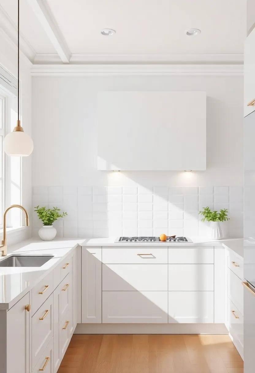
As we step into the world of modern kitchen design, the elegance of white remains unapologetically essential. However,it evolves continually,adapting to contemporary aesthetics while maintaining its classic charm. fresh interpretations of white hues can breathe life into even the most customary kitchens. Consider the following approaches to reinvigorate your space:
- Warm Undertones: Incorporate whites with subtle warm undertones to create a welcoming atmosphere, perfect for family gatherings.
- Mixed Textures: Pair matte white cabinetry with glossy countertops or brushed metal fixtures for a striking visual contrast.
- Layered Whites: Use various shades of white on walls, cabinets, and décor to create depth and interest.
incorporating elements like natural light, statement hardware, and vintage accents can enhance the timeless appeal of your kitchen’s white palette. when choosing whites, consider how they interact with natural light at different times of the day, adjusting their appearance and mood. A well-thought-out combination can result in an habitat that feels both modern and classic. Here’s a swift comparison of whites to consider for your kitchen makeover:
| White Shade | Description | Best Paired With |
|---|---|---|
| Alabaster | Soft and warm, ideal for a cozy feel. | Natural woods, earthy tones |
| Pure White | Crisp and clean, for a fresh look. | Radiant accents, minimalism |
| Chalk White | Subtle, with a hint of gray. | soft pastels, muted colors |
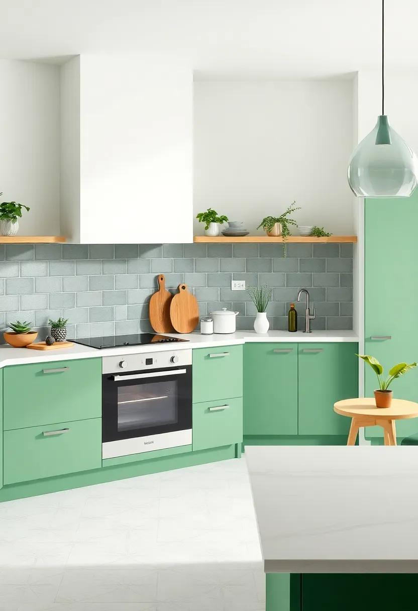
Calming Greens: Creating a Refreshing Oasis with Nature-Inspired Palettes
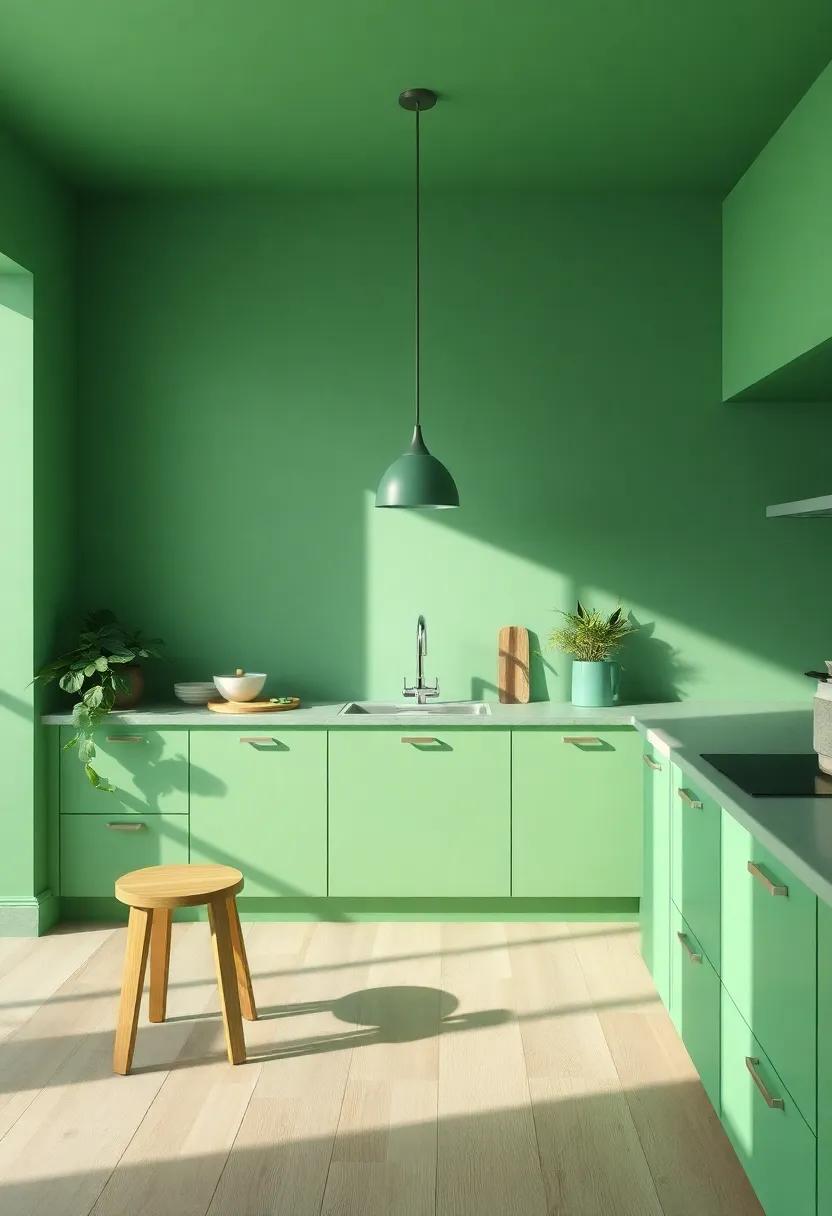
Embracing a palette of calming greens can whisk your kitchen away into a refreshing oasis,harmonizing with the organic elements of nature. By incorporating various shades, from deep forest tones to soft mint hues, you can create an atmosphere that promotes relaxation and tranquility.Consider incorporating these elements:
- Painted Cabinets: Opt for muted sage or olive tones that evoke the tranquility of nature.
- Textured Accents: Use natural materials like wood or stone in light green finishes to add depth and warmth.
- Indoor Plants: Adding greenery not only assists with air quality but enhances the aesthetic feel, creating a lively ambiance.
To elevate the visual appeal further, consider contrasting the greens with lighter, airy colors such as whites or creams.This combination not only brightens your space but also enhances the vibrant energy of your chosen greens. A well-planned color scheme can include:
| Color Pairing | Effect |
|---|---|
| Olive Green & Soft Cream | Warm and inviting |
| Sage Green & Bright White | Fresh and airy |
| Mint Green & Light Gray | Modern and soothing |
playful Pastels: Adding Subtle Whimsy to Modern Kitchen Designs
In the world of modern kitchen designs, a shift towards playful pastels is making waves, allowing homeowners to embrace a softer palette that infuses character without overwhelming the senses. These serene hues, such as mint green, soft lavender, and powder blue, can be seamlessly integrated into various elements of kitchen decor. Consider using pastel cabinets, which offer a fresh departure from the standard white or gray options, while also serving as a gentle backdrop to more vibrant accessories like ceramic dishware or colorful kitchen gadgets. Incorporating playful pastels not only refreshes the aesthetic but also creates an inviting atmosphere, inviting creativity and conversation over a shared meal.
there’s no need to commit to a full renovation to embrace this trend; small, thoughtful additions can yield significant impacts. Simple changes, such as painted backsplashes, pastel-colored counter stools, or delicate dishware, can transform an or else stark space into one filled with charm. For a cohesive look, consider combining various pastel shades in complementary ways—think a soft peach with a light teal or a lemon yellow paired with a muted gray. These playful combinations can evoke a sense of nostalgia while still feeling contemporary, making your kitchen not only a space for cooking but also a canvas for artistic expression.
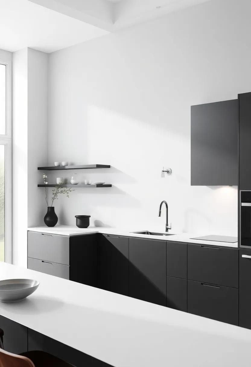
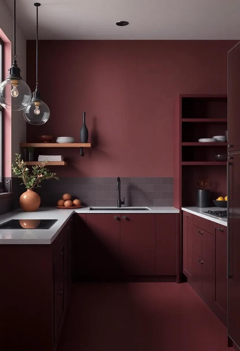
Rich Charcoals: The Elegance of Darker Shades in Kitchen Spaces
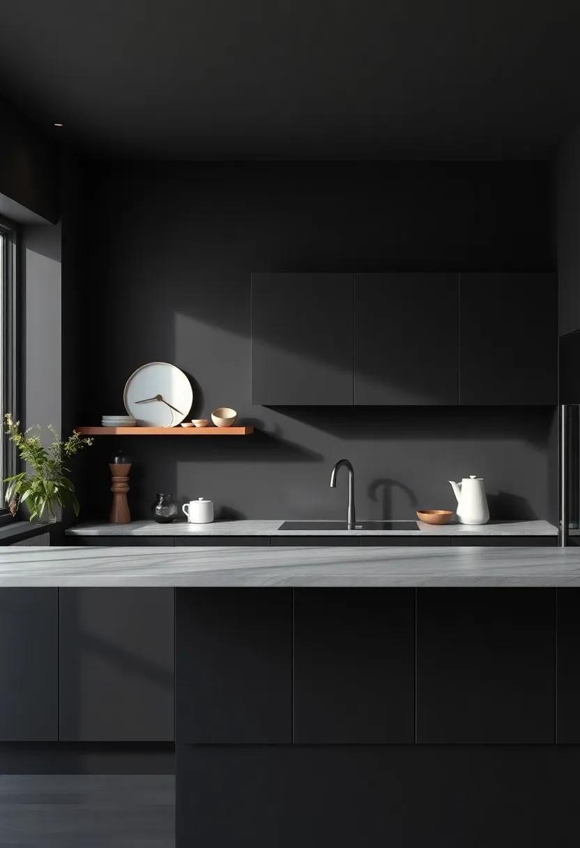
The integration of darker shades, especially rich charcoals, into kitchen spaces is a profound trend that embodies sophistication and depth. These hues impart a sense of modern elegance, transforming traditional kitchens into contemporary masterpieces. The versatility of charcoal allows it to complement a myriad of materials, from sleek stainless steel to warm wooden accents. By utilizing elements such as charcoal cabinetry or dark countertops, homeowners can create a striking visual contrast, making the kitchen both a functional area and a stunning focal point in the home.
To enhance the allure of rich charcoals, consider incorporating a balance of textures and lighting. The following elements can elevate the aesthetic appeal:
- Glossy finishes: To add shine and sophistication, choose cabinets or tiles with a reflective surface.
- Warm lighting: Employ warm-toned fixtures to soften the boldness of dark shades and create an inviting atmosphere.
- Contrasting colors: Pairing charcoal with lighter hues, like soft whites or muted pastels, can create stunning visual dynamics.
| Element | Effect |
|---|---|
| Charcoal Cabinets | Creates a dramatic centerpiece |
| Dark Flooring | Adds depth and sophistication |
| Accent Lighting | Highlights design features |
| Natural Textures | Enhances warmth and character |
Subtle Metallics: Introducing Gleaming Accents for a Luxe Finish
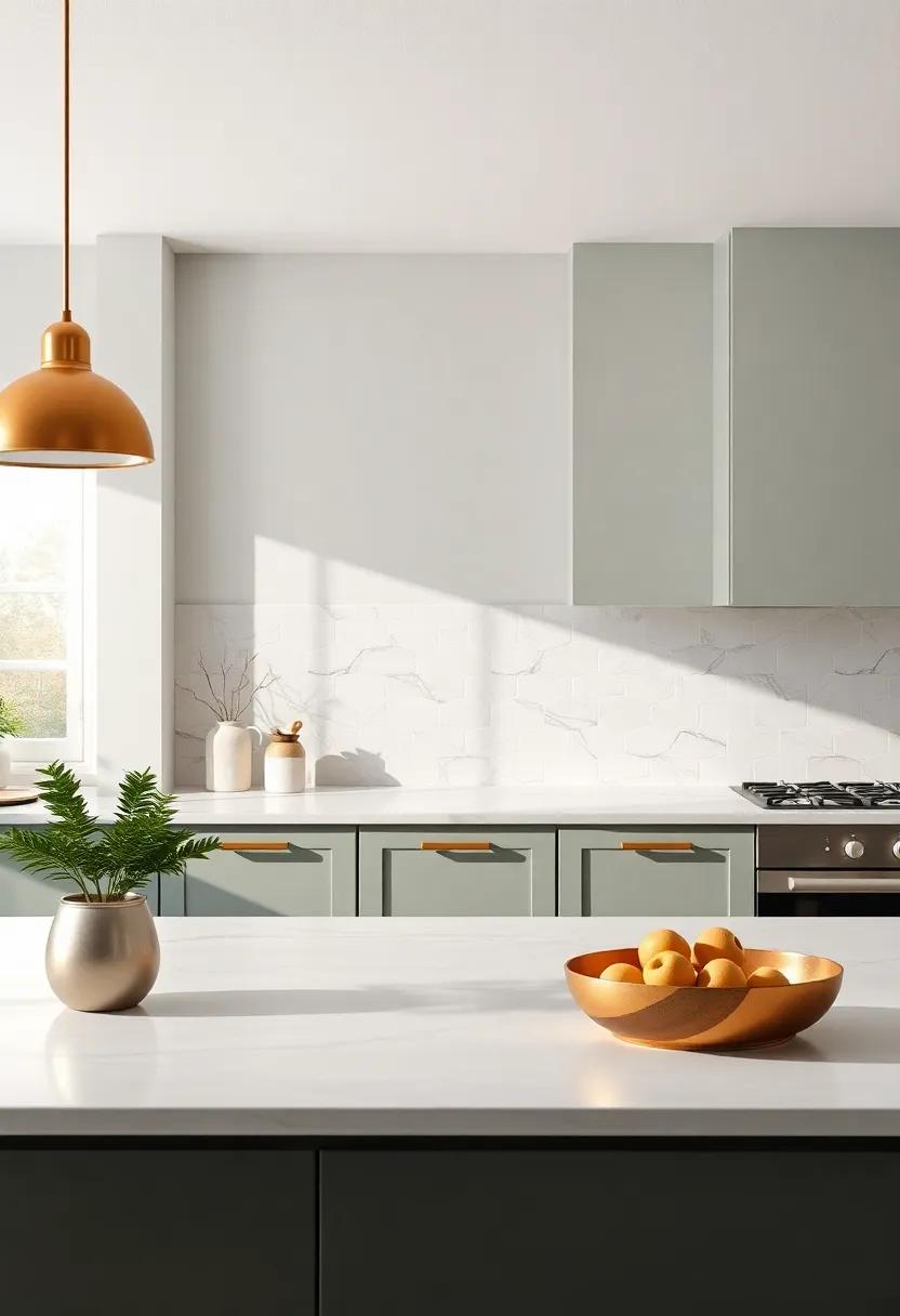
As we journey into the heart of 2025, the allure of subtle metallics emerges as a game changer in kitchen design. These shimmering accents invite a touch of modern sophistication, offering an alternative to harsher, more prominent finishes. Think muted brass, brushed gold, and soft silver—each providing a refreshing glow that complements rich hues and natural materials. These understated metallic elements can be integrated into various kitchen features such as:
- Cabinet hardware – Handles and knobs that spark joy without overwhelm.
- Light fixtures – Pendant lights that softly reflect while illuminating the space.
- Faucets – Stylish yet subtle water fixtures that marry function with finesse.
In terms of color coordination, soft metallics can beautifully harmonize with a spectrum of colors, from deep forest greens to warm terracotta. They add a layer of depth and elegance, creating a cozy atmosphere before even stepping foot in the kitchen. Below is a simple guide to incorporating these accents effectively within your space:
| Metallic Finish | Complementary Colors |
|---|---|
| Brushed Gold | Deep blues, rich burgundies |
| Muted Brass | Earthy tones, sage greens |
| Soft Silver | Cool grays, crisp whites |
Dynamic Two-Tone Schemes: Generating Visual Interest in Your Kitchen
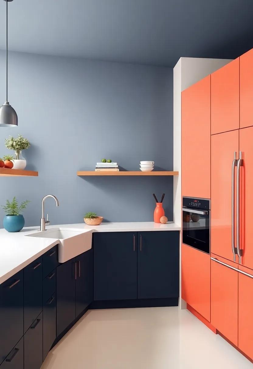
Embracing a two-tone scheme in your kitchen can breathe new life into the heart of your home, creating a dynamic and engaging space. This approach allows you to play with contrasting colors and textures, offering a unique twist that captures attention and enhances visuals. Consider pairing deep navy cabinets with crisp white countertops, or soft sage green walls against charcoal elements. These combinations not only showcase your personal style but also enhance layers, making your kitchen feel more expansive and inviting.
To effectively implement this design, think about incorporating varying materials and finishes that complement your chosen color palette. Some popular combinations include:
- Matte and Glossy Finishes: Combining a matte finish on lower cabinets with glossy upper cabinets can create a stunning visual contrast.
- Wood and Paint: Utilizing natural wood tones on one part of the kitchen while leaving another section painted can add warmth and balance.
- Accent Walls: an accent wall featuring a bold color can act as a perfect backdrop to lighter cabinetry, framing your space beautifully.
by mixing and matching these elements, you can sculpt an inspiring kitchen environment that exudes modernity and charm.
Textured Surfaces: Creating Dimension with paint and Material Choices
In 2025, the allure of textured surfaces will reign supreme in kitchen design, offering an innovative way to elevate any space. By incorporating a blend of rich materials and dynamic colors, homeowners can achieve a captivating aesthetic that transcends traditional flat finishes. Consider the subtle warmth of Matte Clay walls paired with a Glossy Granite countertop.This combination creates an effective interplay of light and shadow, adding depth to the design. Textured paint options such as stucco or lime wash can also enhance walls, making them not just a backdrop, but an integral part of your kitchen’s personality.
In addition to paint, the choice of materials plays a crucial role in enhancing texture. Select wood-paneled cabinetry adorned with a rich stain to introduce warmth,or opt for metal accents that reflect contemporary trends. Other options might include geometric tile patterns or 3D wall panels, which can bring an artistic flair to your kitchen. To illustrate, consider the following table that highlights some popular material combinations for 2025:
| Finish Type | Material | color Palette |
|---|---|---|
| Textured Paint | Lime Wash | Soft Pastels |
| Natural Wood | Reclaimed Oak | Earthy Tones |
| Mixed Media | Metal and Glass | Industrial Grays |
| Tile Design | Ceramic Geometric | Vibrant Blues |
Contrast in Color: Balancing Bright and Dark for impactful Spaces
In the world of interior design, color plays a crucial role in shaping the mood and personality of a space, especially in the heart of the home—the kitchen. Balancing bright and dark hues can create a dynamic environment that not only serves a practical function but also inspires creativity and warmth. This balance can be achieved through several strategies:
- Accent Walls: Using a bold, dark color for an accent wall can help grounding the space while bright cabinetry or backsplashes reflect light and maintain an inviting atmosphere.
- Color Blocking: Combining contrasting colors in distinct areas, like pairing deep navy countertops with soft cream cabinets, can delineate space while keeping it cohesive.
- Statement Furniture: Incorporating dark-toned furniture or fixtures, such as a rich mahogany island paired with crisp white stools, adds depth while ensuring the kitchen feels open and airy.
Interestingly, the psychological impact of color cannot be underestimated. Bright tones can energize a kitchen, making it feel lively and welcoming, whereas darker shades promote a sense of elegance and sophistication. Consider this simple overview of color psychology:
| color | Impact |
|---|---|
| Bright Yellow | stimulating and cheerful |
| Deep Blue | Calm and serene |
| Vibrant Red | Exciting and bold |
| Charcoal Gray | Modern and sophisticated |
By thoughtfully blending these elements, you can craft a kitchen that not only embodies style but also speaks to your personal taste and lifestyle. Each color choice adds a layer of meaning to your space, allowing you to enjoy both the aesthetic and emotional experience it creates.
Nature-Inspired Hues: Blending Outdoor Elements into Indoor Cooking Areas
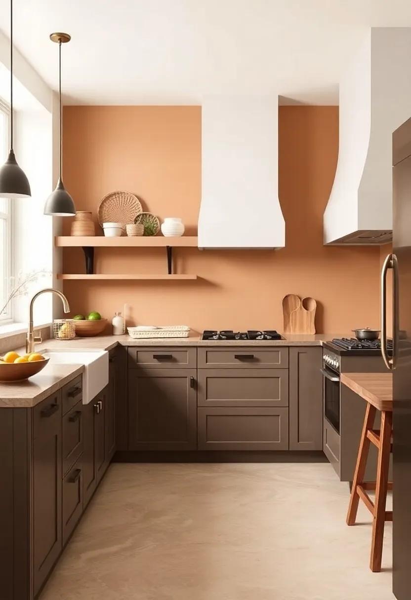
As we step into 2025, the trend of incorporating nature’s palette into our kitchens is gaining momentum, creating a sanctuary of warmth and tranquility.Imagine walls painted in soft earthy greens that echo the lush hue of moss-covered stones, or muted sage grays reminiscent of fog-laden mornings in the woods. Accents of deep terracotta and warm ochre can be used in cabinetry or decor, drawing inspiration from sun-soaked earth. These colors not only harmonize with varied styles—from rustic farmhouse to sleek modern designs—but also promote a soothing atmosphere that enhances the culinary experience.
To further embrace the outdoors, many homeowners are turning toward enriching textures and natural materials that complement these hues. Think wooden beams, stone countertops, and ceramic tiles that mimic the look of natural stone.A kitchen infused with nature-inspired elements can also benefit from touches like indoor planters filled with herbs or vertical gardens, adding a splash of color and life. consider building a color scheme around a combination of soft blues, gentle whites, and organic greens to replicate the fresh, calming feel of an open sky or a serene forest. This balance of color and texture not only elevates the kitchen aesthetic but also invites an uplifting sense of peace that makes cooking a joy.
Sustainable Shades: Eco-Friendly Colors to Inspire Green Living
As we step into 2025,the embrace of eco-conscious choices in interior design will not only reflect our sustainability goals but also enhance the aesthetics of our kitchens. Imagine walls adorned with earthy tones like terracotta and olive green, reminiscent of nature’s palette, seamlessly blending comfort with an environmental ethos. These shades not only create a warm and inviting atmosphere but also promote well-being, making your kitchen a haven of sustainability. Adding accents in soft beige or sage can further enhance this organic vibe, while incorporating natural materials and finishes creates a harmonious balance that speaks to both beauty and responsibility.
Incorporating eco-friendly colors isn’t just about what’s on the walls; it extends to your choice of appliances and decor as well. Opt for energy-efficient models in matte black or brushed gold, which complement the eco-friendly color scheme while reducing energy consumption. consider including a table showcasing the benefits of these color choices:
| Color | benefits |
|---|---|
| Olive Green | Promotes a sense of tranquility |
| Terracotta | Adds warmth and richness |
| sage | Enhances calmness and peace |
| Soft Beige | Creates a neutral backdrop for decor versatility |
By harmonizing eco-friendly colors with sustainable materials and efficient appliances, you’ll not only create a stunning kitchen space but also contribute to a greener planet. Choosing these hues encourages mindfulness in our living environments,proving that style and sustainability go hand in hand. Embrace this intentional shift in color trends and watch your kitchen transform into a space that embodies a brighter,more sustainable future.
Transitions in Color: Crafting Flow Between Kitchen and Adjacent Spaces
as we step into 2025, the emphasis on seamless design between the kitchen and surrounding areas is stronger than ever. The latest color trends focus on creating a harmonious flow, utilizing palettes that draw the eye naturally from one space to the next. Think of soft pastels that can smoothly transition between the vibrancy of a busy kitchen and the tranquility of a nearby living area, or deep jewel tones that bring a sense of luxury while maintaining cohesion. Key colors to consider include:
- Soft Sage Green – Offers a calming backdrop that pairs well with wood tones.
- Dusty Blue – Evokes a sense of serenity and is versatile enough to blend with various styles.
- Warm terracotta – Adds a rustic touch that complements both modern and traditional spaces.
- Muted Coral – Infuses a playful warmth that can energize adjacent rooms.
The integration of color between different spaces doesn’t just elevate aesthetics; it also enhances functionality. Consider the use of contrasting yet complementary shades in adjacent rooms to create distinct zones while maintaining a unified look. As a notable example, pairing a rich navy blue in the kitchen with crisp white in an adjoining dining area emphasizes each space’s function while promoting visual connection. Below is a simple table that highlights effective color combinations for transitioning spaces:
| Kitchen Color | Adjacent Space Color | Effect |
|---|---|---|
| Soft Sage Green | Warm Beige | Calming and Inviting |
| Dusty Blue | Light Gray | Modern and Cohesive |
| Deep charcoal | Bright Mustard | Chic and Dynamic |
| Muted Coral | Mint Green | Playful and Fresh |
Classic Grays: The Versatility of Gray in Modern Kitchen Decor
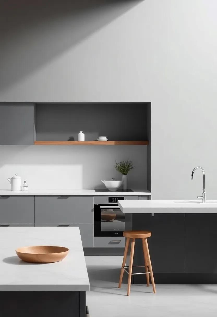
The timeless allure of gray continues to hold a prominent place in modern kitchen decor, embodying an elegance that transcends fleeting trends. A palette of soft grays and charcoal hues creates a serene backdrop, setting the stage for a harmonious blend of functionality and style. This versatile color can stand alone or serve as a canvas for vibrant accent colors, making it ideal for various design aesthetics. whether paired with sleek stainless steel, warm wood finishes, or bold splashes of color, gray adapts effortlessly, allowing homeowners to express their unique taste without overwhelming the senses.
To make the most of gray in your kitchen, consider these key combinations:
- Gray and Natural Wood: The warmth of wood balances gray’s cool tones, adding depth to your space.
- Gray and Bold Colors: Bright accents like yellow or teal pop against a gray backdrop, creating a fun focal point.
- Gray with Textures: Mix matte gray cabinets with glossy surfaces to enhance visual interest and dimension.
| Gray Shade | Ideal Pairing | Style Vibe |
|---|---|---|
| Light Gray | white Cabinets | Airy and Bright |
| Charcoal | Brass Fixtures | Luxurious and Modern |
| Warm Gray | Earthy Greens | Cozy and Inviting |
Integrating gray into your kitchen not only enhances aesthetics but also provides a timeless foundation for creative designs. As we move toward 2025, expect gray to continue evolving—showing up in unexpected ways like uniquely patterned tiles, painted cabinet interiors, or as a soothing base for open shelving displays. The future of kitchen decor invites you to reimagine gray,ensuring it remains a staple in stylish,contemporary homes.
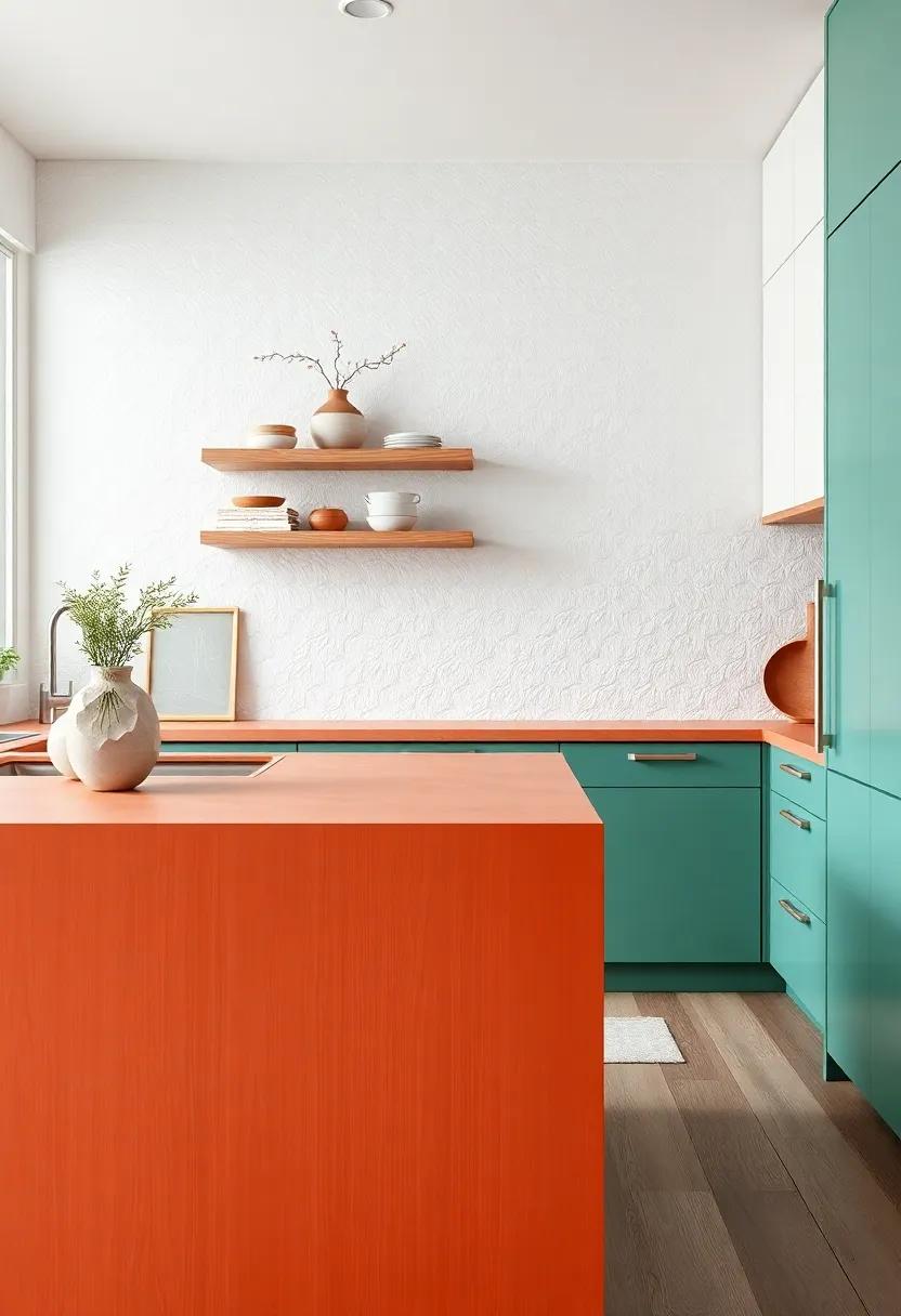
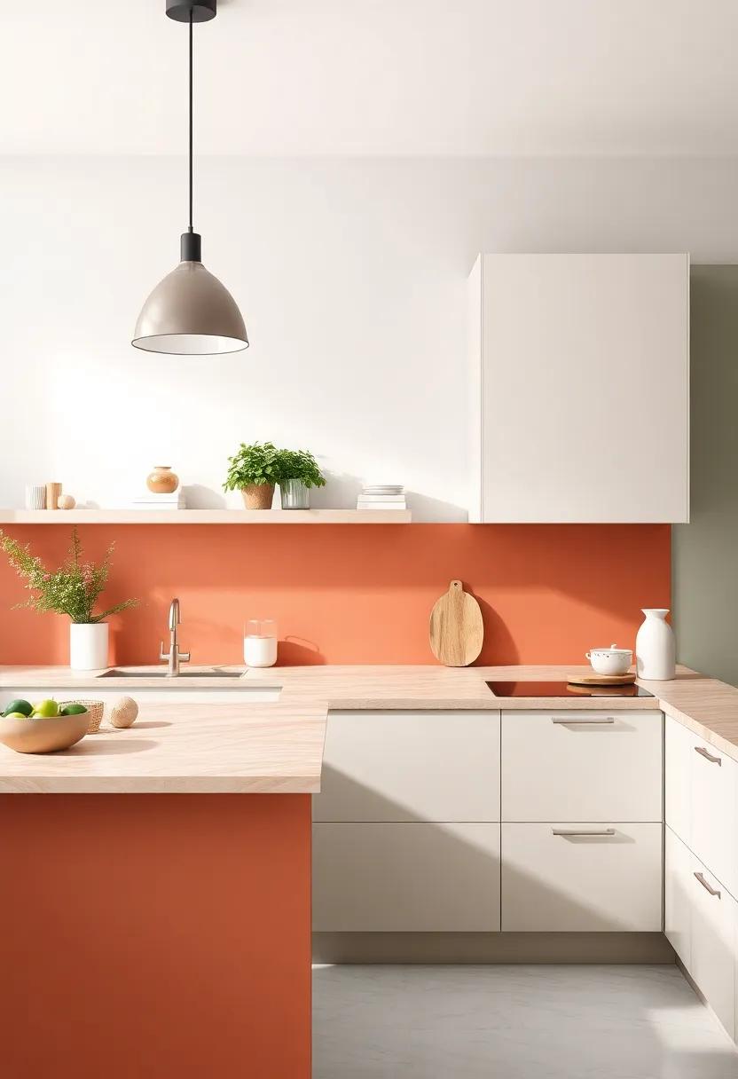
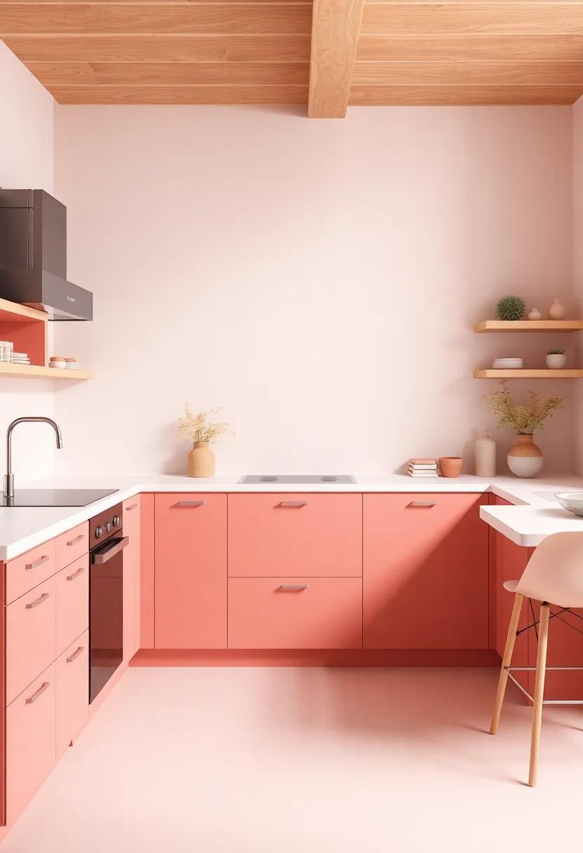
Vibrant Reds: Infusing Energy and Passion into Culinary Environments
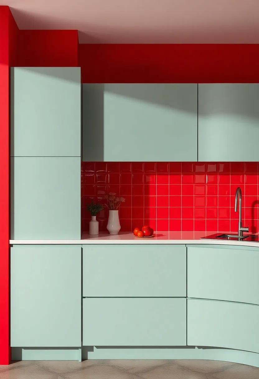
In the world of culinary design,the shade of red is not merely a color; it’s an experience that invigorates the senses and stimulates creativity. The boldness of reds—ranging from deep burgundy to fiery crimson—creates a dynamic backdrop that ignites passion within kitchen spaces. its psychological impact can enhance appetite and provoke excitement,making it an ideal choice for areas where food comes to life. By incorporating red accents or bold red appliances, homeowners can transform their kitchens into energetic hubs that inspire culinary adventures.
To harmonize the vitality of red, consider pairing it with complementary hues that soften its intensity, fostering a balanced atmosphere. The following combinations breathe life into the kitchen while maintaining a stylish allure:
- Red and Beige: Warm and inviting, perfect for a rustic theme.
- red and Gray: Modern sophistication that adds a touch of elegance.
- Red and White: classic and clean, creating a fresh aesthetic.
- Red and Navy: Striking contrast that evokes a sense of depth.
| Accent Color | Effect |
|---|---|
| Beige | Warmth and Coziness |
| Gray | modern Elegance |
| White | Fresh and Clean |
| Navy | Striking Contrast |
Sunlit Yellows: Bringing Warmth and Cheer to Contemporary Kitchens
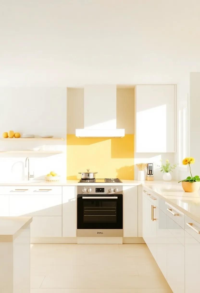
As the heart of the home, kitchens are evolving into more than just functional spaces; they are now vibrant expressions of personal style. Embracing sunlit yellows can instantly infuse your kitchen with a sense of warmth and cheerfulness that enhances the overall ambiance. This uplifting color not only stimulates appetite but also promotes positivity, making it an ideal choice for a lively cooking and gathering area. Popular shades range from soft buttery tones to bold, rich golds. Here are some ways to incorporate these sunny hues:
- Backsplash Tiles: Opt for glossy yellow tiles to create a striking focal point that draws the eye.
- Cabinetry: Consider repainting cabinets in a cheerful shade for a fresh look that can redefine your kitchen.
- Accents: Use yellow accessories such as dishware, kitchen towels, and vases to bring warmth without overwhelming the space.
Additionally, pairing these sunny shades with complementary colors enhances their impact. Navy blues and soft grays provide a sophisticated contrast, while earthy tones like terracotta can ground the brightness, creating a balanced palette that feels inviting. Below is a simple table that showcases some harmonious color pairings:
| Yellow Shades | Complementary Colors |
|---|---|
| Butter Yellow | Charcoal Gray |
| Bold sunny Yellow | Ocean blue |
| Golden Mustard | Olive green |
Moody Mystique: The Allure of Deep Colors for Dramatic Settings
Picture stepping into a kitchen enveloped in rich, deep hues that evoke a sense of warmth and elegance. The allure of these colors can transform the heart of your home, creating a statement that is both inviting and moody. Bold shades like emerald greens, navy blues, and charcoal grays come together to craft a dramatic backdrop that enhances the kitchen’s functionality while providing an artistic touch. Imagine cabinetry dressed in luxurious shades,paired with brass or matte black fixtures that offer a striking contrast,making everyday cooking feel like an indulgent experience.
These darker tones also provide the perfect canvas for playful accent pieces, whether it’s a vibrant piece of artwork or colorful kitchenware. Designs featuring textures such as velvet or matte finishes add depth and richness, while elements of wood or natural stone introduce warmth and grounding elements to the space. An eclectic mix of textures can create a harmonious balance, making the kitchen a sanctuary of creativity and comfort. As we look forward to 2025, it’s clear that embracing deep colors will not only redefine kitchen aesthetics but also encourage culinary adventures in a personally curated environment.
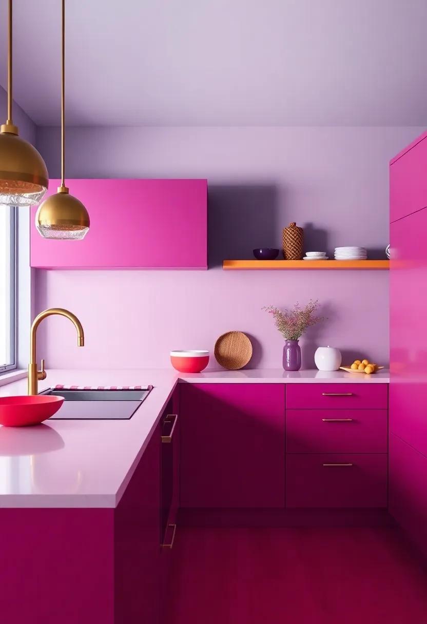
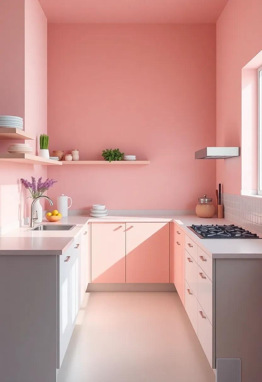
soft Blush Tones: Creating an inviting Atmosphere with Warm Pinks
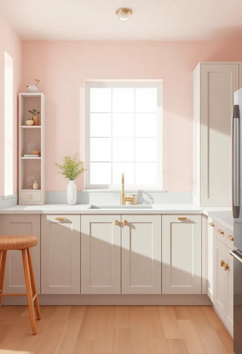
Embracing soft blush tones in your kitchen can create a serene and inviting atmosphere perfect for both cooking and gathering. This subtle hue brings warmth without overwhelming the senses, striking a harmonious balance between modern elegance and cozy charm. Consider integrating blush accents through various elements such as:
- Cabinet Paint: Updating cabinets with a soft blush finish adds a fresh twist to traditional designs.
- Accent Walls: A single blush-painted wall can serve as a focal point, enhancing the room’s overall appeal.
- Textiles: Soft pink linens or cushions can inject comfort and style, inviting relaxation for family and friends.
- Accessories: Incorporating blush-colored kitchenware or decorative items offers a playful pop of color without being too dominant.
This gentle palette pairs beautifully with natural materials, creating an organic feel. Soft blush tones complement wood finishes and stone surfaces, allowing for a seamless blend of textures. Consider the following combinations for a cohesive look:
| Material | Blush Pairing |
|---|---|
| Natural Wood | Soft Blush accents |
| Marble | Rose Gold Fixtures |
| Stainless Steel | Muted Pink Textiles |
Innovative Color Blocking: Transforming Traditional Spaces with Modern Techniques
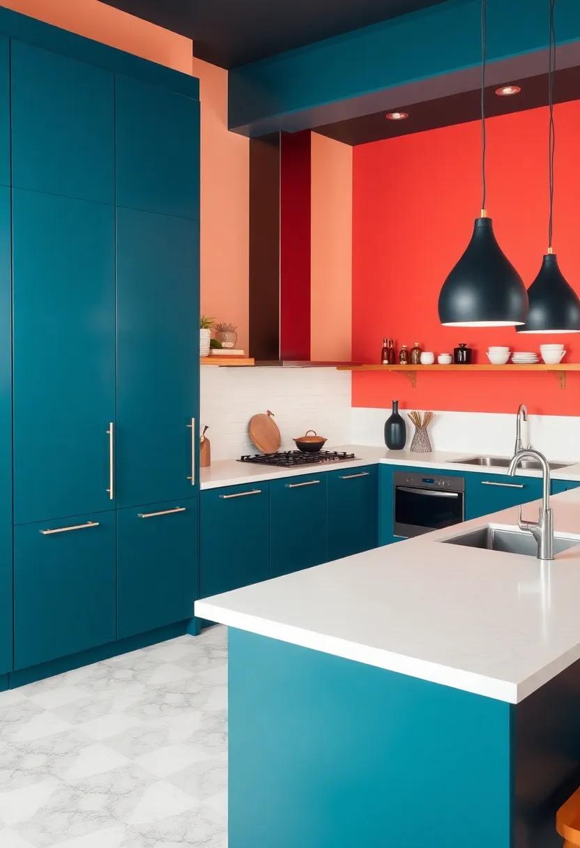
In 2025, the concept of color blocking is not just a technique; it’s an artistic expression that bridges the gap between traditional design and contemporary aesthetics.By embracing bold hues and strategic contrasts, homeowners are able to infuse their kitchens with personality and flair. Imagine a space adorned with deep navy blues paired with vibrant coral or shadowy greens accented by sunny yellows. This method allows for a playful juxtaposition of colors that can enhance natural light and define different areas within the kitchen, creating an atmosphere that feels both dynamic and cozy.
To achieve this modern transformation, consider the following innovative techniques:
- accent Walls: Choose one wall to highlight with a striking color, allowing other elements in the kitchen to blend with softer shades.
- Cabinet Color Contrasts: Pair different colored cabinets to establish a unique rhythm, using one color for upper cabinets and another for lower ones.
- open Shelving Displays: Use open shelves to showcase colorful dishware or herbs, adding layers of vibrancy against a neutral backdrop.
| Color Pairing | Effect |
|---|---|
| Deep Blue & Coral | Creates a refreshing yet warm atmosphere. |
| Shadowy Green & Sunny Yellow | Invokes a lively and invigorating vibe. |
| Classic White & Bold Burgundy | Adds elegance with a modern twist. |
Color Consultations: Collaborating with Designers for Personalized Palettes
Color consultations have become an essential part of the design process,especially when it comes to curating a kitchen that reflects your style and enhances functionality. By collaborating closely with designers, homeowners can explore a wide spectrum of options, ensuring that their color palette not only satisfies aesthetic preferences but also harmonizes with the overall design and mood of the space. This partnership allows for in-depth exploration of both timeless classics and the latest trends, presenting a balanced approach to color selection. Key elements to discuss during a consultation include:
- Personal Style: Identifying the client’s unique tastes and preferences.
- Functionality: Choosing colors that enhance the kitchen’s utility and flow.
- Lighting: Considering how natural and artificial light will affect the chosen colors.
- Material Compatibility: Ensuring color matches with existing or planned materials.
To make the most of color consultations, utilizing tools like mood boards and 3D renderings can provide invaluable visual aids that bridge ideas from concept to reality. With the rise of augmented reality applications, clients can visualize their potential kitchen color schemes in real-time. This innovative approach not only empowers homeowners to make informed decisions but also fosters a creative dialog between them and their designers, leading to more personalized and satisfying results. here’s a brief overview of popular color combinations anticipated for 2025:
| Color Combination | Emotional Impact |
|---|---|
| Soft Sage Green & Cream | Calming, Inviting |
| Rich Terracotta & Charcoal | grounding, Warm |
| Ocean Blue & White | Refreshing, Clean |
| Mustard Yellow & Deep Gray | Bold, Energizing |
In Conclusion
As we stand on the threshold of 2025, the kitchen emerges not just as a functional space, but as a vibrant canvas for personal expression. The trends we’ve explored offer a kaleidoscope of possibilities that elevate both style and ambiance, turning cooking and gathering into immersive experiences. Whether embracing calming earth tones, daring bold accents, or intricate patterns, your kitchen can reflect your unique taste and lifestyle.
As you envision your own culinary sanctuary, remember that the colors you choose will not only transform your space but also influence the mood and energy within it. Embrace the journey of experimentation, blending trends with your individual flair. In this ever-evolving landscape of design, the only limit is your imagination. So, roll up your sleeves, grab that paintbrush, and let the transformation begin—your kitchen revival awaits!